Bootstrap Theme "Company"
Create a Theme: "Company"
This page will show you how to build a Bootstrap theme from scratch.
We will start with a simple HTML page, and then add more and more components, until we have a fully functional, personal and responsive website.
The result will look like this, and you are free to modify, save, share, use or do whatever you want with it:
HTML Start Page
We will start with the following HTML page:
<!DOCTYPE html>
<html lang="en">
<head>
<title>Bootstrap
Theme Company</title>
<meta charset="utf-8">
<meta
name="viewport" content="width=device-width,
initial-scale=1">
</head>
<body>
<h1>Company</h1>
<p>We specialize in blablabla</p>
</body>
</html>
Add Bootstrap CDN and Add a Jumbotron
Add Bootstrap CDN and a link to jQuery and put HTML elements inside a
.jumbotron:
Example
<!DOCTYPE html>
<html lang="en">
<head>
<title>Bootstrap
Theme Company</title>
<meta charset="utf-8">
<meta
name="viewport" content="width=device-width, initial-scale=1">
<link
rel="stylesheet"
href="https://maxcdn.bootstrapcdn.com/bootstrap/3.4.1/css/bootstrap.min.css">
<script
src="https://ajax.googleapis.com/ajax/libs/jquery/3.5.1/jquery.min.js"></script>
<script
src="https://maxcdn.bootstrapcdn.com/bootstrap/3.4.1/js/bootstrap.min.js"></script>
</head>
<body>
<div class="jumbotron">
<h1>Company</h1>
<p>We specialize in blablabla</p>
</div>
</body>
</html>
Result:
Company
We specialize in blablabla
Add Background Color and Center Text
1. Add an orange background color to the jumbotron.
2. Add the .text-center class to center the text inside the
jumbotron:
Example
<style>
.jumbotron {
background-color: #f4511e; /* Orange */
color:
#ffffff;
}
</style>
<body>
<div class="jumbotron
text-center">
<h1>Company</h1>
<p>We
specialize in blablabla</p>
</div>
</body>
Result:
Company
We specialize in blablabla
Add Form
Add a form with an input field and a button:
Example
<div class="jumbotron text-center">
<h1>Company</h1>
<p>We specialize in blablabla</p>
<form
class="form-inline">
<div class="input-group">
<input
type="email" class="form-control" size="50" placeholder="Email
Address"
required>
<div
class="input-group-btn">
<button type="button" class="btn
btn-danger">Subscribe</button>
</div>
</div>
</form>
</div>
Result:
Company
We specialize in blablabla
Add Containers
Add two containers (.container-fluid), and add a custom class to the second
container (.bg-grey
- adds a gray background color):
Example
<style>
.bg-grey {
background-color: #f6f6f6;
}
</style>
<div class="container-fluid">
<h2>About Company
Page</h2>
<h4>Lorem ipsum..</h4>
<p>Lorem
ipsum..</p>
<button class="btn btn-default btn-lg">Get in
Touch</button>
</div>
<div class="container-fluid bg-grey">
<h2>Our Values</h2>
<h4><strong>MISSION:</strong> Our mission lorem
ipsum..</h4>
<p><strong>VISION:</strong> Our vision Lorem
ipsum..
</div>
Result:
About Company Page
Lorem ipsum..
Lorem ipsum..
Our Values
MISSION: Our mission lorem ipsum..
VISION: Our vision Lorem ipsum..
Add Padding
Lets make the jumbotron and the containers look good by adding some padding:
Example
<style>
.jumbotron {
background-color: #f4511e;
color: #fff;
padding: 100px 25px;
}
.container-fluid {
padding: 60px
50px;
}
</style>
Result:
Company
We specialize in blablabla
About Company Page
Lorem ipsum..
Lorem ipsum..
Our Values
MISSION: Our mission lorem ipsum..
VISION: Our vision Lorem ipsum..
Add a Grid
1. Add an icon (or the company's logo) to each container.
2. Separate the icon and the "about text" by creating two columns (.col-sm-8
and .col-sm-4)
3. Add media queries to center the "logo column" on screens smaller than 768 pixels wide.
Example
<style>
.logo {
font-size: 200px;
}
@media screen and
(max-width: 768px) {
.col-sm-4 {
text-align: center;
margin: 25px 0;
}
}
</style>
<div class="container-fluid">
<div
class="row">
<div
class="col-sm-8">
<h2>About Company
Page</h2>
<h4>Lorem ipsum..</h4>
<p>Lorem ipsum..</p>
<button class="btn btn-default btn-lg">Get in Touch</button>
</div>
<div class="col-sm-4">
<span class="glyphicon glyphicon-signal logo"></span>
</div>
</div>
</div>
<div class="container-fluid
bg-grey">
<div class="row">
<div
class="col-sm-4">
<span class="glyphicon
glyphicon-globe logo"></span>
</div>
<div class="col-sm-8">
<h2>Our
Values</h2>
<h4><strong>MISSION:</strong> Our
mission lorem ipsum..</h4>
<p><strong>VISION:</strong> Our vision Lorem ipsum..</p>
</div>
</div>
</div>
Result:
About Company Page
Lorem ipsum..
Lorem ipsum..
Our Values
MISSION: Our mission lorem ipsum..
VISION: Our vision Lorem ipsum..
Add Services Container
Add a new container, with 2x3 columns of equal width (.col-sm-4):
Example
<div class="container-fluid text-center">
<h2>SERVICES</h2>
<h4>What we offer</h4>
<br>
<div
class="row">
<div
class="col-sm-4">
<span class="glyphicon
glyphicon-off"></span>
<h4>POWER</h4>
<p>Lorem ipsum dolor sit
amet..</p>
</div>
<div
class="col-sm-4">
<span class="glyphicon
glyphicon-heart"></span>
<h4>LOVE</h4>
<p>Lorem ipsum dolor sit
amet..</p>
</div>
<div
class="col-sm-4">
<span class="glyphicon
glyphicon-lock"></span>
<h4>JOB
DONE</h4>
<p>Lorem ipsum dolor sit
amet..</p>
</div>
</div>
<br><br>
<div class="row">
<div
class="col-sm-4">
<span class="glyphicon
glyphicon-leaf"></span>
<h4>GREEN</h4>
<p>Lorem ipsum dolor sit
amet..</p>
</div>
<div
class="col-sm-4">
<span class="glyphicon
glyphicon-certificate"></span>
<h4>CERTIFIED</h4>
<p>Lorem ipsum dolor sit
amet..</p>
</div>
<div
class="col-sm-4">
<span class="glyphicon
glyphicon-wrench"></span>
<h4>HARD
WORK</h4>
<p>Lorem ipsum dolor sit
amet..</p>
</div>
</div>
</div>
Result:
SERVICES
What we offer
POWER
Lorem ipsum dolor sit amet..
LOVE
Lorem ipsum dolor sit amet..
JOB DONE
Lorem ipsum dolor sit amet..
GREEN
Lorem ipsum dolor sit amet..
CERTIFIED
Lorem ipsum dolor sit amet..
HARD WORK
Lorem ipsum dolor sit amet..
Styling Icons
Add a custom class (.logo-small) to each glyphicon in the
"Services" container. Use CSS to style them:
Example
/* Add an orange color to all icons and set the font-size */
.logo-small {
color:
#f4511e;
font-size: 50px;
}
.logo {
color: #f4511e;
font-size: 200px;
}
Result:
About Company Page
Lorem ipsum..
Lorem ipsum..
Our Values
MISSION: Our mission lorem ipsum..
VISION: Our vision Lorem ipsum..
SERVICES
What we offer
POWER
Lorem ipsum dolor sit amet..
LOVE
Lorem ipsum dolor sit amet..
JOB DONE
Lorem ipsum dolor sit amet..
GREEN
Lorem ipsum dolor sit amet..
CERTIFIED
Lorem ipsum dolor sit amet..
HARD WORK
Lorem ipsum dolor sit amet..
Add Portfolio Container
Create a new full-width container, with three columns of equal width (.col-sm-4):
Inside each column, add an image.
Then, use the .img-thumbnail class to shape the image to a thumbnail.
Normally, you would add the .img-thumbnail class directly to the
<img> element. In this example, we have placed a thumbnail container around the image, so that we can
specify an image text as well.
Example
<div class="container-fluid text-center bg-grey">
<h2>Portfolio</h2>
<h4>What we have created</h4>
<div
class="row text-center">
<div
class="col-sm-4">
<div
class="thumbnail">
<img
src="paris.jpg" alt="Paris">
<p><strong>Paris</strong></p>
<p>Yes, we built Paris</p>
</div>
</div>
<div class="col-sm-4">
<div class="thumbnail">
<img
src="newyork.jpg" alt="New York">
<p><strong>New York</strong></p>
<p>We built New York</p>
</div>
</div>
<div class="col-sm-4">
<div class="thumbnail">
<img
src="sanfran.jpg" alt="San Francisco">
<p><strong>San Francisco</strong></p>
<p>Yes, San Fran is ours</p>
</div>
</div>
</div>
Result:
Portfolio
What we have created
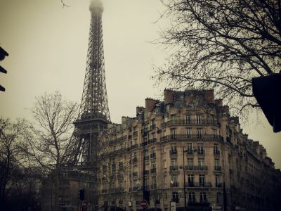
Paris
Yes, we built Paris

New York
We built New York

San Francisco
Yes, San Fran is ours
Styling Thumbnail Images
Use CSS to style the images. In our example, we have tried to make them look like cards, by removing their border, and set a 100% width on each image.
Example
.thumbnail {
padding: 0 0 15px 0;
border: none;
border-radius: 0;
}
.thumbnail img {
width: 100%;
height:
100%;
margin-bottom: 10px;
}
Result:
Portfolio
What we have created
Paris
Yes, we built Paris
New York
We built New York
San Francisco
Yes, San Fran is ours
Add a Carousel
Add a carousel:
Example
<h2>What our customers say</h2>
<div id="myCarousel" class="carousel slide
text-center" data-ride="carousel">
<!-- Indicators -->
<ol
class="carousel-indicators">
<li data-target="#myCarousel"
data-slide-to="0" class="active"></li>
<li
data-target="#myCarousel" data-slide-to="1"></li>
<li
data-target="#myCarousel" data-slide-to="2"></li>
</ol>
<!-- Wrapper for slides -->
<div
class="carousel-inner" role="listbox">
<div class="item
active">
<h4>"This company is the best. I am so happy with the
result!"<br><span style="font-style:normal;">Michael Roe, Vice President, Comment
Box</span></h4>
</div>
<div
class="item">
<h4>"One word...
WOW!!"<br><span style="font-style:normal;">John Doe, Salesman, Rep
Inc</span></h4>
</div>
<div
class="item">
<h4>"Could I... BE any more happy
with this company?"<br><span style="font-style:normal;">Chandler Bing, Actor,
FriendsAlot</span></h4>
</div>
</div>
<!-- Left and right controls -->
<a class="left carousel-control"
href="#myCarousel" role="button" data-slide="prev">
<span class="glyphicon glyphicon-chevron-left"
aria-hidden="true"></span>
<span
class="sr-only">Previous</span>
</a>
<a class="right
carousel-control" href="#myCarousel" role="button"
data-slide="next">
<span class="glyphicon
glyphicon-chevron-right" aria-hidden="true"></span>
<span
class="sr-only">Next</span>
</a>
</div>
Result:
What our customers say
Try it Yourself »Style The Carousel
Use CSS to style the carousel:
Example
.carousel-control.right, .carousel-control.left {
background-image: none;
color: #f4511e;
}
.carousel-indicators li {
border-color: #f4511e;
}
.carousel-indicators li.active {
background-color:
#f4511e;
}
.item h4 {
font-size: 19px;
line-height:
1.375em;
font-weight: 400;
font-style: italic;
margin: 70px 0;
}
.item span {
font-style:
normal;
}
Result:
What our customers say
Try it Yourself »Add Pricing Container
Create a full width container, with three columns of equal width (.col-sm-4):
Inside each column, add a panel:
Example
<div class="container-fluid">
<div
class="text-center">
<h2>Pricing</h2>
<h4>Choose a payment plan that works for you</h4>
</div>
<div
class="row">
<div
class="col-sm-4">
<div class="panel panel-default
text-center">
<div
class="panel-heading">
<h1>Basic</h1>
</div>
<div
class="panel-body">
<p><strong>20</strong>
Lorem</p>
<p><strong>15</strong>
Ipsum</p>
<p><strong>5</strong>
Dolor</p>
<p><strong>2</strong>
Sit</p>
<p><strong>Endless</strong> Amet</p>
</div>
<div
class="panel-footer">
<h3>$19</h3>
<h4>per
month</h4>
<button class="btn
btn-lg">Sign Up</button>
</div>
</div>
</div>
<div class="col-sm-4">
<div
class="panel panel-default text-center">
<div
class="panel-heading">
<h1>Pro</h1>
</div>
<div
class="panel-body">
<p><strong>50</strong>
Lorem</p>
<p><strong>25</strong>
Ipsum</p>
<p><strong>10</strong>
Dolor</p>
<p><strong>5</strong>
Sit</p>
<p><strong>Endless</strong> Amet</p>
</div>
<div
class="panel-footer">
<h3>$29</h3>
<h4>per
month</h4>
<button class="btn
btn-lg">Sign Up</button>
</div>
</div>
</div>
<div class="col-sm-4">
<div
class="panel panel-default text-center">
<div
class="panel-heading">
<h1>Premium</h1>
</div>
<div
class="panel-body">
<p><strong>100</strong>
Lorem</p>
<p><strong>50</strong>
Ipsum</p>
<p><strong>25</strong>
Dolor</p>
<p><strong>10</strong>
Sit</p>
<p><strong>Endless</strong> Amet</p>
</div>
<div
class="panel-footer">
<h3>$49</h3>
<h4>per
month</h4>
<button class="btn
btn-lg">Sign Up</button>
</div>
</div>
</div>
</div>
</div>
Result:
Pricing
Choose a payment plan that works for you
Basic
20 Lorem
15 Ipsum
5 Dolor
2 Sit
Endless Amet
Pro
50 Lorem
25 Ipsum
10 Dolor
5 Sit
Endless Amet
Premium
100 Lorem
50 Ipsum
25 Dolor
10 Sit
Endless Amet
Styling Panels
Use CSS to style the panels:
Example
.panel {
border: 1px solid #f4511e;
border-radius:0;
transition: box-shadow 0.5s;
}
.panel:hover {
box-shadow: 5px 0px 40px
rgba(0,0,0, .2);
}
.panel-footer .btn:hover {
border: 1px solid
#f4511e;
background-color: #fff !important;
color:
#f4511e;
}
.panel-heading {
color: #fff !important;
background-color: #f4511e !important;
padding:
25px;
border-bottom: 1px solid transparent;
border-top-left-radius: 0px;
border-top-right-radius: 0px;
border-bottom-left-radius: 0px;
border-bottom-right-radius: 0px;
}
.panel-footer {
background-color: #fff
!important;
}
.panel-footer h3 {
font-size: 32px;
}
.panel-footer h4 {
color:
#aaa;
font-size: 14px;
}
.panel-footer .btn {
margin: 15px 0;
background-color:
#f4511e;
color: #fff;
}
Result:
Pricing
Choose a payment plan that works for you
Basic
20 Lorem
15 Ipsum
5 Dolor
2 Sit
Endless Amet
Pro
50 Lorem
25 Ipsum
10 Dolor
5 Sit
Endless Amet
Premium
100 Lorem
50 Ipsum
25 Dolor
10 Sit
Endless Amet
Add Contact Container
Add a new container with contact information:
Example
<div class="container-fluid bg-grey">
<h2
class="text-center">CONTACT</h2>
<div
class="row">
<div
class="col-sm-5">
<p>Contact us and we'll get back to
you within 24 hours.</p>
<p><span class="glyphicon
glyphicon-map-marker"></span> Chicago, US</p>
<p><span class="glyphicon glyphicon-phone"></span> +00
1515151515</p>
<p><span class="glyphicon
glyphicon-envelope"></span> myemail@something.com</p>
</div>
<div class="col-sm-7">
<div class="row">
<div class="col-sm-6
form-group">
<input
class="form-control" id="name" name="name" placeholder="Name"
type="text" required>
</div>
<div class="col-sm-6
form-group">
<input
class="form-control" id="email" name="email" placeholder="Email"
type="email" required>
</div>
</div>
<textarea
class="form-control" id="comments" name="comments"
placeholder="Comment"
rows="5"></textarea><br>
<div
class="row">
<div class="col-sm-12
form-group">
<button class="btn
btn-default pull-right"
type="submit">Send</button>
</div>
</div>
</div>
</div>
</div>
Result:
CONTACT
Contact us and we'll get back to you within 24 hours.
Chicago, US
+00 1515151515
myemail@something.com
Add Map/Location Image
Add a location image or a map (read our Google Maps Tutorial for google maps):
Example
<!-- Image of location/map -->
<img src="map.jpg" style="width:100%">
Result:
Add a Navbar
Add a navbar at the top of the page that collapses on smaller screens:
Example
<nav class="navbar navbar-default navbar-fixed-top">
<div
class="container">
<div class="navbar-header">
<button
type="button" class="navbar-toggle" data-toggle="collapse"
data-target="#myNavbar">
<span
class="icon-bar"></span>
<span
class="icon-bar"></span>
<span
class="icon-bar"></span>
</button>
<a class="navbar-brand"
href="#">Logo</a>
</div>
<div class="collapse navbar-collapse"
id="myNavbar">
<ul class="nav navbar-nav
navbar-right">
<li><a
href="#about">ABOUT</a></li>
<li><a
href="#services">SERVICES</a></li>
<li><a
href="#portfolio">PORTFOLIO</a></li>
<li><a
href="#pricing">PRICING</a></li>
<li><a href="#contact">CONTACT</a></li>
</ul>
</div>
</div>
</nav>
Result:
Try it Yourself »Tip: Right-align the navigation buttons with the navbar-right
class.
Style The Navbar
Use CSS to customize the navigation bar:
Example
.navbar {
margin-bottom: 0;
background-color: #f4511e;
z-index: 9999;
border: 0;
font-size: 12px !important;
line-height: 1.42857143 !important;
letter-spacing: 4px;
border-radius: 0;
}
.navbar li a, .navbar .navbar-brand
{
color: #fff !important;
}
.navbar-nav li a:hover, .navbar-nav li.active a {
color: #f4511e !important;
background-color: #fff !important;
}
.navbar-default
.navbar-toggle {
border-color: transparent;
color: #fff !important;
}
Result:
Try it Yourself »Add Scrollspy
Add scrollspy to automatically update navbar links when scrolling:
Example
<body id="myPage" data-spy="scroll" data-target=".navbar"
data-offset="60">
<div id="about" class="container-fluid">
<div id="services"
class="container-fluid">
<div id="portfolio"
class="container-fluid">
<div id="pricing" class="container-fluid">
<div id="contact"
class="container-fluid">
Try it Yourself »
Add a Footer
Add an "Up Arrow" icon to the footer, which will take the user to the top of the page when clicked on:
Example
<style>
footer .glyphicon {
font-size: 20px;
margin-bottom: 20px;
color: #f4511e;
}
</style>
<footer
class="container-fluid text-center">
<a href="#myPage" title="To
Top">
<span class="glyphicon
glyphicon-chevron-up"></span>
</a>
<p>Bootstrap Theme Made By
<a href="https://www.w3schools.com" title="Visit
w3schools">www.w3schools.com</a></p>
</footer>
Result:
Try it Yourself »Adding Smooth Scrolling
Use jQuery to add smooth scrolling (when clicking on the links in the navbar):
Example
<script>
$(document).ready(function(){
// Add smooth scrolling to all links in
navbar + footer link
$(".navbar a, footer a[href='#myPage']").on('click',
function(event) {
// Make sure this.hash has a value before overriding default
behavior
if (this.hash !== "") {
// Prevent default anchor
click behavior
event.preventDefault();
// Store
hash
var hash = this.hash;
// Using jQuery's animate()
method to add smooth page scroll
// The optional number (900) specifies the number of
milliseconds it takes to scroll to the specified area
$('html, body').animate({
scrollTop: $(hash).offset().top
}, 900,
function(){
// Add hash (#) to URL when done scrolling (default click
behavior)
window.location.hash = hash;
});
} // End if
});
})
</script>
Try it Yourself »
Final Touch
Personalize your Theme by adding a font that you like. We have used "Montserrat" and "Lato" from Google's Font Library.
Link to the font in the
<head> section:
<link href="https://fonts.googleapis.com/css?family=Montserrat" rel="stylesheet" type="text/css">
<link href="https://fonts.googleapis.com/css?family=Lato" rel="stylesheet" type="text/css">
Then you can use them in the page:
Example
body {
font: 400 15px Lato, sans-serif;
line-height:
1.8;
color: #818181;
}
.jumbotron {
font-family: Montserrat,
sans-serif;
}
.navbar {
font-family: Montserrat, sans-serif;
}
We have also added some extra style to some elements:
Example
h2 {
font-size: 24px;
text-transform: uppercase;
color: #303030;
font-weight: 600;
margin-bottom: 30px;
}
h4 {
font-size: 19px;
line-height: 1.375em;
color: #303030;
font-weight: 400;
margin-bottom: 30px;
}
Try it Yourself »
Slide In Elements
We have also created an animation effect which will slide in elements on
scroll. If you want to use it, just add the .slideanim class to the
element you want to slide in, and add the following to your CSS and jQuery (feel
free to modify the duration, opacity, where to start, when to slide in, and so
on):
CSS Example
.slideanim {visibility:hidden;}
.slide {
/* The name of the animation */
animation-name: slide;
-webkit-animation-name: slide;
/* The duration of the animation */
animation-duration:
1s;
-webkit-animation-duration: 1s;
/* Make the element visible */
visibility:
visible;
}
/* Go from 0% to 100% opacity (see-through) and specify the percentage from when to slide in the element
along the Y-axis */
@keyframes slide {
0% {
opacity: 0;
transform: translateY(70%);
}
100% {
opacity: 1;
transform: translateY(0%);
}
}
@-webkit-keyframes
slide {
0% {
opacity: 0;
-webkit-transform: translateY(70%);
}
100% {
opacity: 1;
-webkit-transform:
translateY(0%);
}
}
jQuery Example
$(window).scroll(function() {
$(".slideanim").each(function(){
var
pos = $(this).offset().top;
var winTop =
$(window).scrollTop();
if (pos < winTop + 600) {
$(this).addClass("slide");
}
});
});
Try it Yourself »