- Power BI - Home
- Power BI - Introduction
- Power BI - Installation Steps
- Power BI - Architecture
- Power BI Desktop
- Power BI - Desktop
- Power BI - Desktop Window
- Power BI Service
- Power BI - Window Supported Browsers
- Power BI - Generating Reports
- Power BI Desktop Service
- Power BI - Desktop vs Service
- Power BI - Supported Data Sources
- Power BI - Comparison Tools
- Power Query Editor
- Power Query Editor - Introduction
- Power Query Editor - Data Discrepancy
- Power Query Editor - Merge Queries (Part 1)
- Power Query Editor - Merge Queries (Part 2)
- Power BI - Develop Star Schema
- Data Modeling Concepts
- Power BI - Data Modeling
- Power BI - Manage Relationships
- Power BI - Cardinality
- Power BI - Dashboard Options
- Power BI Report Visualizations
- Power BI - Visualization Options
- Power BI - Visualization Charts
- Power BI - Stacked Bar Chart
- Power BI - Stacked Column Chart
- Power BI - Clustered Chart
- Power BI - 100% Stacked Chart
- Power BI - Area Chart and Stacked Area Chart
- Power BI - Line and Stacked Column Chart
- Power BI - Line and Clustered Column Chart
- Power BI - Ribbon Chart
- Power BI - Table and Matrix Visuals
- Power BI Map Visualizations
- Power BI - Creating Map Visualizations
- Power BI - ArcGIS Map
- Power BI Miscellaneous
- Power BI - Waterfall Charts
- Funnel Charts and Radial Gauge Chart
- Power BI - Scatter Chart
- Power BI - Pie Chart and Donut Chart
- Power BI - Card and Slicer Visualization
- Power BI - KPI Visual
- Power BI - Smart Narrative Visual
- Power BI - Decomposition Tree
- Power BI - Paginated Report
- Power BI - Python Script & R Script
- Power BI - Multi-row Card
- Power BI - Power Apps & Power Automate
- Power BI - Excel Integration
- Power BI Dashboard
- Power BI - Sharing Dashboards
- Power BI Sales Production Dashboard
- Power BI - HR Analytics Dashboard
- Power BI - Customer Analytics Dashborad
- Power BI - DAX Basics
- Power BI - Administration Role
- Power BI - DAX Functions
- Power BI - DAX Text Functions
- Power BI - DAX Date Functions
- Power BI - DAX Logical Functions
- Power BI - DAX Counting Functions
- Power BI - Depreciation Functions
- Power BI - DAX Information Functions
Power BI - 100% Stacked Chart
100% Stacked Bar Chart
The 100% stacked bar chart is used to aggregate the field values and the respective percentages of various field values are shown through multiple horizontal bars that exhibit 100% length on each bar. The X-axis displays the numerical values, while the Y-axis displays the categorical (text) values.
How to Generate 100% Stacked Bar Chart?
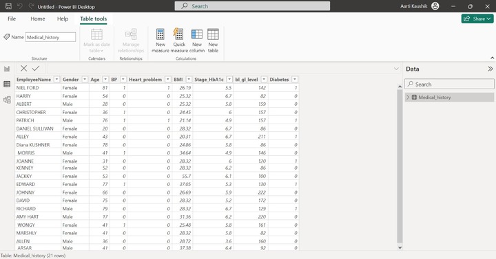
Step 1 − Open the BI desktop and load the "D:\Diabetes1.xlsx" dataset into it. You may observe the dataset in the Table view.
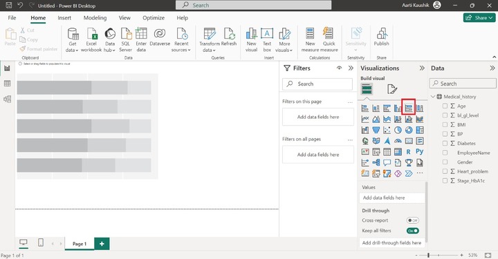
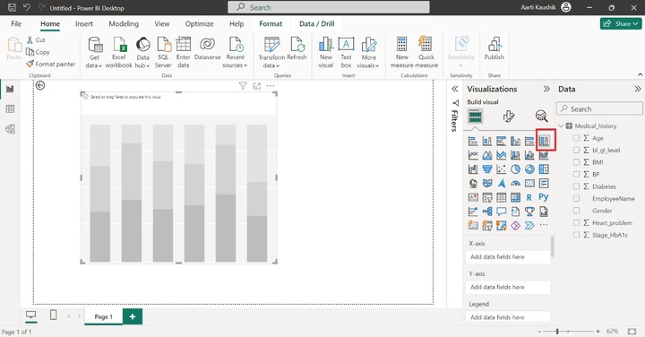
Step 2 − You can navigate to the Report View and selection of the "100% Stacked bar chart" visual has to be done from the "Visualizations" and you may either decrease or increase the visual size.
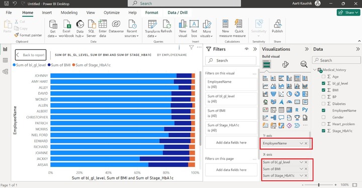
Step 3 − Now, place the "EmployeeName" field into the Y-axis and also drag the "bl_gl_level", "BMI", "Stage_HbA1c" fields and drop them into the X-axis one by one. Therefore, you can observe on the screen, that the sum of bl_gl_level, the sum of BMI, and the Sum of Stage_HbA1c by the employee names are populated on the canvas.
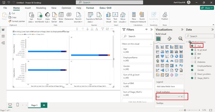
Step 4 − You may take the benefits of the "Small Multiples" section to further subdivide the generated 100% Stacked Bar Chart into smaller charts based on the field. For example, Place the Age field into the "Small multiples section". As you can notice in the screenshot, numerous charts are generated based on the Age field.
Step 5 − When we place the cursor on the data point, only limited information about the data fields is available in the message box. As you can notice in the screenshot, the details of "Employee Name" and "SUM of BMI" are illustrated.
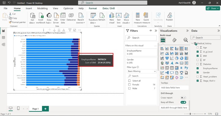
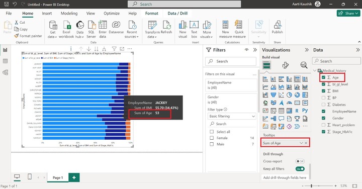
If you wish to add more field information to the message box, then it can be done through the "Tooltips" option. Place the "Age" field into the "Tooltips" section. Moreover, the detailed information related to the "Age" field is appended to the message box when you hover over the specific horizontal bar.
Step 6 − What in case you want to view only Female/Male employees on the Report?
Filtration can be done on the generated visuals by using "Drill through". You may place the "Gender" field into "Tooltips" and click on the "Male" category.

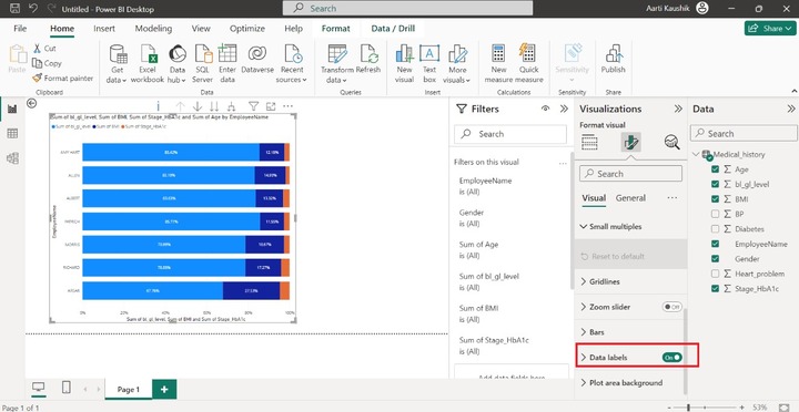
Step 7 − You may customize the generated visual. Click on the Chart area and then navigate to the "Format Visual" and click on "Visual". You may turn on the "Data labels".
100% Stacked Column Chart
It is just the opposite of a 100% Stacked bar chart. The vertical bars whose elevation is 100% are employed in this chart. The X-axis displays the categorical (text) values whereas the Y-axis displays the numerical values.
Creating a 100% Stacked Column Chart
Step 1 − You may use the same dataset "Diabetes1.xlsx" to build a 100% stacked column chart. Now, you can switch to the "Report" View and select the "100% stacked column chart". The default visual build on the canvas.
Step 2 − You may add the "EmployeeName" field to the X-axis. The next step is to add multiple field values in the Y axis for comparing field values against categorical value. After that, place the "Age", "BP", "BMI" and "bl_gl_level" field values in the Y-axis one by one.
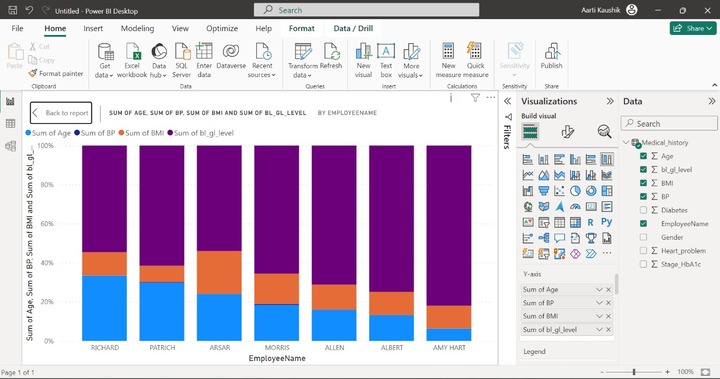
As you can see in the screenshot, each field is represented by a distinct color.
Step 3 − Suppose you wish to further divide the chart into multiple charts based on the specific criteria. It can be achieved through the "Small Multiples" section. You may place the "Diabetes" field into the "Small multiples" section.
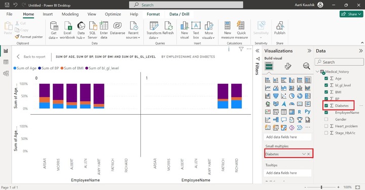
Therefore, you can notice on the screenshot, two different visuals have been created based on the Diabetes field. Note that the Diabetes field contains only 0 and 1 values.
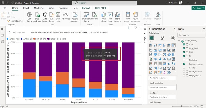
Step 4 − If you hover over any vertical bar, only the EmployeeName and Sum of bl_gl_level field value information is populated.
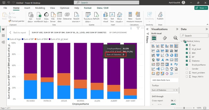
You can use the Tooltips section so that other field values information can also be viewed. For example, place the "Sum of Diabetes" into the "Tooltips" section. Moreover, once you hover over any vertical bar, the information of "Sum of Diabetes" is also populated. Similarly, you can add more fields into Tooltips to get their detailed information.
Step 5 − With the aid of the "Drill Through" option, you can resolve queries like "How many employees have heart disease"" How many employees have diabetes or BP" and so on.
You may add the "Diabetes" field to the "Drill through", expand the "Allow drill through when:" and select the "Used as Category". You can select the 1.
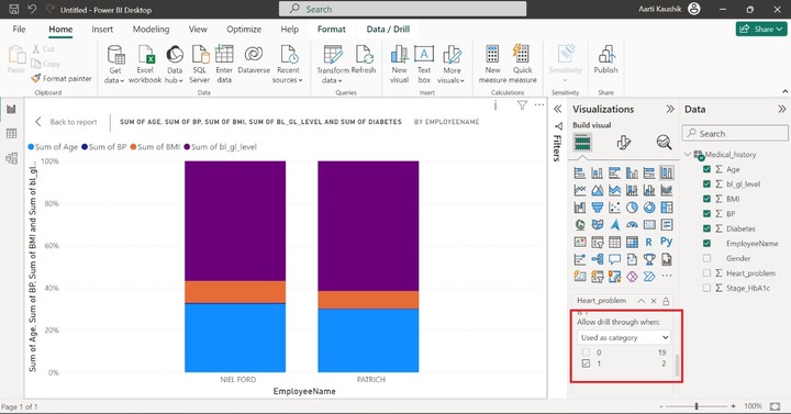
As you can visualize in the screenshot, only two employees have heart disease.
You may choose the "Format Visual" to customize this chart and alter the canvas settings, background information, font size, color, and so on.