- Power BI - Home
- Power BI - Introduction
- Power BI - Installation Steps
- Power BI - Architecture
- Power BI Desktop
- Power BI - Desktop
- Power BI - Desktop Window
- Power BI Service
- Power BI - Window Supported Browsers
- Power BI - Generating Reports
- Power BI Desktop Service
- Power BI - Desktop vs Service
- Power BI - Supported Data Sources
- Power BI - Comparison Tools
- Power Query Editor
- Power Query Editor - Introduction
- Power Query Editor - Data Discrepancy
- Power Query Editor - Merge Queries (Part 1)
- Power Query Editor - Merge Queries (Part 2)
- Power BI - Develop Star Schema
- Data Modeling Concepts
- Power BI - Data Modeling
- Power BI - Manage Relationships
- Power BI - Cardinality
- Power BI - Dashboard Options
- Power BI Report Visualizations
- Power BI - Visualization Options
- Power BI - Visualization Charts
- Power BI - Stacked Bar Chart
- Power BI - Stacked Column Chart
- Power BI - Clustered Chart
- Power BI - 100% Stacked Chart
- Power BI - Area Chart and Stacked Area Chart
- Power BI - Line and Stacked Column Chart
- Power BI - Line and Clustered Column Chart
- Power BI - Ribbon Chart
- Power BI - Table and Matrix Visuals
- Power BI Map Visualizations
- Power BI - Creating Map Visualizations
- Power BI - ArcGIS Map
- Power BI Miscellaneous
- Power BI - Waterfall Charts
- Funnel Charts and Radial Gauge Chart
- Power BI - Scatter Chart
- Power BI - Pie Chart and Donut Chart
- Power BI - Card and Slicer Visualization
- Power BI - KPI Visual
- Power BI - Smart Narrative Visual
- Power BI - Decomposition Tree
- Power BI - Paginated Report
- Power BI - Python Script & R Script
- Power BI - Multi-row Card
- Power BI - Power Apps & Power Automate
- Power BI - Excel Integration
- Power BI Dashboard
- Power BI - Sharing Dashboards
- Power BI Sales Production Dashboard
- Power BI - HR Analytics Dashboard
- Power BI - Customer Analytics Dashborad
- Power BI - DAX Basics
- Power BI - Administration Role
- Power BI - DAX Functions
- Power BI - DAX Text Functions
- Power BI - DAX Date Functions
- Power BI - DAX Logical Functions
- Power BI - DAX Counting Functions
- Power BI - Depreciation Functions
- Power BI - DAX Information Functions
Power BI - Card and Slicer Visualization
Power BI is an awesome tool for creating interactive reports and modeling data. Various built-in visuals are exclusive in the Visualization pane where measures, aggregation functions, and so on can be applied to construct the specific model. A card visual is one of the crucial visuals where a computed solitary value like average salary, maximum salary, or total production in a specific year is to be highlighted on a card.
Calculating Average Monthly Salary via Card Visualization
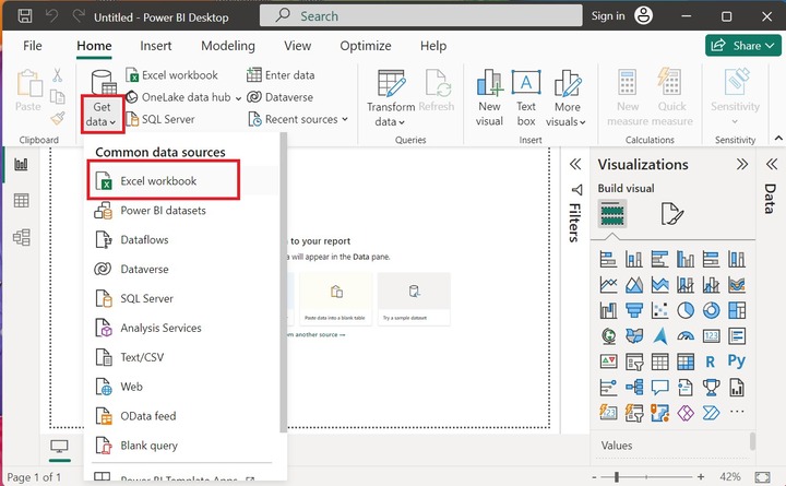
Step 1 − You can click on the "Power BI Desktop" icon, navigate to the "Home" tab select the "Get data" tile, and click on the "Excel workbook" to load the table named Employee.xls.
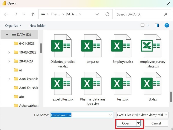
Step 2 − Users need to choose the specified file name from the location of the system and then click on the "Open" button.
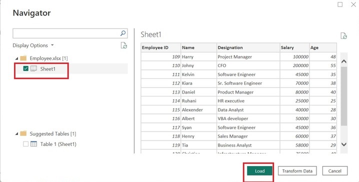
Step 3 − The preview of the Employee table is shown in the Navigator window box. Now, click on the "Sheet1" checkbox and press the "Load" button as given below −
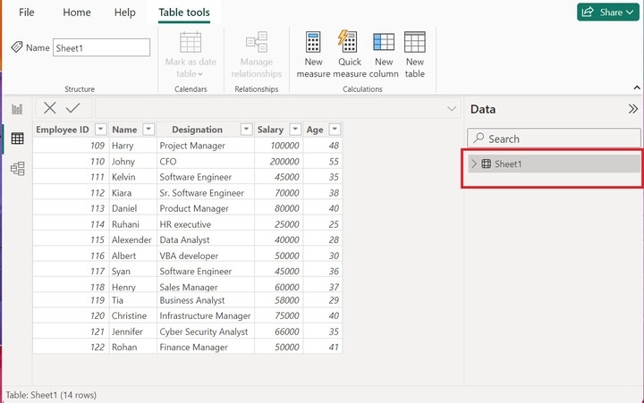
Step 4 − Moreover, the employee table is inserted in the Power BI desktop. All the tables are shown under the "Data" pane.
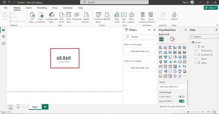
Step 5 − You may click on the Report view, expand Sheet1, and select the "Salary" column as highlighted below image −
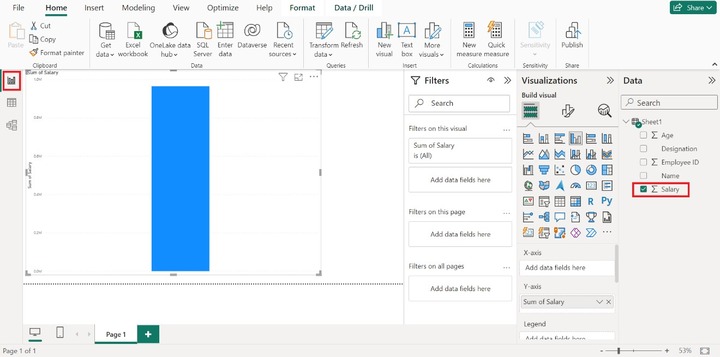
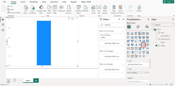
Step 6 − After switching to the Report Editor, by default, the sum of the salary column chart graph is automatically displayed on the window. Now, select the Card visual icon.
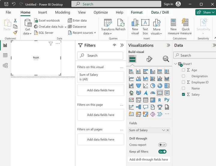
Step 7 − Click on the lower arrow adjacent to the "Sum of Salary" under the Fields section and select the Average option from the drop-down menu as given below −
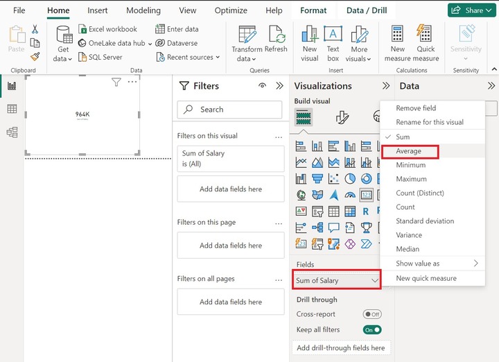
Step 8 − Therefore, the average employee's salary that is 68.86K is showcased through a Card visual icon as shown below −
Slicer Visual
You may insert a Slicer (new) to filter employee data according to their job roles. The Visual format option may be chosen to develop a more interactive slicer where boundaries, font size, and font color can also be edited.
Slicer is an alternative way of filtering. Numeric Value, Relative Date and time, and Hierarchy are the primary types of slicers. The benefits of slicer(new) include easy access to filtered data, fast retrieval of employee-related information, column-based data filtering, vibrant reports, and compatibility with other charts.
Filtering Employee Names with Slicer Based on New Constraints
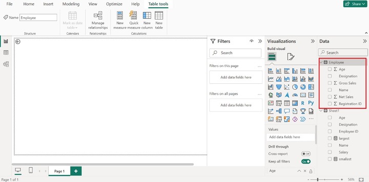
Step 1 − Consider the sample dataset "Employee" comprises six columns as given below −
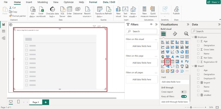
Step 2 − Two slicer options are available in the Visualization pane. To insert the slicer into the editor, the user may select the "Slicer(New)" visual under the Visualizations pane. The empty slicer would be generated. Users may expand the slicer's size for clear visibility.
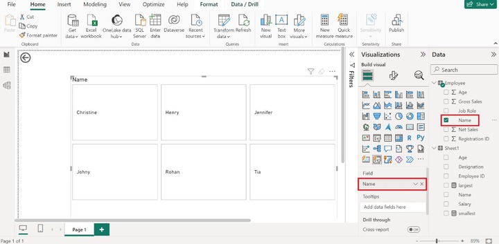
Step 3 − You may drag the "Name" column of the Employee table and drop it into the "Field" textbox. Once you have selected this column, all employees' names will display on the Slicer as given below −
Step 4 − You can drag the "Job Role" column and drop it into the "Drill through fields". Select the "Used as category" option. All the employees are listed in the category form along with a number. The numbers 1,2,..10 indicate the number of employees working in a specific job role.
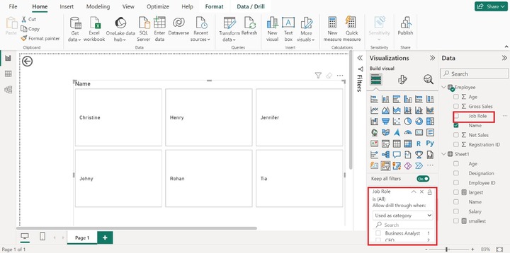
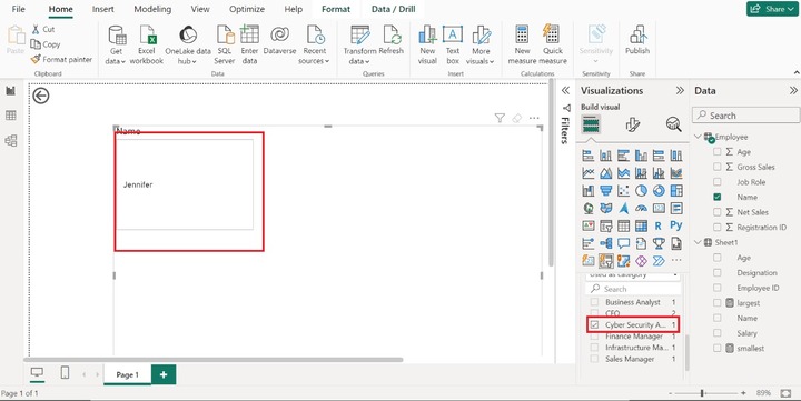
Step 5 − Let's click on the "Cyber Security Analyst" checkbox, the employee's name "Jennifer" is displayed on the slicer which means only one employee is currently working on this role. Similarly, we can choose other job roles and filter the employee's name accordingly.
Sometimes, beginners encounter difficulty in evaluating the complex datasets in Power BI. As they are not aware of the crucial functionality of this tool, encounter difficulty in understanding DAX measures and the usage of the calculated column. However, with the assistance of Card Visual, they can seamlessly view the result without any interruption. Users may practice more on numerous visuals to improve their data analytics skills.