- Power BI - Home
- Power BI - Introduction
- Power BI - Installation Steps
- Power BI - Architecture
- Power BI Desktop
- Power BI - Desktop
- Power BI - Desktop Window
- Power BI Service
- Power BI - Window Supported Browsers
- Power BI - Generating Reports
- Power BI Desktop Service
- Power BI - Desktop vs Service
- Power BI - Supported Data Sources
- Power BI - Comparison Tools
- Power Query Editor
- Power Query Editor - Introduction
- Power Query Editor - Data Discrepancy
- Power Query Editor - Merge Queries (Part 1)
- Power Query Editor - Merge Queries (Part 2)
- Power BI - Develop Star Schema
- Data Modeling Concepts
- Power BI - Data Modeling
- Power BI - Manage Relationships
- Power BI - Cardinality
- Power BI - Dashboard Options
- Power BI Report Visualizations
- Power BI - Visualization Options
- Power BI - Visualization Charts
- Power BI - Stacked Bar Chart
- Power BI - Stacked Column Chart
- Power BI - Clustered Chart
- Power BI - 100% Stacked Chart
- Power BI - Area Chart and Stacked Area Chart
- Power BI - Line and Stacked Column Chart
- Power BI - Line and Clustered Column Chart
- Power BI - Ribbon Chart
- Power BI - Table and Matrix Visuals
- Power BI Map Visualizations
- Power BI - Creating Map Visualizations
- Power BI - ArcGIS Map
- Power BI Miscellaneous
- Power BI - Waterfall Charts
- Funnel Charts and Radial Gauge Chart
- Power BI - Scatter Chart
- Power BI - Pie Chart and Donut Chart
- Power BI - Card and Slicer Visualization
- Power BI - KPI Visual
- Power BI - Smart Narrative Visual
- Power BI - Decomposition Tree
- Power BI - Paginated Report
- Power BI - Python Script & R Script
- Power BI - Multi-row Card
- Power BI - Power Apps & Power Automate
- Power BI - Excel Integration
- Power BI Dashboard
- Power BI - Sharing Dashboards
- Power BI Sales Production Dashboard
- Power BI - HR Analytics Dashboard
- Power BI - Customer Analytics Dashborad
- Power BI - DAX Basics
- Power BI - Administration Role
- Power BI - DAX Functions
- Power BI - DAX Text Functions
- Power BI - DAX Date Functions
- Power BI - DAX Logical Functions
- Power BI - DAX Counting Functions
- Power BI - Depreciation Functions
- Power BI - DAX Information Functions
Power BI - Visualization Charts
When you open a BI desktop, then you need to click on the Report View where so many visuals are available under "Visualizations". You may select these visuals and facilitate them in your storytelling, dashboard, and reports.
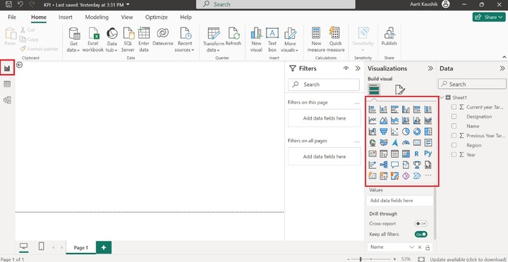
Types of Visuals in BI Desktop
Here are the common types of visuals available in Power BI Desktop −
Stacked Bar Chart
A 2D horizontal stacked rectangle with no overlaps is employed for depicting the data values in a stacked bar chart.
Stacked Column chart
A 2D vertical stacked rectangle with no interruptions will be utilized to show the data values in a stacked column chart.
Clustered bar chart and Clustered Column chart
A cluster bar chart is used to visualize large voluminous of data with extended labels. In the clustered column chart, the different data points are illustrated by various vertical bars depending on the supported fields.
100% Stacked bar chart and 100% Stacked column chart
These charts are employed to combine the data values and the percentages of different data values are illustrated through multiple horizontal bars/multiple vertical bars that exhibit 100% length on each bar.
Line chart
The line chart discloses the patterns that vary over certain periods. For example, tracking the monthly sales production.
Area chart and Stacked area chart
The area chart covers the region that lies between the specified series of data points and the axis. The stacked area chart allows you to the adjoining of many series, each of which has a stacking area that does not exceed that of the preceding series.
Line and stacked column chart
It usually combines the enriched qualities of line charts and stacked charts that are utilized to compare the two series, one may be a categorical value and the other is a numeric series and uncover the hidden patterns between them.
Line and clustered column chart
A combinational chart that provides the correlation between two numeric fields and eliminates the clutter and ambiguity in the generated report.
Ribbon Chart
The multiple categories that are piled on top of each other are represented by the colorful ribbons.
Waterfall chart
The waterfall chart shows increases or decreases in field values throughout time as well as year-by-year variations.
Funnel chart and Radial Gauge Chart
To demonstrate how data is progressively decreased as it advances from one phase to the next, a funnel chart is employed. The final phase signifies the maximum value, whereas the initial phase indicates the minimum amount.
Scatter chart
The correlation between two distinct series is identified by the scatter chart.
Pie chart
It is used to contrast and distinguish different groups that are showcased by the colorful pie. It evaluates the percentage of individual groups to the whole.
Donut chart
It shows the relationship between the subsets of the data and the entire set and is represented by a circular arc.
Treemap
It is another variation of Map visualization where colorful rectangles are utilized to depict the field values in an organized way.
Map
It populates the data points representing the associated location on a Map. Companies have so many branches all over the world. For instance, if you wish to find the highest sales production in a specified geographical area, the location of the employees can be identified through Map Visual.
Filled Map
It is another variant of the Map visual that populates the filled area of the selected field.
Azure Map
The user needs to log in before accessing the Azure Map visual. This visual establishes a connection to the Azure which provides the cloud service. After authenticating login, Azure Map Visual can be employed in BI desktop that fetches the geospatial location, and images of the selected data points.
Card and Card(New)
A card visual populates the atomic value after evaluating the selected field. For example: the Sum of Gross Sales production, and total sales revenue in a specific year, etc.
Multi-row Card
The various field values are populated depending on the selected fields. For example, you wish to see a sales manager's monthly salary and incentive in a single card.
KPI Visual
Key performance indicators are used throughout multinational companies to monitor the employees productivity and measure the profit and loss of the company.
Slicer
The main advantages of slicers are quick accessibility of filtered data, swift retrieval the employee-related information, data filtering, and vibrant reports.
Table and Matrix visual
The colorful table and matrix can be developed, and the outcome of new measures can also be viewed through this visual.
R script and Python visual
You need to install this application software in the system before employing these visuals.
Decomposition Tree
It has a hierarchical structure that has so many branches. The decomposition tree splits down the complicated work structure into multiple levels.
Q&A visual
Sometimes, business users face challenges in analyzing the shared report. With the aid of this visual, you may ask the related questions and AI gives the answers to these questions.
Smart Narrative
You may select the Smart Narrative visual that generates the report summary for the users get to know more about the related field value information.
Paginated Report
These reports are pixel-perfect, and you can print them off without compromising any data.
ArcGIS Maps for Power BI
Users need to log in before employing this visual or choose the region-based field to utilize this visual.
Power Apps for Power BI
It permits users to connect to the Power apps where you can create the apps and share them with other users.
Power Automate for Power BI
The colorful button is created that set off the repeated tasks.