- Power BI - Home
- Power BI - Introduction
- Power BI - Installation Steps
- Power BI - Architecture
- Power BI Desktop
- Power BI - Desktop
- Power BI - Desktop Window
- Power BI Service
- Power BI - Window Supported Browsers
- Power BI - Generating Reports
- Power BI Desktop Service
- Power BI - Desktop vs Service
- Power BI - Supported Data Sources
- Power BI - Comparison Tools
- Power Query Editor
- Power Query Editor - Introduction
- Power Query Editor - Data Discrepancy
- Power Query Editor - Merge Queries (Part 1)
- Power Query Editor - Merge Queries (Part 2)
- Power BI - Develop Star Schema
- Data Modeling Concepts
- Power BI - Data Modeling
- Power BI - Manage Relationships
- Power BI - Cardinality
- Power BI - Dashboard Options
- Power BI Report Visualizations
- Power BI - Visualization Options
- Power BI - Visualization Charts
- Power BI - Stacked Bar Chart
- Power BI - Stacked Column Chart
- Power BI - Clustered Chart
- Power BI - 100% Stacked Chart
- Power BI - Area Chart and Stacked Area Chart
- Power BI - Line and Stacked Column Chart
- Power BI - Line and Clustered Column Chart
- Power BI - Ribbon Chart
- Power BI - Table and Matrix Visuals
- Power BI Map Visualizations
- Power BI - Creating Map Visualizations
- Power BI - ArcGIS Map
- Power BI Miscellaneous
- Power BI - Waterfall Charts
- Funnel Charts and Radial Gauge Chart
- Power BI - Scatter Chart
- Power BI - Pie Chart and Donut Chart
- Power BI - Card and Slicer Visualization
- Power BI - KPI Visual
- Power BI - Smart Narrative Visual
- Power BI - Decomposition Tree
- Power BI - Paginated Report
- Power BI - Python Script & R Script
- Power BI - Multi-row Card
- Power BI - Power Apps & Power Automate
- Power BI - Excel Integration
- Power BI Dashboard
- Power BI - Sharing Dashboards
- Power BI Sales Production Dashboard
- Power BI - HR Analytics Dashboard
- Power BI - Customer Analytics Dashborad
- Power BI - DAX Basics
- Power BI - Administration Role
- Power BI - DAX Functions
- Power BI - DAX Text Functions
- Power BI - DAX Date Functions
- Power BI - DAX Logical Functions
- Power BI - DAX Counting Functions
- Power BI - Depreciation Functions
- Power BI - DAX Information Functions
Power BI - Pie Chart and Donut Chart
What is a Pie Chart?
A pie chart comprises a circle that is filled with different colors to specify the relationship between the whole and the datas slices. It is an alternative option to a Donut chart. For example, you may easily identify the sales production of the various products in the different regions through this visual and make a business decision accordingly. It is easy to construct a very colorful pie chart to understand the business data concisely. Numerous formatting options are available in this visual for better data visualization.
How to Generate a Pie Chart in Power BI?
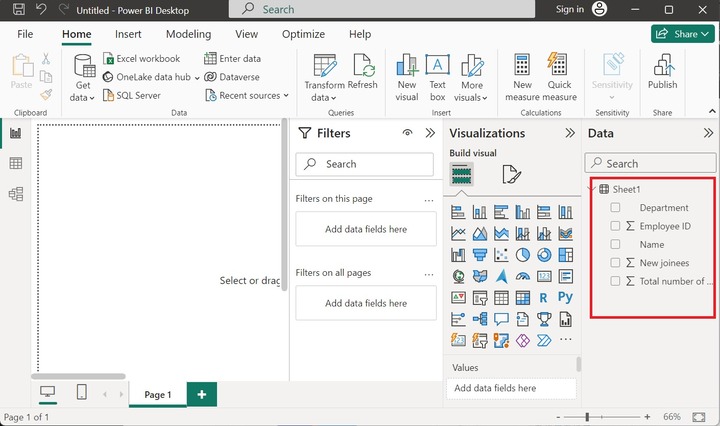
Step 1 − The first step is to load the Excel sheet into Power BI and sample Excel named "Sheet1" consisting of columns "Department", "Employee ID", "Name", "New joiners", and "Total number of employees in a Department".
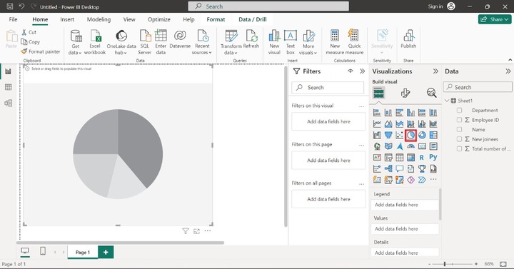
Step 2 − Click on the "Pie chart" from the Visualizations pane and increase its size. The default pie chart does not contain data points.
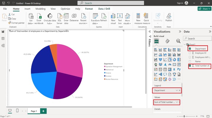
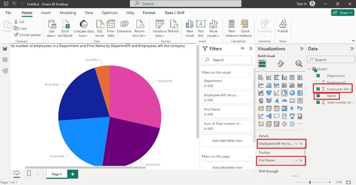
Step 3 − Drag and drop the "Department" column into the "Legend" section. Pick the "Total number of employees in a Department" column and place it in the "Values" section as shown in the below image −
Step 4 − By using the "Details" and "Tooltips" sections, users may see more detailed information when we place the cursor on a specific slice. Drag the "Employee ID" and drop it into the "Details" section. Furthermore, drag and drop the "Name" column into the "Tooltips" section as shown below −
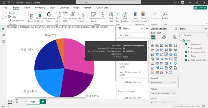
Step 5 − Let's place the cursor on the pink slice, the extensive information like its department, Employees left the company, the sum of the Total number of employees in a department, and first name are showcased for the subpart.
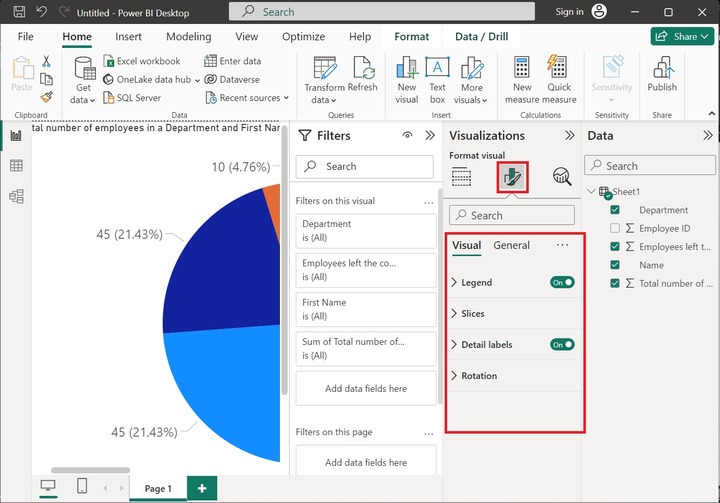
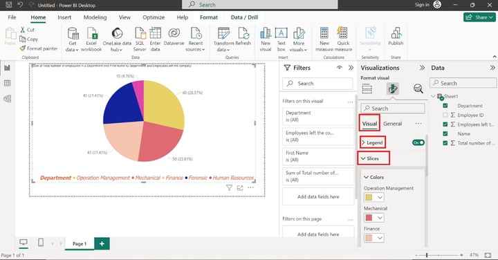
Step 6 − Users may format the PIE chart by choosing the "Format visual" option. "Visual" and "General" are two options available to format this visual. Four options Legend, Slices, Detail labels, and Rotation are built in the "Visual" tab as given below:
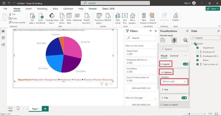
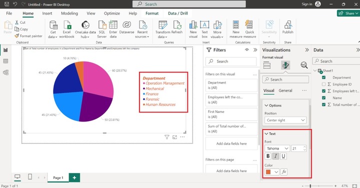
Step 7 − By default, Legend is placed in the center-right position. If you want to alter its placement expand the "Legend" label and then expand the "Options" label and choose the "Center right" position as shown below −
Step 8 − We can also change the font size, and font style of the text by expanding the "Text" label. Here, we have set the Font "Tahoma", Font size to 21, and Font color orange and selected the italic font style like this −
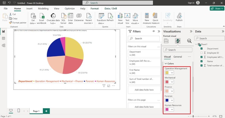
Step 9 − There are plenty of other formatting options to improve the pie chart. For instance, you may change the color of the slices by expanding the "Slices" label and then clicking on the "Colors" label and altering all slices's colors one by one as shown below −
Donut Chart Visual in Power BI
Power BI provides excellent facilities for developing a wide variety of interactive charts like Pie charts, Donut charts, Bar charts, Column charts, and so on. It comprises a circular arc and provides the relationship between the datas subsets and the whole. Unlike the Pie chart, the center part is empty permitting users to add names for data labels.
The users may easily visualize the difference between the whole and the portion of each data. For example: which state produces the most wheat sales overall?
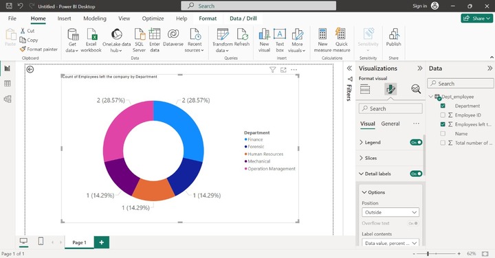
Counting Employees in Distinct Departments with a Donut Chart
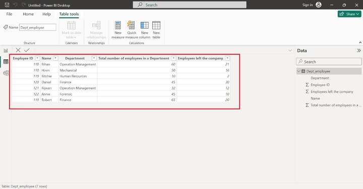
Step 1 − Consider the sample dataset Dept_employee table comprised of five fields as shown below −
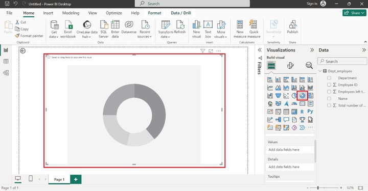
Step 2 − Switch to the "Report View" and select the "Donut" chart as given below −
Step 3 − Drag the "Name" column and drop it into the "Values" section, select the Department column, and put it into the "Details" section. After selecting the column, the colorful Donut chart is displayed. All the distinct departments are depicted in separate sections with vibrant colors.
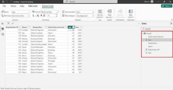
To Count the Number of Active Users
Step 1 − Assume the sample dataset named Sheet2 consists of six columns as shown below.
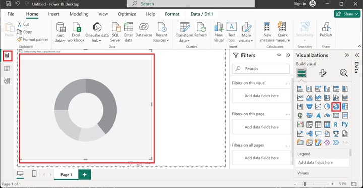
Step 2 − Navigate to the "Report Editor" and click on "Donut chart" icon. The default donut chart is displayed as shown below:
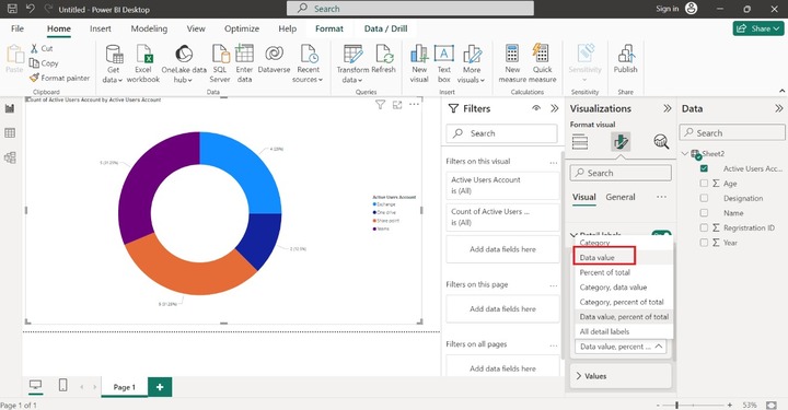
Step 3 − Suppose we intend to count the number of active users in certain applications software like Sharepoint, Teams, Exchange, and One drive. Drag the "Active Users Account" column and drop it into the "Values" section and "Details" section. Data value and percent label are highlighted in the sub part of the Donut chart.

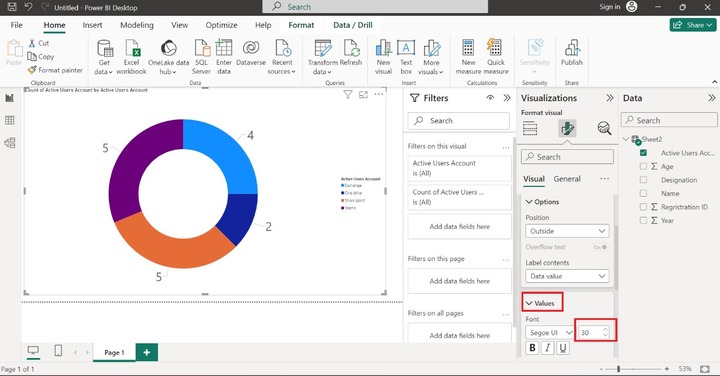
Step 4 − Suppose you wish to hide the percent of the total of every subsection of Donut chart and display only the number of active users. To accomplish this, go to the "Format Your Visual" option in the "Visualizations" pane. Select the drop-down menu of the "Details" section and select the "Data Value" option to count only the number of active users as given below −
Step 5 − Let's increase the size of the Data value. Click on the "Values" tiles and set the font size to 30 for more clarity.