- Power BI - Home
- Power BI - Introduction
- Power BI - Installation Steps
- Power BI - Architecture
- Power BI Desktop
- Power BI - Desktop
- Power BI - Desktop Window
- Power BI Service
- Power BI - Window Supported Browsers
- Power BI - Generating Reports
- Power BI Desktop Service
- Power BI - Desktop vs Service
- Power BI - Supported Data Sources
- Power BI - Comparison Tools
- Power Query Editor
- Power Query Editor - Introduction
- Power Query Editor - Data Discrepancy
- Power Query Editor - Merge Queries (Part 1)
- Power Query Editor - Merge Queries (Part 2)
- Power BI - Develop Star Schema
- Data Modeling Concepts
- Power BI - Data Modeling
- Power BI - Manage Relationships
- Power BI - Cardinality
- Power BI - Dashboard Options
- Power BI Report Visualizations
- Power BI - Visualization Options
- Power BI - Visualization Charts
- Power BI - Stacked Bar Chart
- Power BI - Stacked Column Chart
- Power BI - Clustered Chart
- Power BI - 100% Stacked Chart
- Power BI - Area Chart and Stacked Area Chart
- Power BI - Line and Stacked Column Chart
- Power BI - Line and Clustered Column Chart
- Power BI - Ribbon Chart
- Power BI - Table and Matrix Visuals
- Power BI Map Visualizations
- Power BI - Creating Map Visualizations
- Power BI - ArcGIS Map
- Power BI Miscellaneous
- Power BI - Waterfall Charts
- Funnel Charts and Radial Gauge Chart
- Power BI - Scatter Chart
- Power BI - Pie Chart and Donut Chart
- Power BI - Card and Slicer Visualization
- Power BI - KPI Visual
- Power BI - Smart Narrative Visual
- Power BI - Decomposition Tree
- Power BI - Paginated Report
- Power BI - Python Script & R Script
- Power BI - Multi-row Card
- Power BI - Power Apps & Power Automate
- Power BI - Excel Integration
- Power BI Dashboard
- Power BI - Sharing Dashboards
- Power BI Sales Production Dashboard
- Power BI - HR Analytics Dashboard
- Power BI - Customer Analytics Dashborad
- Power BI - DAX Basics
- Power BI - Administration Role
- Power BI - DAX Functions
- Power BI - DAX Text Functions
- Power BI - DAX Date Functions
- Power BI - DAX Logical Functions
- Power BI - DAX Counting Functions
- Power BI - Depreciation Functions
- Power BI - DAX Information Functions
Power BI - Line and Clustered Column Chart
Line and Clustered column charts are considered as combination charts and made up of two distinct charts Line chart and Clustered column chart.
Case Study
Richard has learned the simple charts visual from the previous chapters. But he is not well versed with the combinational charts. His task is to create a Line and Clustered column chart to uncover the trends and identify the maximum sales production and minimum sales production of the countries.
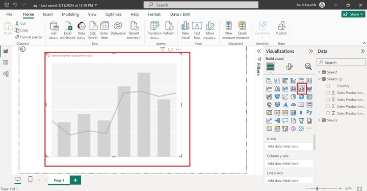
Richard has loaded the Sales worksheet on the BI desktop. He needs to click on the "Line and Clustered column chart" visual from the "Visualizations".
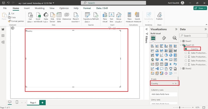
Now he added the "Country" to the X-axis. But, there is no proper visualization as it is incomplete. The specific fields have to be added in the Column y-axis and Line y-axis.
He added the "Sales Production in 1990", and "Sales Production in 1991" fields into the "Column y-axis" and placed the "Sales production in 1992".
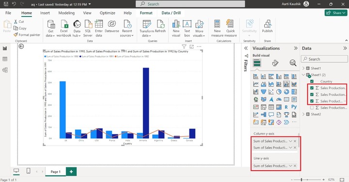
Therefore, the Line and clustered column chart has been generated.
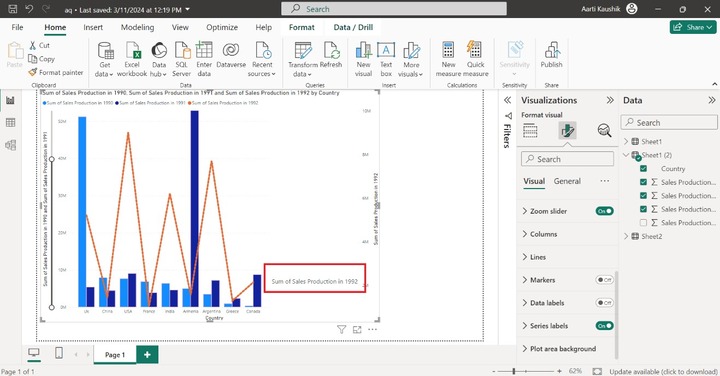
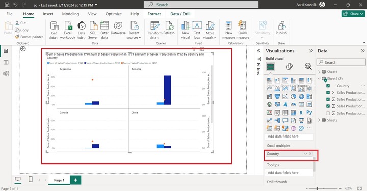
Small multiple section is utilized if he wants to subdivide the designated chart into small charts. He added the "Country" field into the "Small multiples" to see the "Sum of Sales production in 1990, "Sum of sales production in 1991", and "Sum of sales production in 1992" by country through various independent visuals.
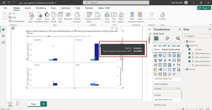
When he hovers the cursor on a specific data point, only the country name and "Sum of Sales production in 1991" are populated. He can use the Tooltips to add more extensive information.
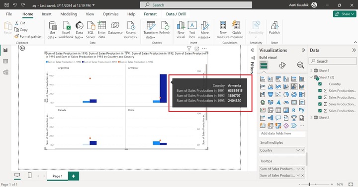
He can place the "Sum of Sales production in 1993", and "Sum of Sales production in 1992" fields into the Tooltips section to populate their values.
How to Format Line and Clustered Column Chart?
Richard can customize the Line and Clustered Column to make it more stunning and colorful. He chose the "Format Visual" which comprises multiple sections are available.
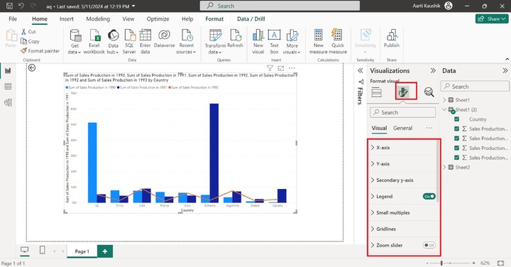
X-axis
He expands the "X-axis" tile that consists of "Values", "Title" and "Layout" options. He altered the Font style to "DIN", set the size to 14, and selected the specified color from the given list under "Color".
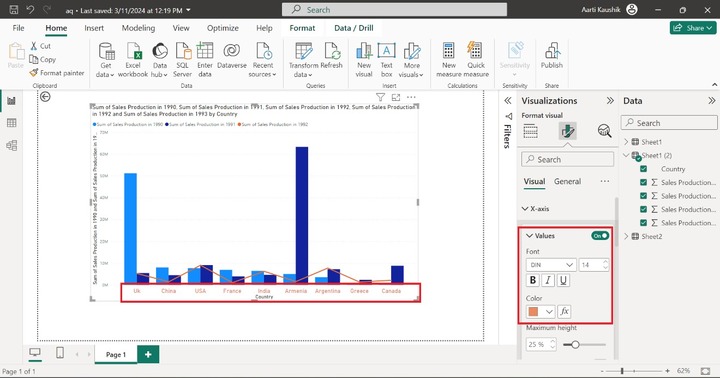
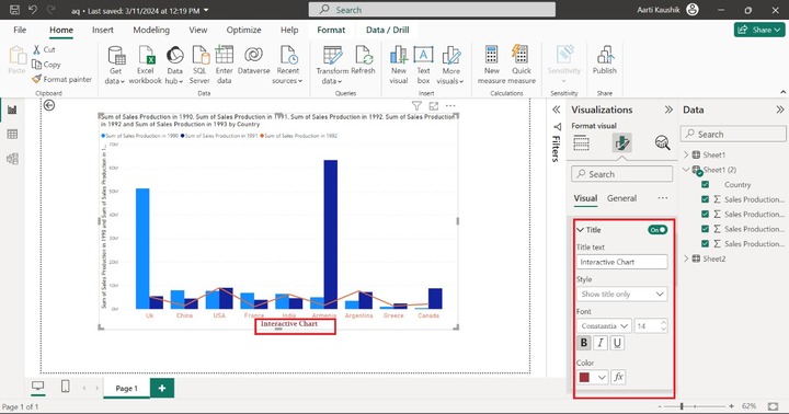
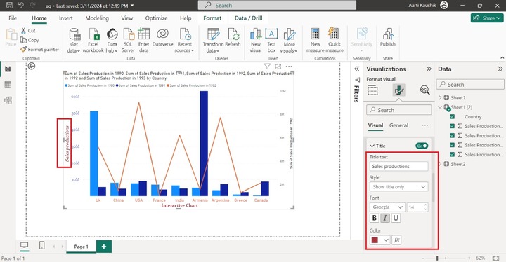
He may also turn on the "Title" button to modify the default formatting of the title text. He entered the "Interactive chart" in the "Title text" textbox. Also, change the font style to "Constantia" and increase its size to 14.
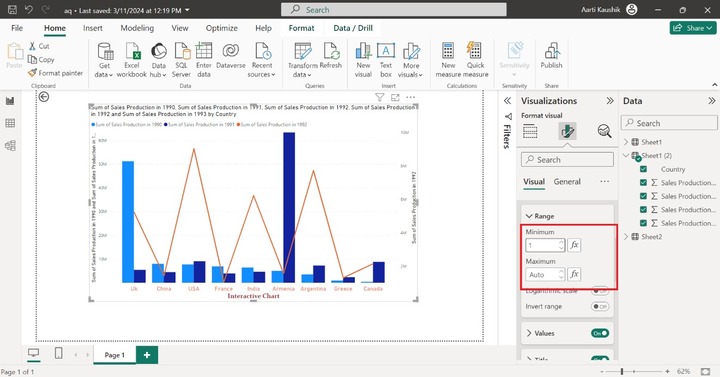
Y-axis
He can click on the Y-axis to modify the vertical axis labelss formatting. He can set the Minimum value to 1 and Maximum values remain the same under the Range section.
Moreover, he expanded the "Values" tile, selected the Font style "Georgia" and chose the "#717bc5" color from the drop-down list under "Color" section.
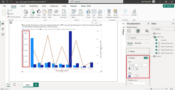
He expanded the "Title" tile and entered the "Sales productions" in the "Title text" textbox. Select the "Georgia" style and increase the font size to 14.
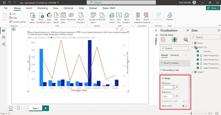
Secondary y-axis
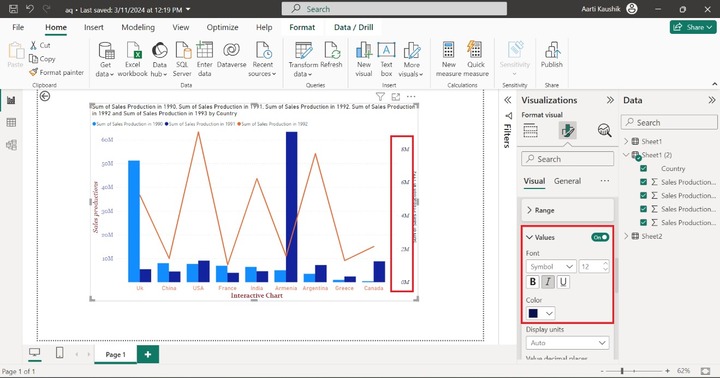
He selected the "Secondary y-axis" that consists of three subparts "Range", "Values" and "Title" options. In the range section, he can set the minimum and maximum values for the secondary y-axis.
After that, he can click on the "Values", modify the font style to "Symbol", and increase the font size to 12. Select the specified color "#09124f" under the "Color" section.
Similarly, the title of the secondary y-axis can be modified as he did for the y-axis.
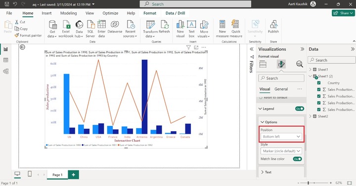
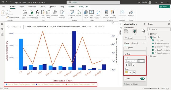
Legend
He can click on the "Legend" tile, expand the "Options" tile, and choose the "Bottom left" from the drop-down list to alter the placement of the Legend.
To alter the Legend Text, he can expand the "Text" to change the font style like "Segoe UI", choose "Italic" and select the "#e8d166" from the given list.
Gridlines
He may also change the color and shape of the Horizontal Gridlines under the "Gridlines" section, and he selected the "Dashed" style and chose the specified color from the given list.
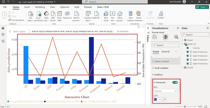
As he may notice in the screenshot, the Dashed horizontal gridlines are populated.
Zoom Slider
He can click on the Zoom Slider to embed the Zoom Sliders for the Line chart and Stacked column chart.

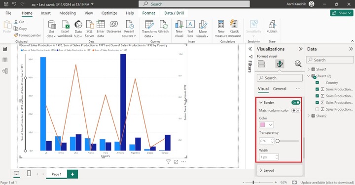
Columns
It consists of the "Color", "Border" and "Layout" options. Richard can set the transparency of the columns bar under the Color section. The column border can be populated after turning on the "Border" and choosing the desired color from the specified color list.
Lines
It comprises "Shape" and "Colors" options. He can expand the "Lines" tile, click on the Shape tile to select the "Dotted" Line style, and choose the "Miter" from the drop-down menu under "Line type" and increase the stroke width to 5 px.

As he can observe in the screenshot, the Line formatting has been changed.
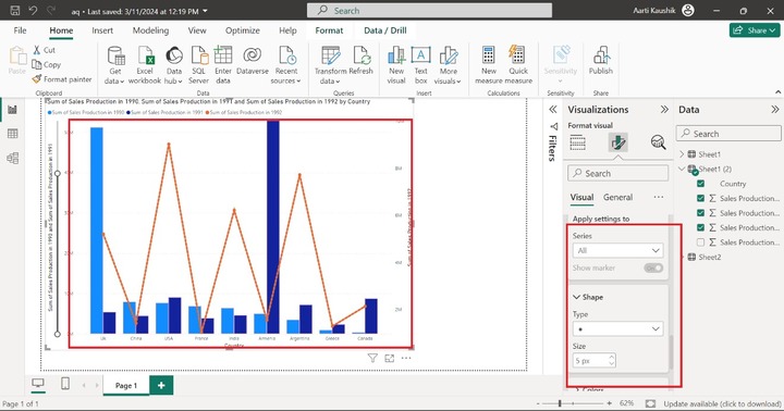
Markers
You may click on the Markers button and modify its type to a circle symbol. Hence, circle markers that specify the data points of the line chart have been embedded.
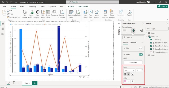
Data Labels
It consists of the Options, Title, Value, Detail, Background, and Layout. He can turn on the Data labels button to populate the data labels on the visual. He can also expand the "Value" tile, change the font style to "DIN", set the size to 10, and change the font color.
Series Labels
To populate the Series labels options, you may turn on the "Series Labels" and also change the text formatting under the Value tile.