- Power BI - Home
- Power BI - Introduction
- Power BI - Installation Steps
- Power BI - Architecture
- Power BI Desktop
- Power BI - Desktop
- Power BI - Desktop Window
- Power BI Service
- Power BI - Window Supported Browsers
- Power BI - Generating Reports
- Power BI Desktop Service
- Power BI - Desktop vs Service
- Power BI - Supported Data Sources
- Power BI - Comparison Tools
- Power Query Editor
- Power Query Editor - Introduction
- Power Query Editor - Data Discrepancy
- Power Query Editor - Merge Queries (Part 1)
- Power Query Editor - Merge Queries (Part 2)
- Power BI - Develop Star Schema
- Data Modeling Concepts
- Power BI - Data Modeling
- Power BI - Manage Relationships
- Power BI - Cardinality
- Power BI - Dashboard Options
- Power BI Report Visualizations
- Power BI - Visualization Options
- Power BI - Visualization Charts
- Power BI - Stacked Bar Chart
- Power BI - Stacked Column Chart
- Power BI - Clustered Chart
- Power BI - 100% Stacked Chart
- Power BI - Area Chart and Stacked Area Chart
- Power BI - Line and Stacked Column Chart
- Power BI - Line and Clustered Column Chart
- Power BI - Ribbon Chart
- Power BI - Table and Matrix Visuals
- Power BI Map Visualizations
- Power BI - Creating Map Visualizations
- Power BI - ArcGIS Map
- Power BI Miscellaneous
- Power BI - Waterfall Charts
- Funnel Charts and Radial Gauge Chart
- Power BI - Scatter Chart
- Power BI - Pie Chart and Donut Chart
- Power BI - Card and Slicer Visualization
- Power BI - KPI Visual
- Power BI - Smart Narrative Visual
- Power BI - Decomposition Tree
- Power BI - Paginated Report
- Power BI - Python Script & R Script
- Power BI - Multi-row Card
- Power BI - Power Apps & Power Automate
- Power BI - Excel Integration
- Power BI Dashboard
- Power BI - Sharing Dashboards
- Power BI Sales Production Dashboard
- Power BI - HR Analytics Dashboard
- Power BI - Customer Analytics Dashborad
- Power BI - DAX Basics
- Power BI - Administration Role
- Power BI - DAX Functions
- Power BI - DAX Text Functions
- Power BI - DAX Date Functions
- Power BI - DAX Logical Functions
- Power BI - DAX Counting Functions
- Power BI - Depreciation Functions
- Power BI - DAX Information Functions
Power BI - Customer Analytics Dashborad
Richard needs to create a Customer Analytics Dashboard that resolve the mystery of the following questions −
- What is the Total number of customers.
- Calculate the Sum of CSAT.
- What is the total number of CS ticket.
- Use a visual to populate the Count of Data Resources portioned by the Resources Popularity.
- How to evaluate the" Number of customers by Purchase data resources frequency(Pur_dr_fr)
- Use a appropriate visual to get extensive details of the data resources.
Note − To change the background of every visual, you may utilize the "Format your visual" and switch to the "General" tab expand the "Effects" tile and select the desired color from the theme colors under the "Background" section.
Multiple Steps to Create Vibrant Dashboard
Richard needs to employ multiple steps to generate this vibrant dashboard.
Step 1 − You may need to import the "D:\customer data.xlsx" in the BI desktop.
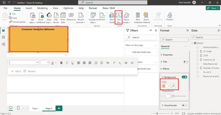
Step 2 − To write the title "Customer Analytics Dashboard," you can select the "Textbox" from the "Insert" group by switching to the "Home" tab. You can choose bold (B) and change the text size to 18. You may navigate to "Format Visual" to modify the background color under the "Effects" section. You may decrease its size.
Step 3 − You can click on any part of the canvas, switch to the "Format visual" where you can select the "Wallpaper" tile and choose the desired color from the drop-down menu under the Color section.
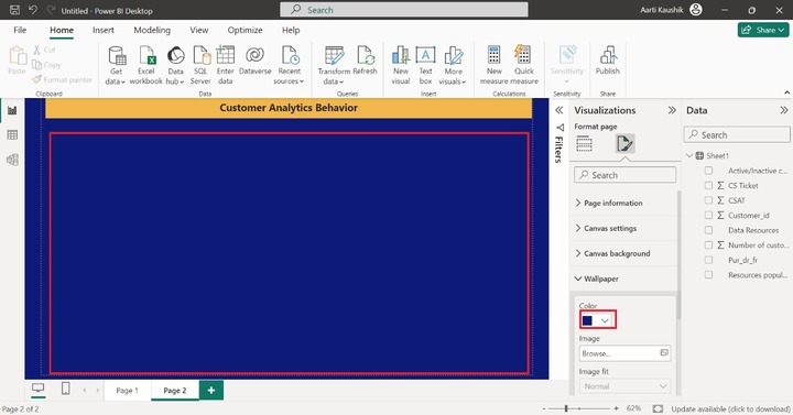
Therefore, the background of the Wallpaper has been altered.
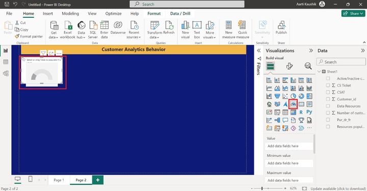
Step 4 − You can select the "Gauge Chart" from the "Visualizations pane". The canvas contains a blank gauge chart with no information.
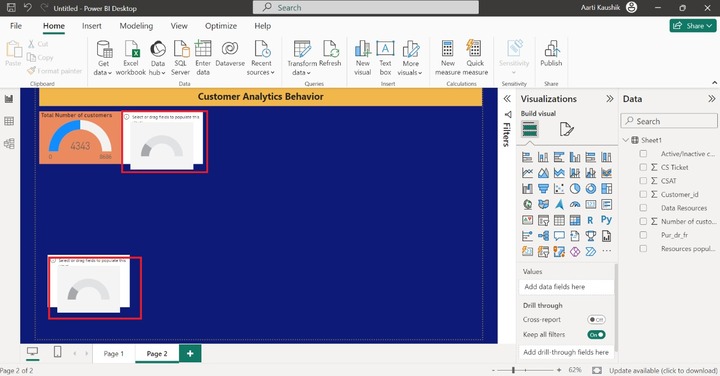
Step 5 − Now, you may place the "Number of the "Customer" into the "Values" and decrease its size and you may also modify the default background color of the "Gauge chart" and modify its title and enter the text "Total number of customers".

Hence, the total number of customers that is 4343 is visualized by the colorful Gauge chart.
Step 6 − Similarly, select two more "Gauge chart" visuals as you did in the previous step.
Step 7 − Now, select the second "Gauge chart" and add the "CSAT" into the Value section. You can also customize the gauge chart by using the "Format visual" option.
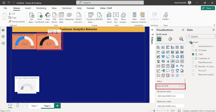
Hence, the sum of CSAT is 8.37.
Step 8 − Let's add a field for the third gauge chart. You can place the "CS ticket" into the "Value". And alter the background of this gauge chart. Here, CS ticket denotes total number of the customer enquires related to the multiple data resources.
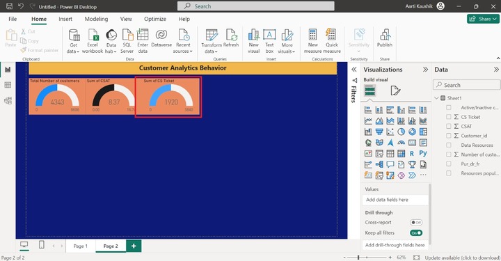
As you can notice in the snapshot, the Sum of CS ticket is 1920.
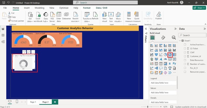
Step 9 − You may select the "Donut chart" from the "Visualizations" pane.
Step 10 − You may place the "Resource popularity" into the "Legend" section and "Data resource" into the "Values" section. Also, alter its background and adjust its position on the Canvas.
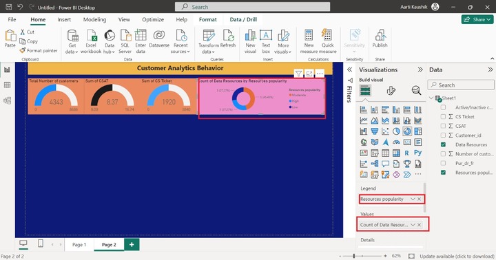
The count of Data Resources by resource popularity is showcased through the Donut chart.
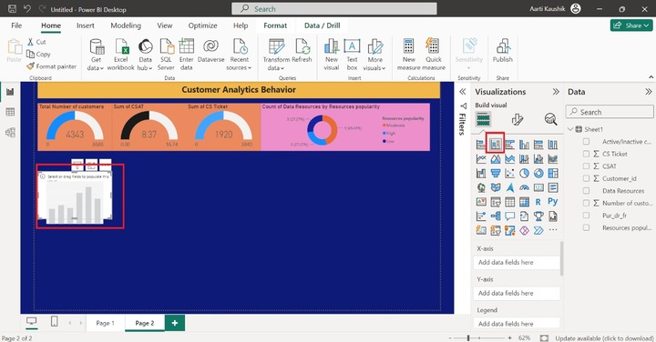
Step 11 − You can select the "Stacked Column chart" from the "Visualizations" pane. The empty chart has been inserted into the canvas.
Step 12 − You may add the "Pur_dr_fr" into the "X-axis" and place the "Number of the customers" into the Y-axis. Also, alter the background and column color from the "Format your visual" option.
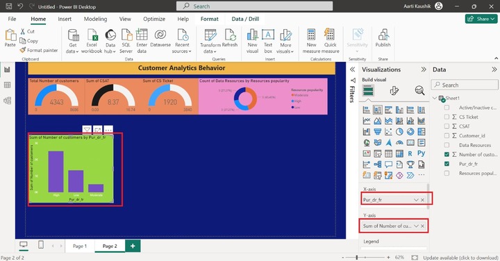
Note: A separate chapter has been created for the "Stacked Column Chart" where you can see step-by-step instructions to format the "Stacked Column Chart".
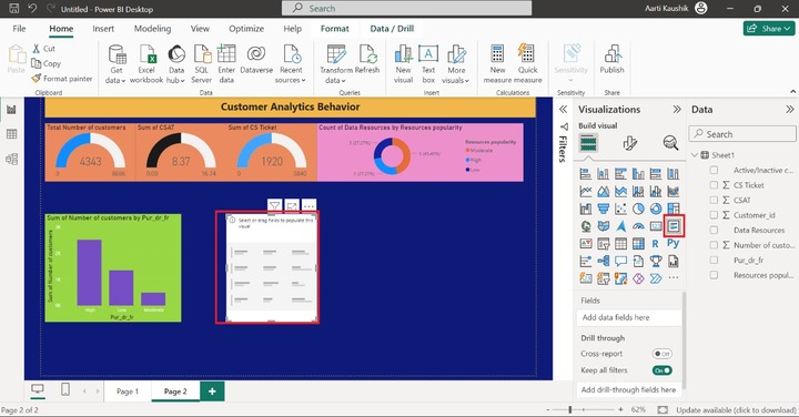
Step 13 − You can select the "Multi-row card" from the "Visualizations" pane. The empty row card is placed on the Report. Let's add the field one by one in the next step.
Step 14 − You may add the "Data resources", "CSAT", "Number of customers" and "CS Ticket" into the "Fields" section. After that, you can customize the Multi-row card for better visibility. You can modify the background color and set the Font color to "white" from the "Format your Visual".
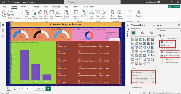
Therefore, the vibrant Multirow card populates the extensive information of the selected field of each data resources.
Step 15 − For example, suppose you clicked on the "Banks-Credit/Debit cards" in the Mutli row card, then its associated details are populated on the Dashboard.
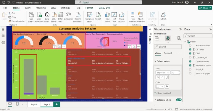
As you can notice in the snapshot, for the Banks-Credit/Debit cards- the sum of CSAT is .75, the Sum of the number of customers is 120, the sum of CS Ticket is 13 and the sum of number of the customers by purchase data resource frequency (Pur_dr_fr) is 120 and high.
It would be concluded that colorful Customer Analytics Dashboard has been generated through multiple visuals. We can swiftly and easily detect customer behaviour, interests, product popularity, the number of customers who tend to be interested in the data sources, customer support, customer ratings, and more with the assistance of the Customer Analytics Dashboard.