- Power BI - Home
- Power BI - Introduction
- Power BI - Installation Steps
- Power BI - Architecture
- Power BI Desktop
- Power BI - Desktop
- Power BI - Desktop Window
- Power BI Service
- Power BI - Window Supported Browsers
- Power BI - Generating Reports
- Power BI Desktop Service
- Power BI - Desktop vs Service
- Power BI - Supported Data Sources
- Power BI - Comparison Tools
- Power Query Editor
- Power Query Editor - Introduction
- Power Query Editor - Data Discrepancy
- Power Query Editor - Merge Queries (Part 1)
- Power Query Editor - Merge Queries (Part 2)
- Power BI - Develop Star Schema
- Data Modeling Concepts
- Power BI - Data Modeling
- Power BI - Manage Relationships
- Power BI - Cardinality
- Power BI - Dashboard Options
- Power BI Report Visualizations
- Power BI - Visualization Options
- Power BI - Visualization Charts
- Power BI - Stacked Bar Chart
- Power BI - Stacked Column Chart
- Power BI - Clustered Chart
- Power BI - 100% Stacked Chart
- Power BI - Area Chart and Stacked Area Chart
- Power BI - Line and Stacked Column Chart
- Power BI - Line and Clustered Column Chart
- Power BI - Ribbon Chart
- Power BI - Table and Matrix Visuals
- Power BI Map Visualizations
- Power BI - Creating Map Visualizations
- Power BI - ArcGIS Map
- Power BI Miscellaneous
- Power BI - Waterfall Charts
- Funnel Charts and Radial Gauge Chart
- Power BI - Scatter Chart
- Power BI - Pie Chart and Donut Chart
- Power BI - Card and Slicer Visualization
- Power BI - KPI Visual
- Power BI - Smart Narrative Visual
- Power BI - Decomposition Tree
- Power BI - Paginated Report
- Power BI - Python Script & R Script
- Power BI - Multi-row Card
- Power BI - Power Apps & Power Automate
- Power BI - Excel Integration
- Power BI Dashboard
- Power BI - Sharing Dashboards
- Power BI Sales Production Dashboard
- Power BI - HR Analytics Dashboard
- Power BI - Customer Analytics Dashborad
- Power BI - DAX Basics
- Power BI - Administration Role
- Power BI - DAX Functions
- Power BI - DAX Text Functions
- Power BI - DAX Date Functions
- Power BI - DAX Logical Functions
- Power BI - DAX Counting Functions
- Power BI - Depreciation Functions
- Power BI - DAX Information Functions
Power BI - ArcGIS Map
With the help of ArcGIS Map, we may gain a deep insight into your data through the vibrant map, disclose patterns and trends, and populate the interactive infographic thoroughly. Users have two options to generate the ArcGIS map: either by signing into the ArcGIS website and adding the location-based field or by adding longitude and latitude fields. For instance, to identify the population of a specific region, determine the net sales products profit for the country, and populate it on the map.
We may customize the ArcGIS map to enrich the designated data with more styling capabilities, like changing its background and font size, showcasing the specific address location, and so on.
How to Generate ArcGIS Map in Power BI?
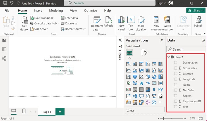
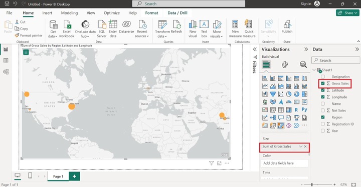
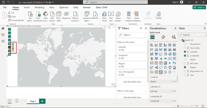
Assume the sample dataset "Sheet1" comprises nine columns Designation, Gross Sales, Latitude, Longitude, Name, Net Sales, Region, Registration ID, and Year.
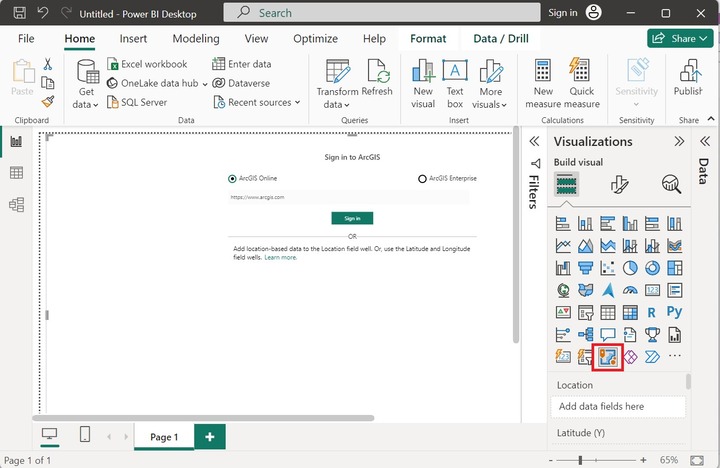
You have to either sign in to ArcGIS Online where you should have a valid account or drag the location-based field value to the Location field. Latitude and longitude columns can also be dragged in their respective fields.
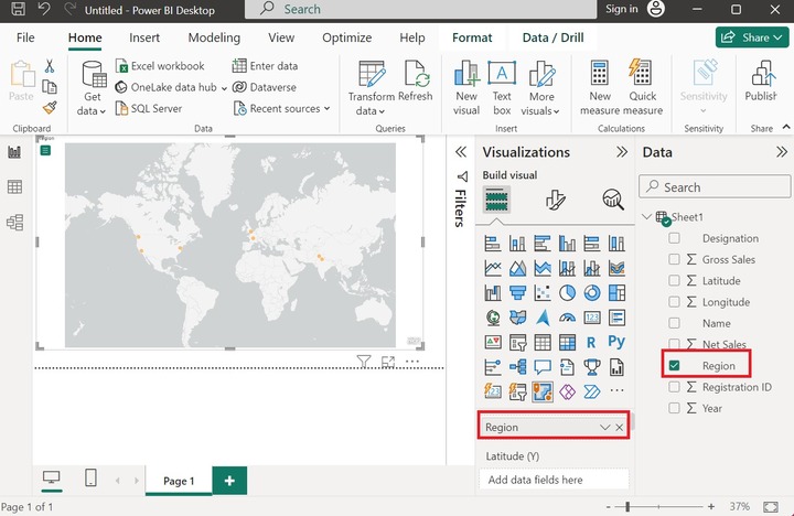
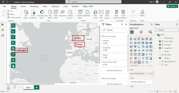
Drag and drop the Region column into the Location. The scattered bubbles are illustrated below image representing the distinctive countries on the map.
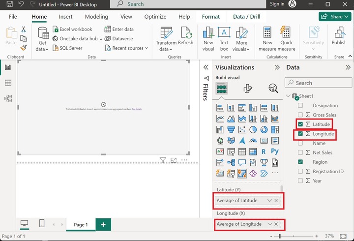
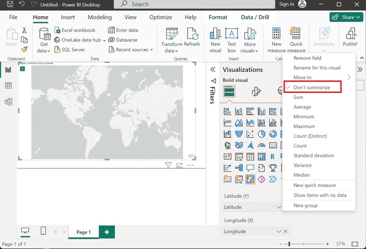
Similarly, drag and drop the Latitude and Longitude columns into the Latitude and Longitude sections and choose the "Don't summarize" option as the latitude and longitude bucket would not support aggregated numbers or other measures.
Drag the "Gross Sales" column and drop it into the "Size" section. The largest bubble shows the highest Gross Sales of a specific country whereas the smallest bubble indicates the lowest gross sales.
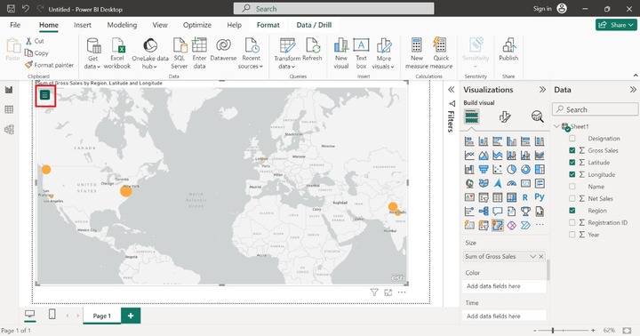
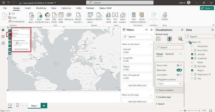
On the top left corner, click on the "Expand Map tools" where you may find multiple formatting options like choosing the location in your map, searching the specific address points, Layers, and many more.
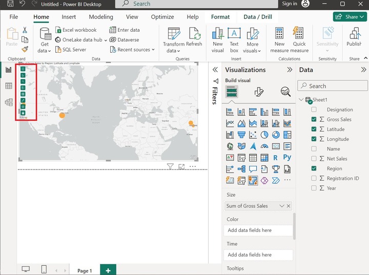
Select Location in Your Layer
The second icon is utilized to showcase the specified location. Once you click on this icon, it shows the active layer where you can choose any of the features to highlight the specified location on the map.
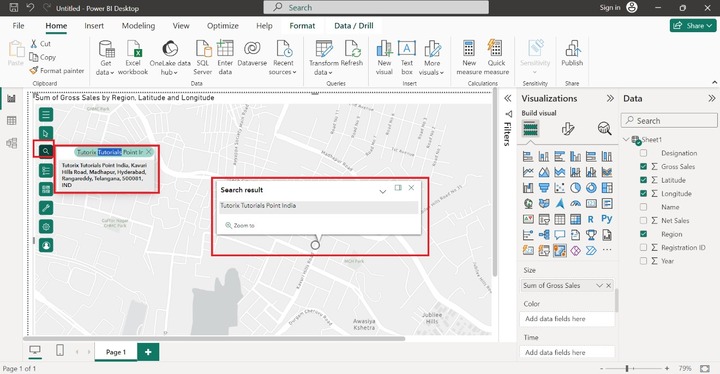
Search for an Address
Suppose users want to search address point, city, or country on the Map, use the third option "Search" and type the complete address. The designated address would be pointed on the Arcgis Map as shown below −
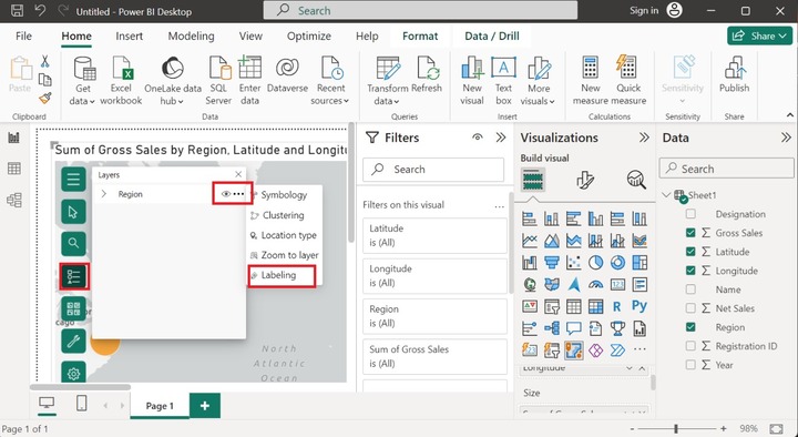
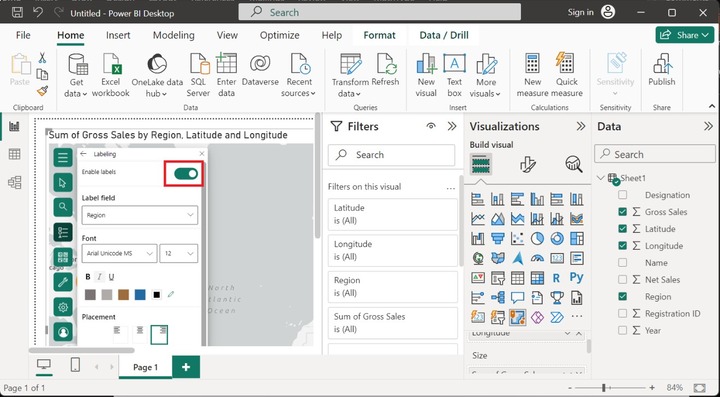
Now, you can move to the next option, the user needs to click on the three dots ...."View a layer of list on Map" and click on the "Labeling" option as highlighted below image:
Choose the Background
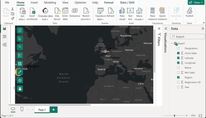
You may also change the background of the visual context, click on the base map option, and choose any of the desired options like "Dark Gray Canvas" as given below:
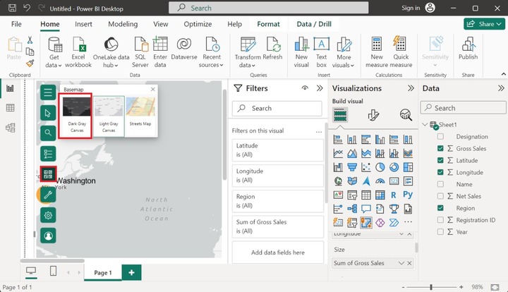
Hence, the background of the map has been changed.
Adding Context
You may add the content to your data value to understand its meaning and uncover the patterns. Four options "Infographics", "Reference layer", "Buffer/Drive time", and "Find Similar" are available.
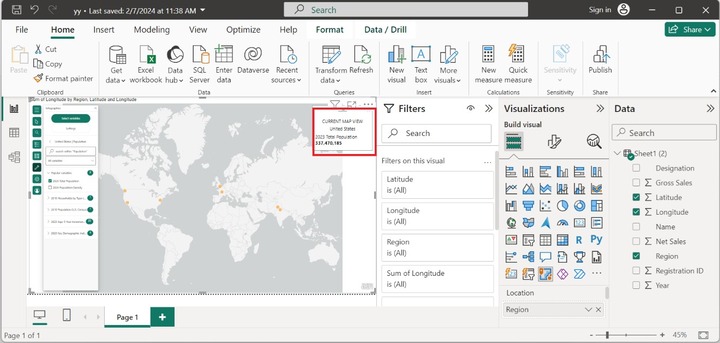
Click on the "Infographics" icon and select the desired variables. For instance, select the "2023 Total Variable". After that, the "2023 US population" is populated on the canvas.
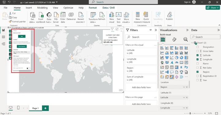
Settings
You can select "Setting" to alter the EUEI program and view attribution, get some help, and submit your response after joining the ESRI community. The screenshot shows the multiple options in the Settings icon.
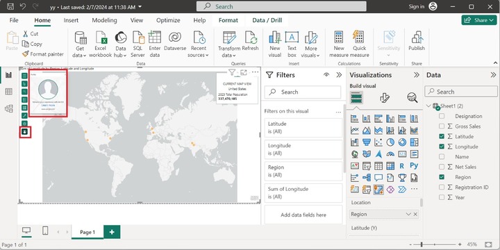
User Account
Select the "View signed in user profile" and click on the "Learn More" option.
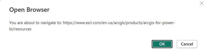
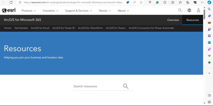
The Open Browser window will display that navigates users to the ESRI website and click on OK.
The ESRI website will open where you can learn more about Arcgis for other software like Excel, Teams, SharePoint, and ArcGIS connectors for Power Automate.
It would be concluded that the precise ArcGIS map may be generated by choosing the appropriate location-based columns representing the spatial distribution of data and uncovering the hidden patterns on the report, and dashboards also.