- Power BI - Home
- Power BI - Introduction
- Power BI - Installation Steps
- Power BI - Architecture
- Power BI Desktop
- Power BI - Desktop
- Power BI - Desktop Window
- Power BI Service
- Power BI - Window Supported Browsers
- Power BI - Generating Reports
- Power BI Desktop Service
- Power BI - Desktop vs Service
- Power BI - Supported Data Sources
- Power BI - Comparison Tools
- Power Query Editor
- Power Query Editor - Introduction
- Power Query Editor - Data Discrepancy
- Power Query Editor - Merge Queries (Part 1)
- Power Query Editor - Merge Queries (Part 2)
- Power BI - Develop Star Schema
- Data Modeling Concepts
- Power BI - Data Modeling
- Power BI - Manage Relationships
- Power BI - Cardinality
- Power BI - Dashboard Options
- Power BI Report Visualizations
- Power BI - Visualization Options
- Power BI - Visualization Charts
- Power BI - Stacked Bar Chart
- Power BI - Stacked Column Chart
- Power BI - Clustered Chart
- Power BI - 100% Stacked Chart
- Power BI - Area Chart and Stacked Area Chart
- Power BI - Line and Stacked Column Chart
- Power BI - Line and Clustered Column Chart
- Power BI - Ribbon Chart
- Power BI - Table and Matrix Visuals
- Power BI Map Visualizations
- Power BI - Creating Map Visualizations
- Power BI - ArcGIS Map
- Power BI Miscellaneous
- Power BI - Waterfall Charts
- Funnel Charts and Radial Gauge Chart
- Power BI - Scatter Chart
- Power BI - Pie Chart and Donut Chart
- Power BI - Card and Slicer Visualization
- Power BI - KPI Visual
- Power BI - Smart Narrative Visual
- Power BI - Decomposition Tree
- Power BI - Paginated Report
- Power BI - Python Script & R Script
- Power BI - Multi-row Card
- Power BI - Power Apps & Power Automate
- Power BI - Excel Integration
- Power BI Dashboard
- Power BI - Sharing Dashboards
- Power BI Sales Production Dashboard
- Power BI - HR Analytics Dashboard
- Power BI - Customer Analytics Dashborad
- Power BI - DAX Basics
- Power BI - Administration Role
- Power BI - DAX Functions
- Power BI - DAX Text Functions
- Power BI - DAX Date Functions
- Power BI - DAX Logical Functions
- Power BI - DAX Counting Functions
- Power BI - Depreciation Functions
- Power BI - DAX Information Functions
Power BI - Line and Stacked Column Chart
Line and Stacked Column Chart
It is a special type of combination chart which is constructed from two charts Stacked column chart and a Line chart. It is useful in certain scenarios like determining the company's net sales revenue periodically and analyzing the website traffic, etc. The main section of Line and stacked column charts is the X-axis, Column y-axis, and Line y-axis.
How to Build Line and Stacked Column Chart in BI Desktop?
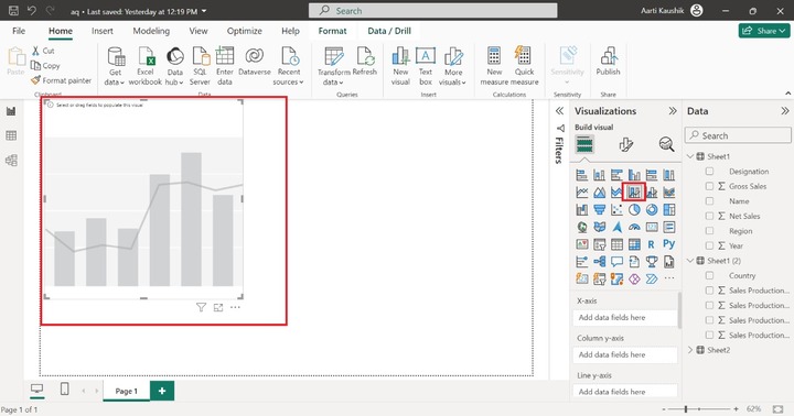
Step 1 − The dataset needs to be imported first into the BI desktop. You may select the "Line and Stacked Column Chart" from the "Visualization".
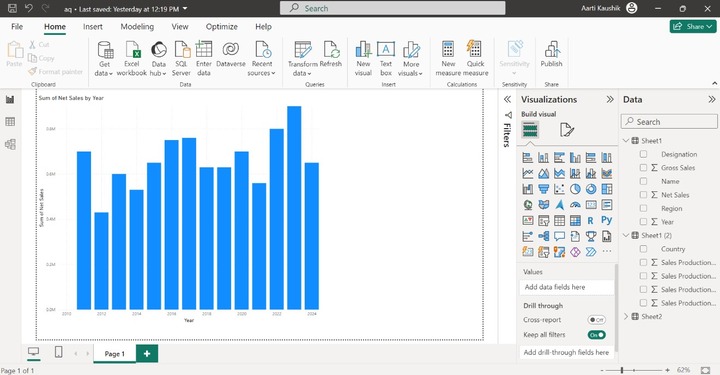
Step 2 − Now you can add the "Year" field into the X-axis and place the "Net Sales" field into the "Column y-axis".
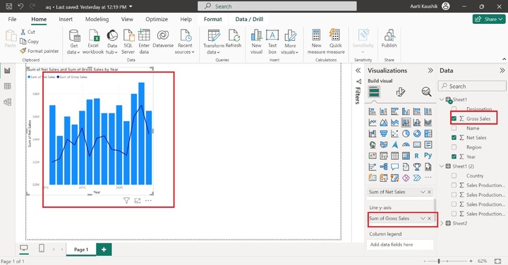
Step 3 − Furthermore, you can place the "Gross Sales" into the "Line y-axis".
Step 4 − You may place a specific field like "Name" into the "Column legend" to make the chart colorful.
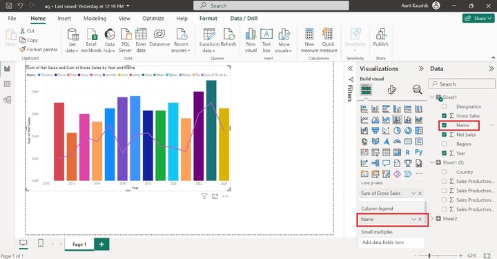
Step 5 − What in case you wish to partition the chart into independent numerous charts based on the specified field. You can add the "Region" into the "Small multiples".
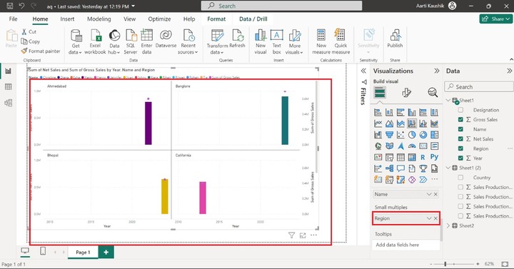
As you may notice in the screenshot, small distinct charts have been developed which are separated by different regions.
Step 5 − When you place the cursor on a specific column bar, only three field values of corresponding information are populated. You may use the Tooltips section to get to know about remaining field value-related information.
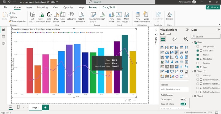
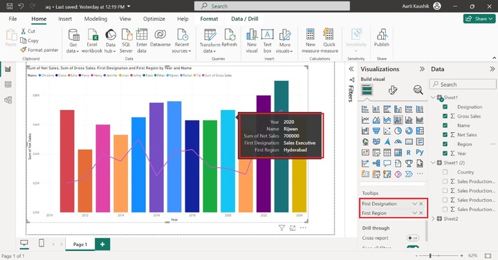
For example − You may place the "Designation", and "Region" fields into the "Tooltips". Once you hover again over the specific column bar, the "Region" and "Designation" field-related corresponding values are appended in the textbox.
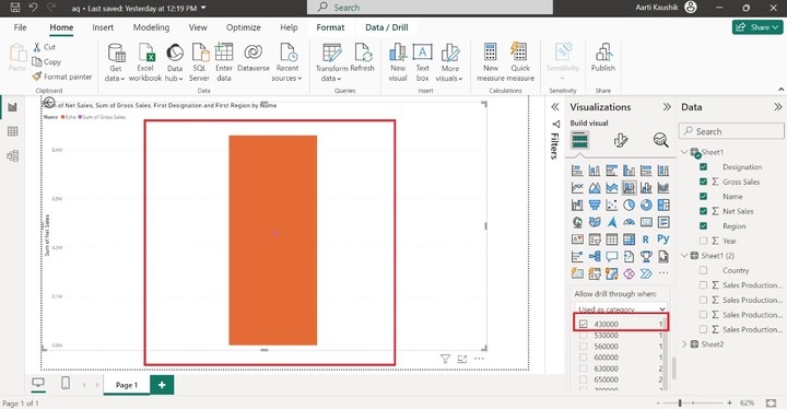
Now, add the "Net Sales" to the "Drill through" which allows you to filter the generated report. Select the "Used as Category" option and select the specific data value like 430000.
Customize the Line and Stacked Column Chart
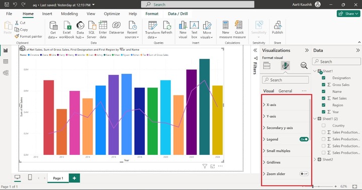
You may format the generated Line and stacked column chart to make the visual more appealing. Click on the "Format Visual" where so many sections are available to enhance the visibility of the designation chart.
X-axis
You may click on the "X-axis" that comprises "Values", "Range" and "Title" options. Now, select the "Categorical" under "Type". Modify the Font style to "Georgia" and set the size to 13 click on the "Italics" and select the specified color from the drop-down menu under the "Color".
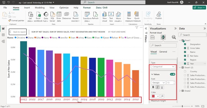
As you can notice in the screenshot, the X-axis data label formatting has been modified and years are shown in categorical form which means the highest net sales bar comes first and moves towards the lowest net sales bars.
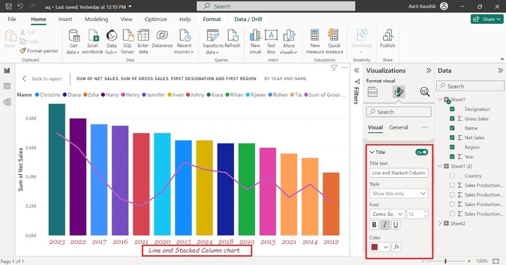
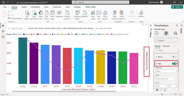
You can also turn on the "Title" button to alter the title text and modify its formatting. Write the "Line and Stacked Column chart" text under the "Title" section. Also, modify its font style to "Comic Sans MS" and increase its size to 12.
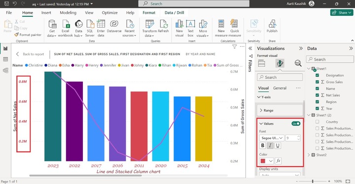
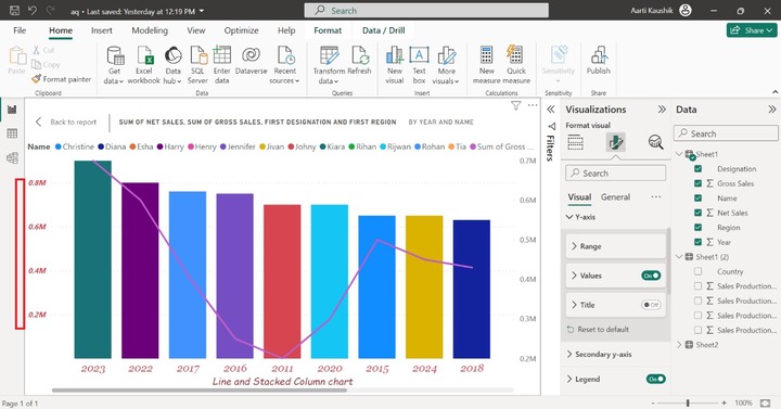
Y-axis
You may select the Y-axis where you can data labels of the vertical axis. You can increase the Minimum value to 1 and Maximum values remain the same under the Range section.
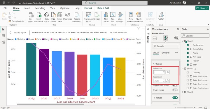
Now, you may click on "Values" and set the Font style to "Segoe UI Bold" and alter its desired color like Red.
You can either turn off the Title button not to display the title on the Y-axis or alter its default text, or other formatting under the Title section.
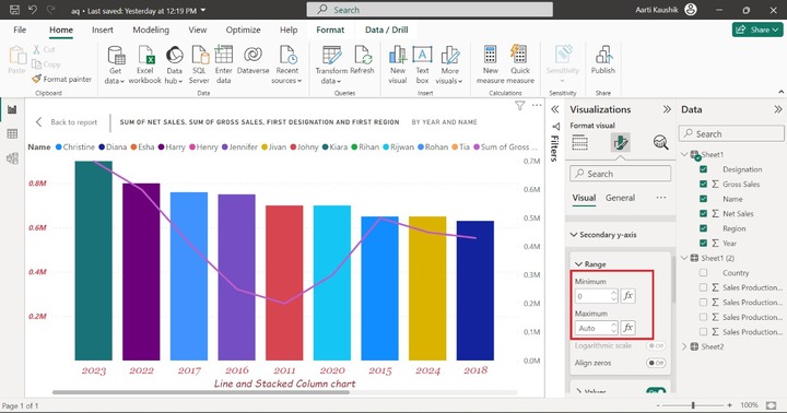
Secondary y-axis
It comprises "Range", "Values" and "Title" options. In the range, you can set the smaller and larger values of this axis.
Moreover, you can expand the "Values" and select the "Symbol" font style, and increase the font size that is 12 also. Choose the specified color to alter its default of the secondary y-axis.
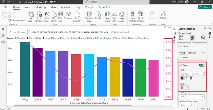
You can also turn off the "Values" button to hide its data label. Similarly, you can turn on the title button to customize its settings.
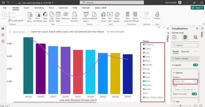
Legend
You can expand the "Legend" tile, click on "Options" and select the "Center right" position from the list.
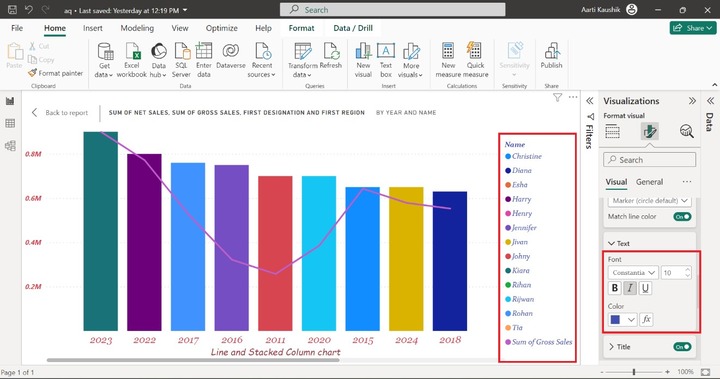
You may select the Text where you can change the font style like "Constantia" and choose "Italic" and select the desired color from the given list of colors.
Gridlines
You can expand the Gridlines tile and also turn on the "Horizontal" button, select the Solid style, choose the desired color, and increase its 2px width.
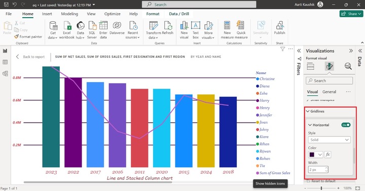
As you can observe in the screenshot, the solid horizontal is displayed.
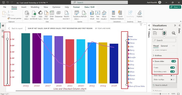
Zoom Slider
You may expand the Zoom Slider where you can turn on the Y-axis and secondary Y-axis buttons to insert the two Zoom Sliders for the Line chart and Stacked column chart. You can zoom in and zoom out through these sliders.
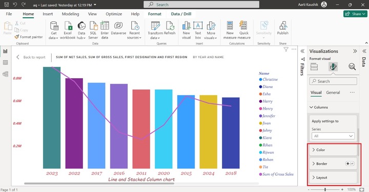
Columns
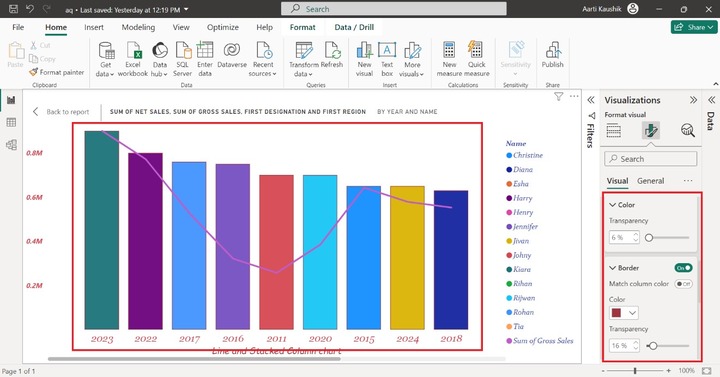
It comprises the "Color", "Border" and "Layout" options. You may increase the transparency of the columns bar under the Color section. Also, turn on the "Border" button and choose the desired color from the specified color list.
Here, you can view in the screenshot, column transparency has been increased to 6% and the columns bar border has been changed.
Lines
It consists of two options "Shape" and "Colors". You can click on the Lines, expand the Shape tile, change the Line style to "Dashed" and select "Smooth" from the drop-down menu under Line type.
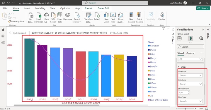
As you can notice in the screenshot, the Line style and Line type have been changed.
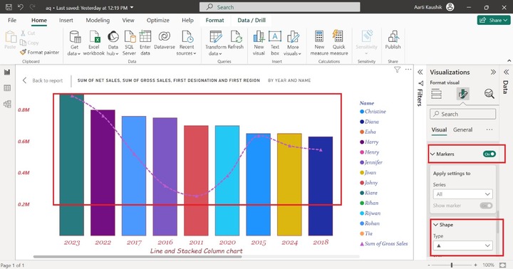
Markers
Turn on the Markers button and change its shape to a triangle symbol. Therefore, triangle markers have been added to the Line.
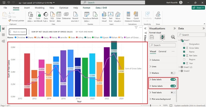
Data Labels and Series Labels
You may turn on the Data labels and Series labels toggle buttons to populate the labels on the chart.
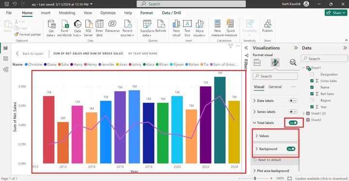
Total Labels
It consists of Values and a background where you can change the default formatting of the total labels. Turn on the Total labels to display the total labels options on the visual.