- Power BI - Home
- Power BI - Introduction
- Power BI - Installation Steps
- Power BI - Architecture
- Power BI Desktop
- Power BI - Desktop
- Power BI - Desktop Window
- Power BI Service
- Power BI - Window Supported Browsers
- Power BI - Generating Reports
- Power BI Desktop Service
- Power BI - Desktop vs Service
- Power BI - Supported Data Sources
- Power BI - Comparison Tools
- Power Query Editor
- Power Query Editor - Introduction
- Power Query Editor - Data Discrepancy
- Power Query Editor - Merge Queries (Part 1)
- Power Query Editor - Merge Queries (Part 2)
- Power BI - Develop Star Schema
- Data Modeling Concepts
- Power BI - Data Modeling
- Power BI - Manage Relationships
- Power BI - Cardinality
- Power BI - Dashboard Options
- Power BI Report Visualizations
- Power BI - Visualization Options
- Power BI - Visualization Charts
- Power BI - Stacked Bar Chart
- Power BI - Stacked Column Chart
- Power BI - Clustered Chart
- Power BI - 100% Stacked Chart
- Power BI - Area Chart and Stacked Area Chart
- Power BI - Line and Stacked Column Chart
- Power BI - Line and Clustered Column Chart
- Power BI - Ribbon Chart
- Power BI - Table and Matrix Visuals
- Power BI Map Visualizations
- Power BI - Creating Map Visualizations
- Power BI - ArcGIS Map
- Power BI Miscellaneous
- Power BI - Waterfall Charts
- Funnel Charts and Radial Gauge Chart
- Power BI - Scatter Chart
- Power BI - Pie Chart and Donut Chart
- Power BI - Card and Slicer Visualization
- Power BI - KPI Visual
- Power BI - Smart Narrative Visual
- Power BI - Decomposition Tree
- Power BI - Paginated Report
- Power BI - Python Script & R Script
- Power BI - Multi-row Card
- Power BI - Power Apps & Power Automate
- Power BI - Excel Integration
- Power BI Dashboard
- Power BI - Sharing Dashboards
- Power BI Sales Production Dashboard
- Power BI - HR Analytics Dashboard
- Power BI - Customer Analytics Dashborad
- Power BI - DAX Basics
- Power BI - Administration Role
- Power BI - DAX Functions
- Power BI - DAX Text Functions
- Power BI - DAX Date Functions
- Power BI - DAX Logical Functions
- Power BI - DAX Counting Functions
- Power BI - Depreciation Functions
- Power BI - DAX Information Functions
Power BI - Area Chart and Stacked Area Chart
The area chart develops the region that lies between the specified series of data points and the axis. It is typically utilized for field value comparisons that vary over specific periods. In the area chart, the X-axis denotes the categorical values whereas the Y and Secondary axis represents the numeric values.
How to Create an Area Chart in BI Desktop?
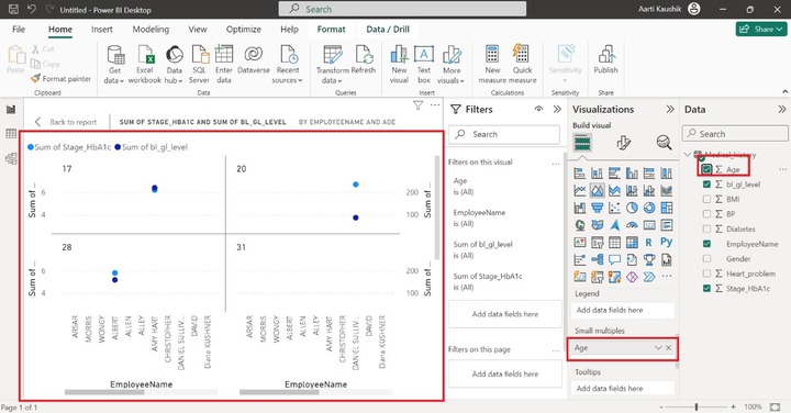
Scenario − Richard wishes to determine type 2 diabetes among employees which is done by visualizing the level of the HbA1c test over employees through an area chart.
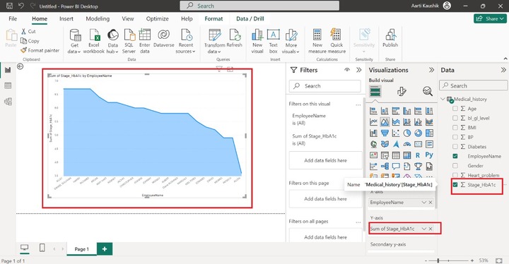
Step 1 − Richard imported the Medical_History.xlsx file and clicked on the "Area Chart" visual. The default chart is displayed on the canvas.
Step 2 − He placed the "EmployeeName" into the X-axis and the "Sum of Stage_HbA1c" into the Y-axis.
Step 3 − Now, add the "Sum of bl_gl_level" into the Secondary y-axis.
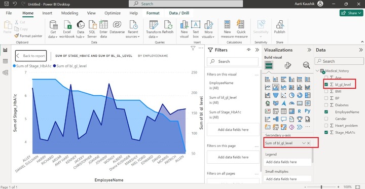
Step 4 − He may partition the generated "Area Chart" into smaller visuals to categorize employees based on their age. He places the "Age" column into "Small multiples". Therefore, all multiple visuals of the Area chart have been created and the light blue bubble indicates the "Sum of Stage_hbA1c" and the navy-blue bubble indicates the "Sum of bl_gl_level".
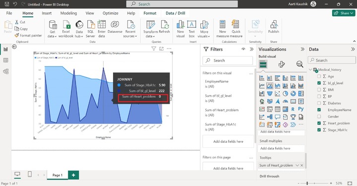
Step 5 − Richard can also add an extra field into the "Tooltips" section and when he places the cursor on the data point then he can observe the detailed information about that field. You can place the "Heart_problem" field into the "Tooltips" section. When he hovers any part of the chart, the additional field information of "Sum of Heart_problem" is appended in the message box.
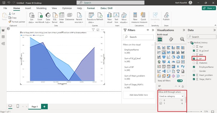
Step 6 − He may also filter the generated chart by using the "Drill Through" option.
How Many Employees have BP Problems?
To identify this, drag and drop the "BP" field into the "Drill through" section. Select the "Used as category" and tick on the checkbox corresponding to 1.
Stacked Area Chart
Multiple series can be adjoined through this chart and their area is stacked but does not surpass the previous series.
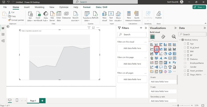
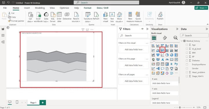
Step 1 − You may use the same dataset as loaded in the previous case study. Select the "Stacked Area Chart" visual presented in the Visualization pane. The default chart having no field values is created on the canvas.
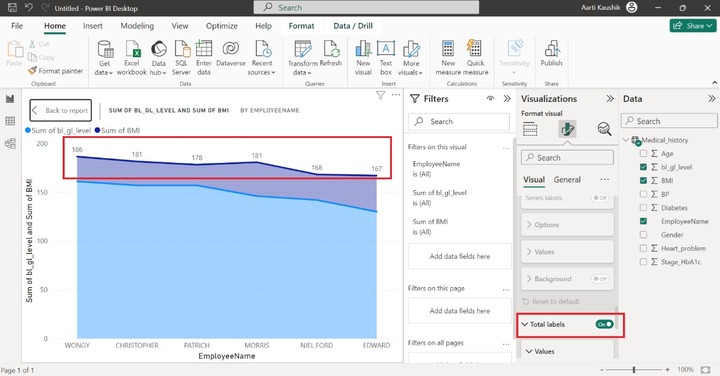
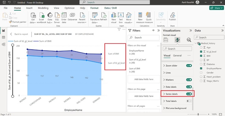
Step 2 − Place the EmployeesName field into the X-axis section and place the "bl_gl_level" and BMI fields into the Y-axis section.
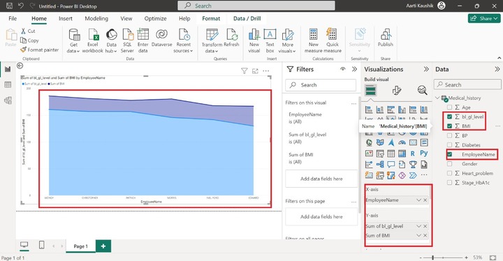
As you may notice in the screenshot, the Stacked Area chart shows the Sum of bl_gl_level and the Sum of BMI by EmployeeName.
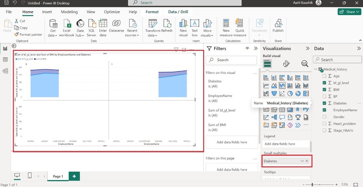
Step 3 − You may use the "Legend" section to show the categorical field value in the different colors. Note, that you cannot add the field in the Legend section if multiple fields are added into the Y-axis section. Small multiple part is used to subdivide the stacked area chart into various small charts.
You may add the "Diabetes" field to the "Small multiples".
Similarly, you may practice for another section like "Tooltips", or "Drill through" as discussed in the first example.
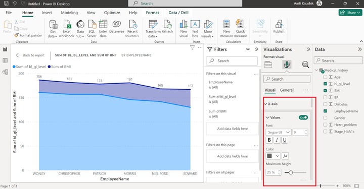
Customizing the Stacked Area Chart
In the Visualization pane, click on "Format your visual". You may alter the font style and size, and font color of the X-axis and Y-axis. You can also Turn off the titles of these axes. As shown in the screenshot, you may expand the X tiles and then further click on the Values modify the Font style and set its size.
Other options like alignment of Legends, Turning off the Legends, and their style, etc.
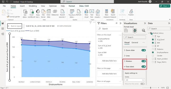
Now, turn on the "Markers" that denote the small bubble on the two data series, and also turn on the "Data labels" that populate the data points values on the Stacked Area Chart.
Turn on the "Total Labels" option to showcase the field labels on the chart.
Turn on the "Series labels" option that is used to exhibit the series name as shown in the screenshot.
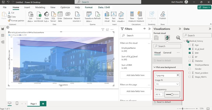
Lets change the background of the chart. Expand the "Plot area background" and choose the image from the system. Select the "Fit" option in the "Image fit" and then set the "Transparency" to 48%.
You can click on the General tab where these options are available depicted in the screenshot.
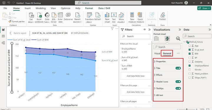
Properties − Expand the Properties tile which further contains four sub-sections "Size", "Position", "Padding", and "Advanced options".
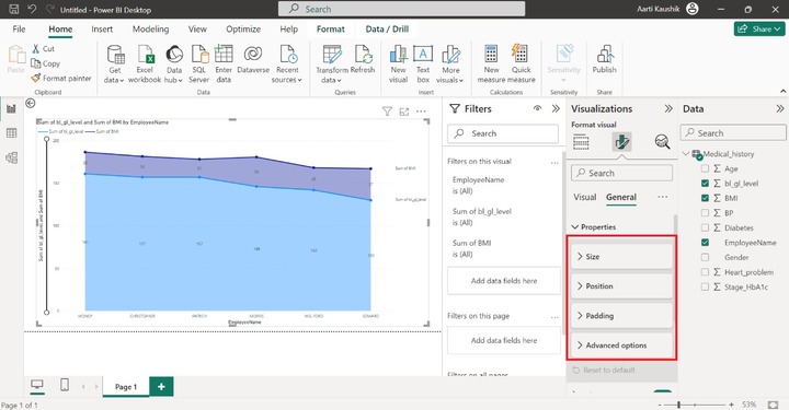
You can expand the "Size" tile to modify the height and width of the generated visual. Also, alter the position of the designated chart either horizontally or vertically by utilizing the Position section.

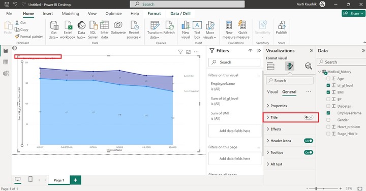
You may also hide the Title of the Area Stacked chart by turning off the "Title". As you can see in the screenshot, there is no title of the visual.
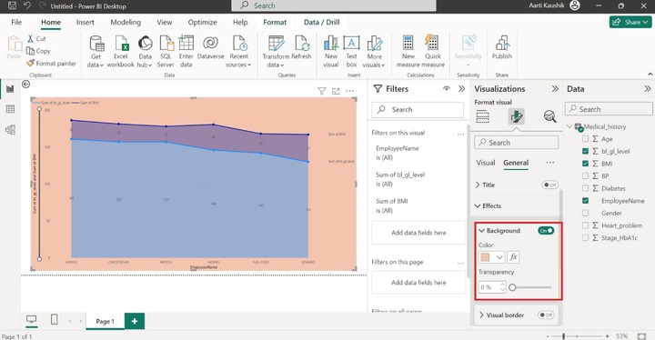
Click on the "Expand" tile, expand the background tile, and select the desired color to alter the background color of the Stacked Area Chart.
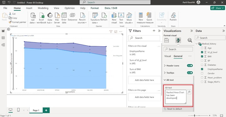
You may turn off the header icon and Tooltips buttons.
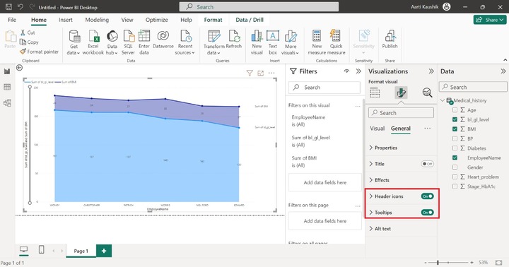
The last option "Alt text" is applicable if the narrator is downloaded and active on the local system. You may type the sentence related to this chart and that Alt text statement would be dictated by the active narrator.