- Power BI - Home
- Power BI - Introduction
- Power BI - Installation Steps
- Power BI - Architecture
- Power BI Desktop
- Power BI - Desktop
- Power BI - Desktop Window
- Power BI Service
- Power BI - Window Supported Browsers
- Power BI - Generating Reports
- Power BI Desktop Service
- Power BI - Desktop vs Service
- Power BI - Supported Data Sources
- Power BI - Comparison Tools
- Power Query Editor
- Power Query Editor - Introduction
- Power Query Editor - Data Discrepancy
- Power Query Editor - Merge Queries (Part 1)
- Power Query Editor - Merge Queries (Part 2)
- Power BI - Develop Star Schema
- Data Modeling Concepts
- Power BI - Data Modeling
- Power BI - Manage Relationships
- Power BI - Cardinality
- Power BI - Dashboard Options
- Power BI Report Visualizations
- Power BI - Visualization Options
- Power BI - Visualization Charts
- Power BI - Stacked Bar Chart
- Power BI - Stacked Column Chart
- Power BI - Clustered Chart
- Power BI - 100% Stacked Chart
- Power BI - Area Chart and Stacked Area Chart
- Power BI - Line and Stacked Column Chart
- Power BI - Line and Clustered Column Chart
- Power BI - Ribbon Chart
- Power BI - Table and Matrix Visuals
- Power BI Map Visualizations
- Power BI - Creating Map Visualizations
- Power BI - ArcGIS Map
- Power BI Miscellaneous
- Power BI - Waterfall Charts
- Funnel Charts and Radial Gauge Chart
- Power BI - Scatter Chart
- Power BI - Pie Chart and Donut Chart
- Power BI - Card and Slicer Visualization
- Power BI - KPI Visual
- Power BI - Smart Narrative Visual
- Power BI - Decomposition Tree
- Power BI - Paginated Report
- Power BI - Python Script & R Script
- Power BI - Multi-row Card
- Power BI - Power Apps & Power Automate
- Power BI - Excel Integration
- Power BI Dashboard
- Power BI - Sharing Dashboards
- Power BI Sales Production Dashboard
- Power BI - HR Analytics Dashboard
- Power BI - Customer Analytics Dashborad
- Power BI - DAX Basics
- Power BI - Administration Role
- Power BI - DAX Functions
- Power BI - DAX Text Functions
- Power BI - DAX Date Functions
- Power BI - DAX Logical Functions
- Power BI - DAX Counting Functions
- Power BI - Depreciation Functions
- Power BI - DAX Information Functions
Power BI - Waterfall Charts
The waterfall chart denotes the increment or decrements in values that might change over time, as well as by year. Usually, the y-axis denotes a change in data values, and the x-axis denotes year, time, etc. For example, users can see the increment or decrease in net sales yearly through this chart. In the waterfall chart, the green color shows a hike in gross sales where blue color shows the total sales, and the red color demonstrates a decline in sales production.
Benefits of Waterfall Chart
The benefits of the Waterfall chart are listed below −
- It is an efficient way to visualize the production of Sales either monthly or yearly.
- Users may easily visualize the attrition period of employment in an organization.
- Cash inflow and outflow would also be visualized through a waterfall chart.
- Net sales revenue can also be visualized by this waterfall chart.
Let's commence with an interesting example.
How to Develop a Waterfall Chart in Power BI?
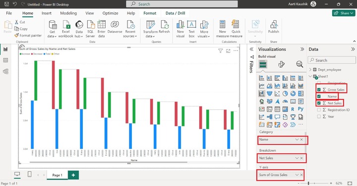
Step 1 − Consider the Sheet1 dataset "D:\waterfall model new.xlsx" consisting of six columns named Designation, Gross Sales, Name, Net Sales, Registration ID, and Year.
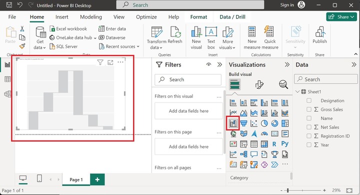
Step 2 − Select the "Waterfall" chart from the "Visualizations" pane. The empty waterfall chart is inserted into the Editor that contains no field values as given below −
Step 3 − Drag the Gross Sales column and drop it into the Y-axis. Also, select the Year column and drop it into Category.
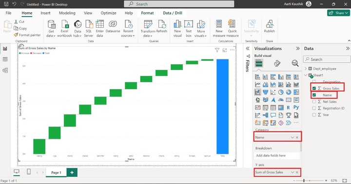
Step 4 − We can further extend the chart by using the breakdown option. Users could break down the net sales by a given year. Now, drag the "Net Sales" column into the Breakdown textbox. The green bar depicts the increment in sales whereas the red bar illustrates the decrement in sales. Therefore, the waterfall chart represents the sum of gross sales by year and net sales.
How to Customize the Waterfall Chart in Power BI?
Once you have generated the Waterfall chart, you may customize the chart to enhance its appearance.
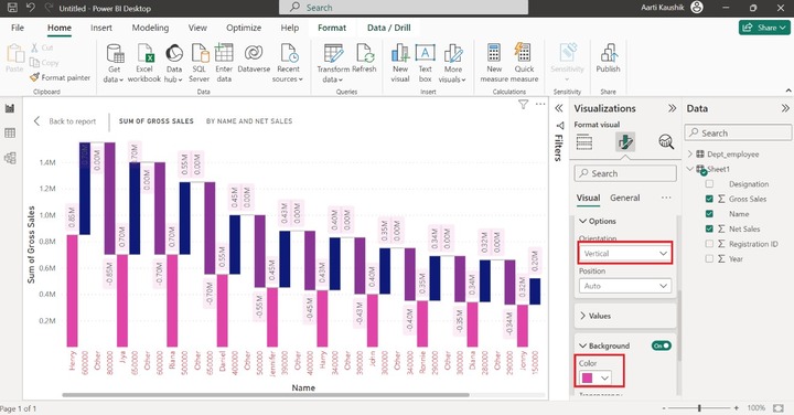
Step 1 − You may alter the style, color, and font size of the data label of the X Axis. You just need to click on the X-axis and then select the three options that are "Values", "Title" and "Layout". For X-axis data value styling, you can expand the "Values" option, alter the data value size, and modify its default color.
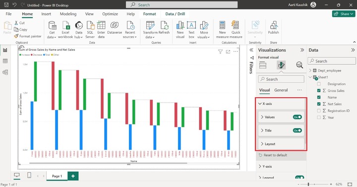
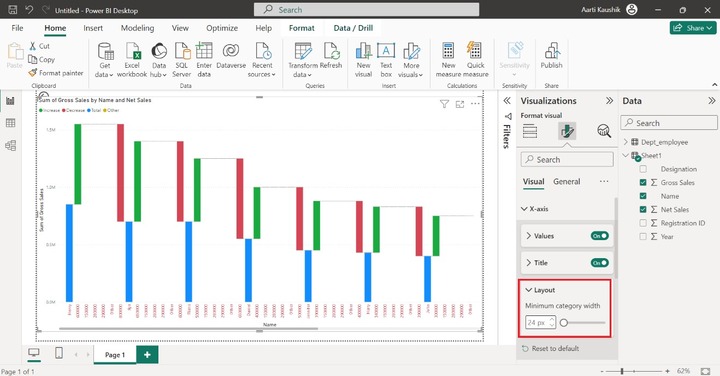
Now, let's expand the "Layout" option where you can increase the width among the X-axis data values.
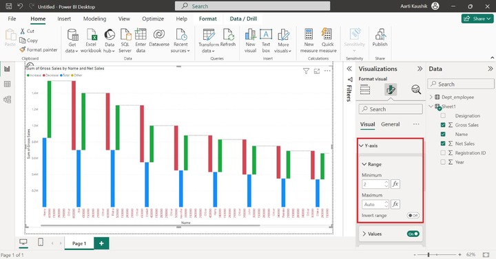
Step 2 − Similarly, you can modify the data labels of the Y-axis by clicking on the "Y-axis" tile where three options "Range", "Values" and "Title" are available.
You can alter the minimum and maximum range of the Y axis by expanding the "Range" tile and setting the specific values for them.
If you dont want to see the Y-axis data values and Title, you may turn off the "Values" button as well as the Title button.
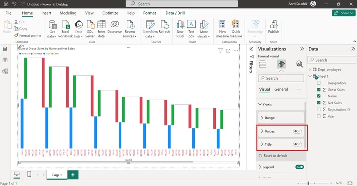
As you can observe in the screenshot, the y-axis data values and y-axis titles are not displayed.
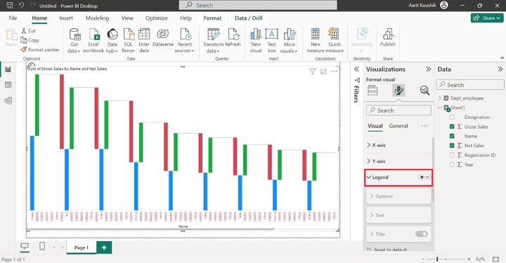
Step 3 − The next section is Legend.
Case 1 − If you intend to hide the legend in the designated Waterfall chart, then you can turn the "Legend" button.
Case 2 − You can expand the legend tile and then further stretch the "Options" and select the "Bottom Right" position to change the legend placement.
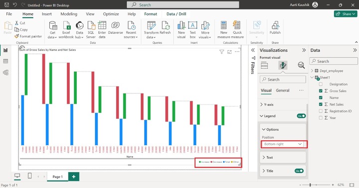
As you can illustrate in the screenshot, the legend placement has been changed.
Case 3 − You may utilize the "Text" option to increase the "Legend" style, its size, and its default color.
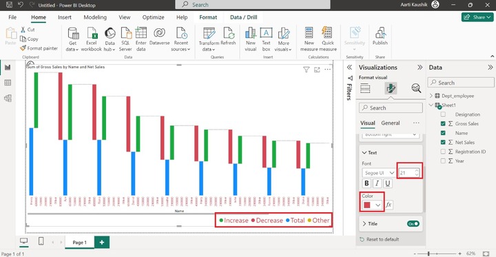
As you may notice in the screenshot, the size of the legend and its color have been modified.
Case 4 − You may expand the "Title" and set the specific title for the legend. For example: Type the Waterfall Chart in the textbox.
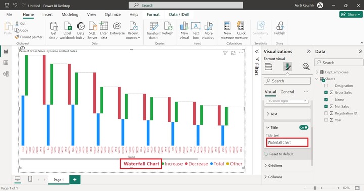
Step 4 − With the aid of the "Columns" section, you may alter the default colors of the selected fields.
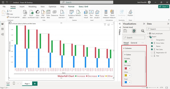
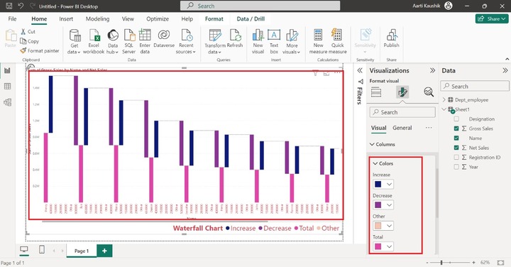
As you can notice in the screenshot, the color of the designated columns has been changed.
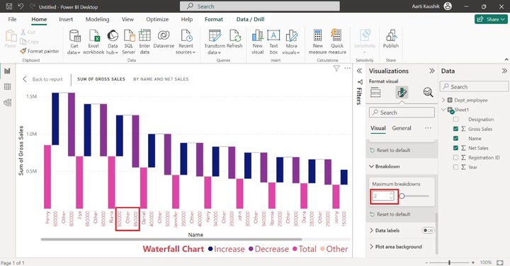
Step 5 − In the breakdown section, you may alter the breakdowns among supported categories. For example, you may decrement its value to 2. As you can observe in the screenshot, there are only two breakdowns between categories.
Step 6 − The descriptive information of the Y-axis field is showcased by the "Data labels". For example, the sum of gross sales of all employees can be shown if you turn on the Data labels. The orientation of data labels can be changed to vertical also. Alter its background color to pink as shown in the screenshot.