- Power BI - Home
- Power BI - Introduction
- Power BI - Installation Steps
- Power BI - Architecture
- Power BI Desktop
- Power BI - Desktop
- Power BI - Desktop Window
- Power BI Service
- Power BI - Window Supported Browsers
- Power BI - Generating Reports
- Power BI Desktop Service
- Power BI - Desktop vs Service
- Power BI - Supported Data Sources
- Power BI - Comparison Tools
- Power Query Editor
- Power Query Editor - Introduction
- Power Query Editor - Data Discrepancy
- Power Query Editor - Merge Queries (Part 1)
- Power Query Editor - Merge Queries (Part 2)
- Power BI - Develop Star Schema
- Data Modeling Concepts
- Power BI - Data Modeling
- Power BI - Manage Relationships
- Power BI - Cardinality
- Power BI - Dashboard Options
- Power BI Report Visualizations
- Power BI - Visualization Options
- Power BI - Visualization Charts
- Power BI - Stacked Bar Chart
- Power BI - Stacked Column Chart
- Power BI - Clustered Chart
- Power BI - 100% Stacked Chart
- Power BI - Area Chart and Stacked Area Chart
- Power BI - Line and Stacked Column Chart
- Power BI - Line and Clustered Column Chart
- Power BI - Ribbon Chart
- Power BI - Table and Matrix Visuals
- Power BI Map Visualizations
- Power BI - Creating Map Visualizations
- Power BI - ArcGIS Map
- Power BI Miscellaneous
- Power BI - Waterfall Charts
- Funnel Charts and Radial Gauge Chart
- Power BI - Scatter Chart
- Power BI - Pie Chart and Donut Chart
- Power BI - Card and Slicer Visualization
- Power BI - KPI Visual
- Power BI - Smart Narrative Visual
- Power BI - Decomposition Tree
- Power BI - Paginated Report
- Power BI - Python Script & R Script
- Power BI - Multi-row Card
- Power BI - Power Apps & Power Automate
- Power BI - Excel Integration
- Power BI Dashboard
- Power BI - Sharing Dashboards
- Power BI Sales Production Dashboard
- Power BI - HR Analytics Dashboard
- Power BI - Customer Analytics Dashborad
- Power BI - DAX Basics
- Power BI - Administration Role
- Power BI - DAX Functions
- Power BI - DAX Text Functions
- Power BI - DAX Date Functions
- Power BI - DAX Logical Functions
- Power BI - DAX Counting Functions
- Power BI - Depreciation Functions
- Power BI - DAX Information Functions
Power BI - Decomposition Tree
The Decomposition Tree visual in Power BI assists users in showcasing the data in various dimensions. Once you choose the data point and maintain track of the drill-down hierarchies, the decomposition tree will reflect the many degrees of hierarchy.
Following are the main benefits of using the Decomposition tree visual in Power BI −
- The decomposition tree breaks down the complex work structure into multiple levels.
- It is very helpful in interpreting data accurately and finding correlations among data points.
- It has AI split characteristics which means we can get the maximum value and minimum value in the loaded dataset and summarize the data according to the defined constraint.
- It permits users to explore data deeply and move to the next level through its hierarchical structure.
Note − Employee data set is employed, and you need to upload the employee Excel workbook into the Power BI desktop before creating the Decomposition tree. "D:\decomposition tree.xlsx"
How to Develop a Decomposition Tree?
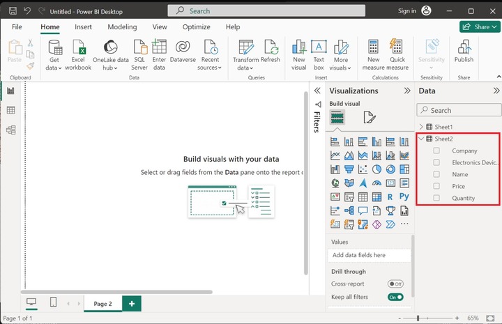
Step 1 − Consider the sample dataset named Sheet 2 consists of five columns Company, Electronics Devices, Name, Price, and Quantity that is loaded into the Power BI.
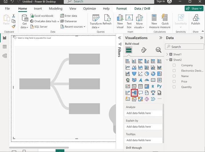
Step 2 − You need to click on the "Decomposition tree" visual and expand its size as given below:
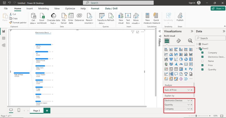
Step 3 − Drag the "Price" column and drop it into "Analyze" section. Furthermore, drag and drop the Electronics Devices, Quantity, and Company columns into the "Explain by section" as shown below −
Step 4 − The decomposition tree is developed in the Report.

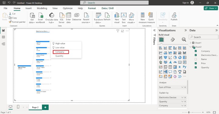
Step 5 − Click on the + sign adjacent to the "LED TV" and select the "Company" option to identify its company name. You may choose any of the following options High Value, Low Value, or Quantity from the menu.
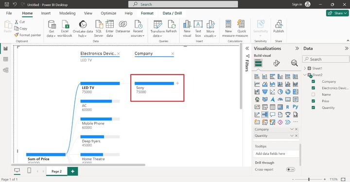
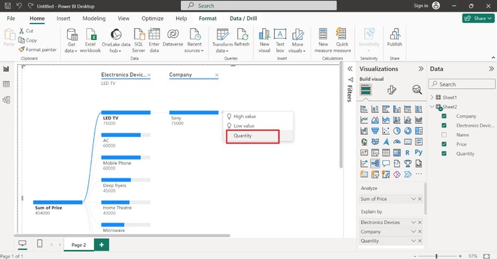
Step 6 − Furthermore, click on the + sign just adjacent to the "Sony" and select the "Quantity" option to populate the total number of specific electronic devices.
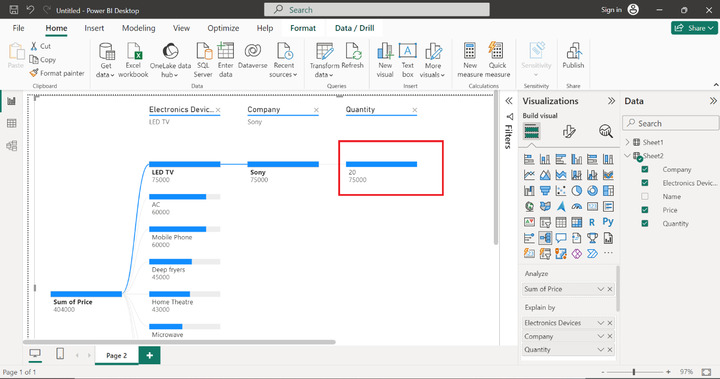
Therefore, the decomposition tree is depicted in the below image. You may choose other electronic devices and get to know about their details.
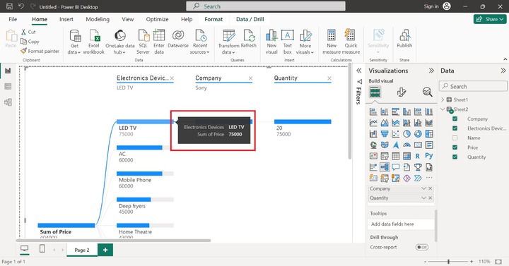
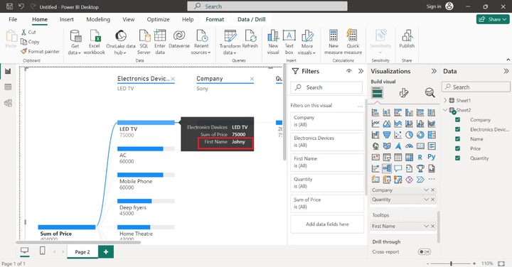
Step 7 − Let's move to the next section "Tooltips". If the user hovers over the LED TV data point, then more details like "Electronics Devices LED TV" and "Sum of price 75000" are populated like this −
Step 8 − If you wish to see the name of the employee when we hover over the specific data point. Drag and drop the "Name" column into the "Tooltips" section as given below −
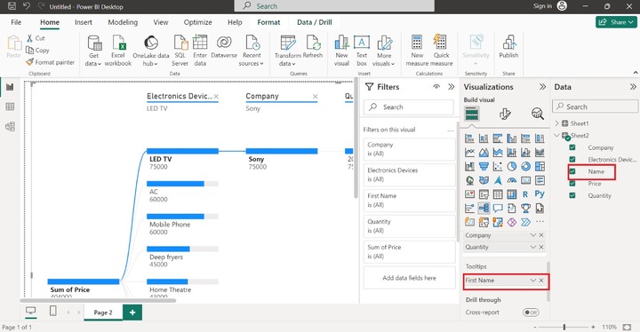
Now the information related to Names associated with "Electronic Devices" is to be showcased when users hover over the "LED TV" data point as highlighted below images −
More Options
You may click on (....) highlighted on the screenshot where various options are available. If you wish to export data, then you may select "Export data" where data is saved in .csv format.
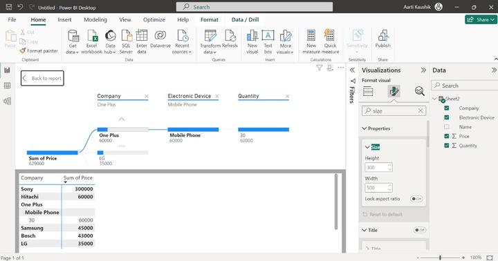
Now, click on the "Show as a table" where the dataset is populated on the screen in tabular form.
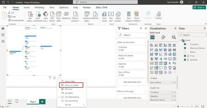
As you can see in the screenshot, the table depicts the company name and its sum of prices along with the quantity of mobile phones. Click on the "Back to report" to view only report.
Sorting
You can also sort the data points by using three options that are available "Sort descending", "Sort ascending" and "Sort by" in the "More options" drop-down list.
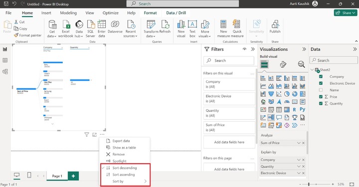
Lets expand the "Sort by" tile and choose "Company" which will sort the data points in descending.
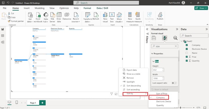
Finally, you can notice in the screenshot that the company name is sorted in descending form.
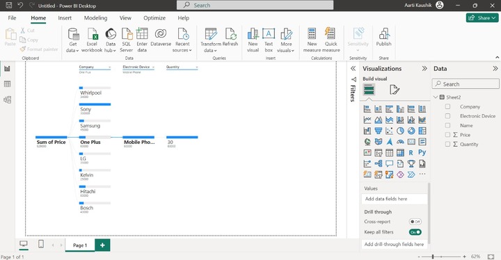
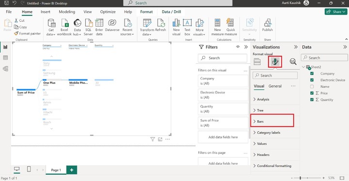
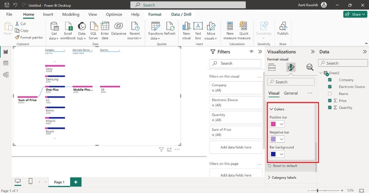
How to Change the Color of Bars?
You can click on the "Format your visual" and expand the "Bars" tile. Select the "Colors" tile and choose the desired color for the positive bar, negative bar, and bar background.
You can visualize in the screenshot that the color of the bar has been modified.
The main steps for the creation of this visual are to load the dataset into POWER BI, choose the decomposition tree visual, add a specific column into the Analyze section to aggregate the data, place the other columns for drill down into the Explain section, and then finally save the report.
The main drawback of the decomposition tress is that it is restricted to five thousand data points and levels can go up to 50. Users should have in-depth knowledge of Power BI Desktop is required to understand the relationship between data points in the decomposition tree.