- Power BI - Home
- Power BI - Introduction
- Power BI - Installation Steps
- Power BI - Architecture
- Power BI Desktop
- Power BI - Desktop
- Power BI - Desktop Window
- Power BI Service
- Power BI - Window Supported Browsers
- Power BI - Generating Reports
- Power BI Desktop Service
- Power BI - Desktop vs Service
- Power BI - Supported Data Sources
- Power BI - Comparison Tools
- Power Query Editor
- Power Query Editor - Introduction
- Power Query Editor - Data Discrepancy
- Power Query Editor - Merge Queries (Part 1)
- Power Query Editor - Merge Queries (Part 2)
- Power BI - Develop Star Schema
- Data Modeling Concepts
- Power BI - Data Modeling
- Power BI - Manage Relationships
- Power BI - Cardinality
- Power BI - Dashboard Options
- Power BI Report Visualizations
- Power BI - Visualization Options
- Power BI - Visualization Charts
- Power BI - Stacked Bar Chart
- Power BI - Stacked Column Chart
- Power BI - Clustered Chart
- Power BI - 100% Stacked Chart
- Power BI - Area Chart and Stacked Area Chart
- Power BI - Line and Stacked Column Chart
- Power BI - Line and Clustered Column Chart
- Power BI - Ribbon Chart
- Power BI - Table and Matrix Visuals
- Power BI Map Visualizations
- Power BI - Creating Map Visualizations
- Power BI - ArcGIS Map
- Power BI Miscellaneous
- Power BI - Waterfall Charts
- Funnel Charts and Radial Gauge Chart
- Power BI - Scatter Chart
- Power BI - Pie Chart and Donut Chart
- Power BI - Card and Slicer Visualization
- Power BI - KPI Visual
- Power BI - Smart Narrative Visual
- Power BI - Decomposition Tree
- Power BI - Paginated Report
- Power BI - Python Script & R Script
- Power BI - Multi-row Card
- Power BI - Power Apps & Power Automate
- Power BI - Excel Integration
- Power BI Dashboard
- Power BI - Sharing Dashboards
- Power BI Sales Production Dashboard
- Power BI - HR Analytics Dashboard
- Power BI - Customer Analytics Dashborad
- Power BI - DAX Basics
- Power BI - Administration Role
- Power BI - DAX Functions
- Power BI - DAX Text Functions
- Power BI - DAX Date Functions
- Power BI - DAX Logical Functions
- Power BI - DAX Counting Functions
- Power BI - Depreciation Functions
- Power BI - DAX Information Functions
Power BI - Stacked Bar Chart
What is a Stacked Bar Chart?
A Stacked Bar chart that displays the data values in the two-dimensional horizontal stacked rectangle without overlapping. The horizontal stacked bar represents a subset of the total, and the various partitions of each horizontal bar show how each category leads to the whole.
How to Create a Stacked Bar Chart?
Dataset − You can import the sl.xlsx "D:\Dataset_excel\sl.xlsx" before creating the Stacked Bar chart.
Case Study 1
In the given dataset, Sales production for various years in different countries is given. Richard needs to generate the Stacked bar chart of the following questions.
- What is the sales production in 2023 years of different countries?
- What is the sales production in 2020 and 2021 years of various countries through a Stacked Bar chart? Also, explain each section of the Stacked bar chart in detail.
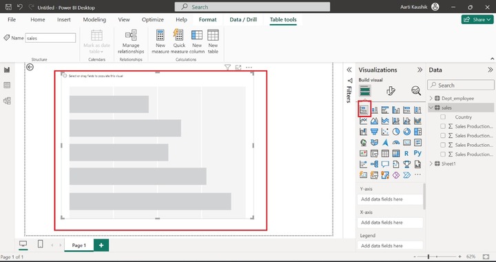
Step 1 − Richard navigates to the Report View and selects the "Stacked Bar chart" from Visualizations.
Step 2 − Richard added the "Country" field to the Y-axis and the "Sales production in 2023" field to the X-axis.
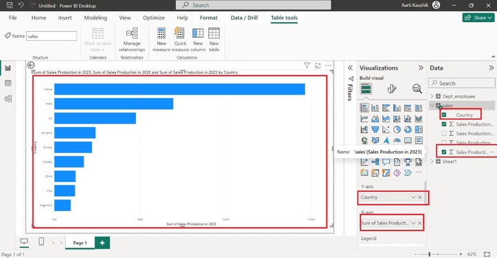
As you may notice in the screenshot, the Sum of sales production in 2023 categorized by country is shown.
Step 3 − The next step is to alter the fields of the X-axis. He can add the "Sales production in 2020" and "Sales production in 2021" fields to the X-axis. As you can observe in the screenshot, the colorful Stacked Bar chart has been developed that shows the Sum of Sales production in 2020 and the Sum of Sales production in 2021 by country.
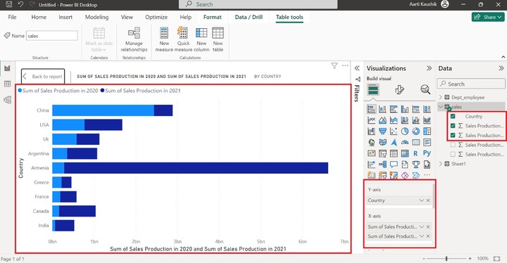
Note: In the above screenshot, the visual is shown in Focus Mode.
Step 4 − The next feature is Legend which shows the different countries in various color. To activate this feature, remove the "Sum of Sales Production in 2020" as the "Legend" will not function if more than one field is being placed on the X-axis. Place the "Country" field to the "Legend".
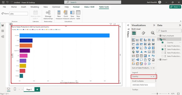
As you can observe in the screenshot, the colorful Stacked bar chart has been populated on the canvas.
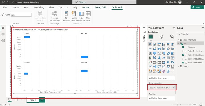
Step 5 − Richard may also partition the generated visual into various independent visuals through the usage of the "Small multiples" section. He will place "Sales production in 2023" into the "Small Multiples".
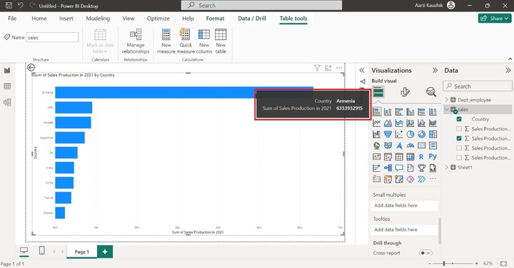
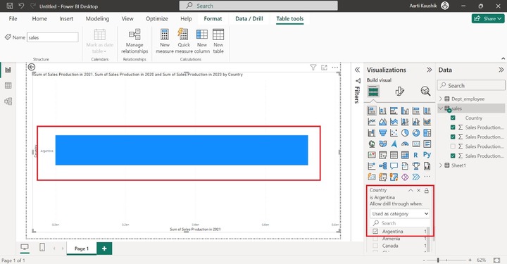
Step 6 − Richard can see only two pieces of information that is "Country Name" and "Sum of Sales production in 2021" when he places the cursor on the specific bar.
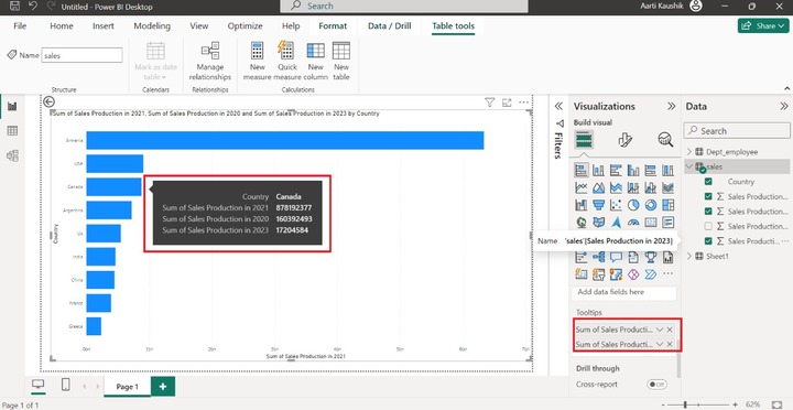
To view more extensive information about other fields, he adds "Sales production in 2020" and "Sales production in 2023" into the "Tooltips" section.
Step 7 − Richard will use the "Drill through" section where he can filter the field values. Suppose he just wants to see the Sales production of Argentina country. In that case, he needs to add the "Country" to the Drill through the section, select the "Used as Category" option from the drop-down menu, and select the "Argentina" country.
How to Format a Stacked Bar Chart?
Once he clicks on Format Visual, two options "Visual" and "General" are available. The General comprises various options like Properties, Titles, Effects, Header icons, Tooltips, and Alt text.
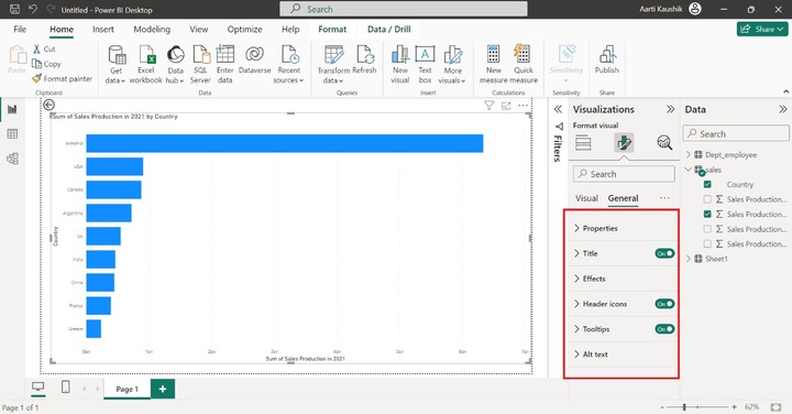
Step 1 − The Properties option consists of four sections Size, Position, Padding, and Advanced Options.
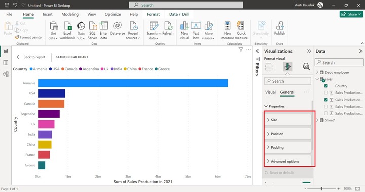
He can expand the Size tile and increase or decrease the Height and Width of the visual.

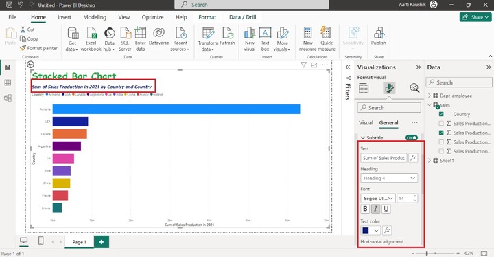
Step 2 − He can also turn off the supported title just by turning off the title button. Moreover, he can alter the default title name and modify it to "Stacked Bar Chart", set the heading to "Heading 2", and select the Font style "Comic Sans MS" to modify and set the font size to 29 and choose the Bold.
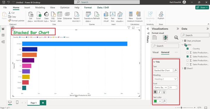
Here, you can view in the screenshot, the title styling has been modified.
Similarly, he can alter the styling of the "Subtitle".
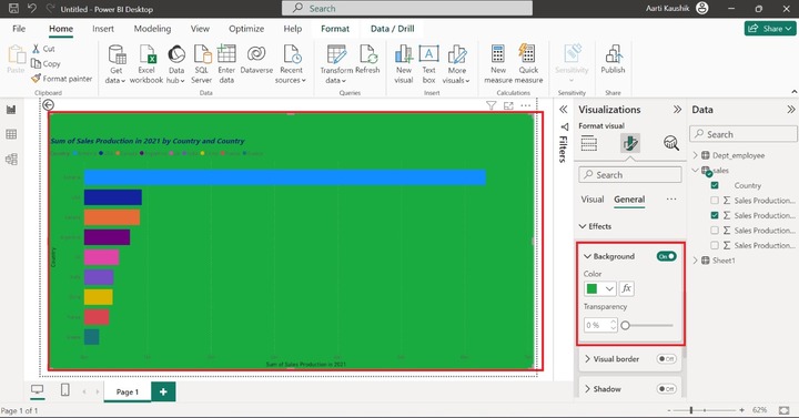
Step 3 − Turn on the Background color and select the desired color from the drop-down list of listed colors.
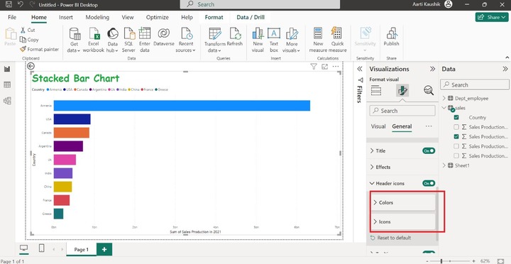
Step 4 − Two options "Colors" and "Icons" are available in the Header icons. The alteration which are applied to the Header icons will be showcased in the reading view.
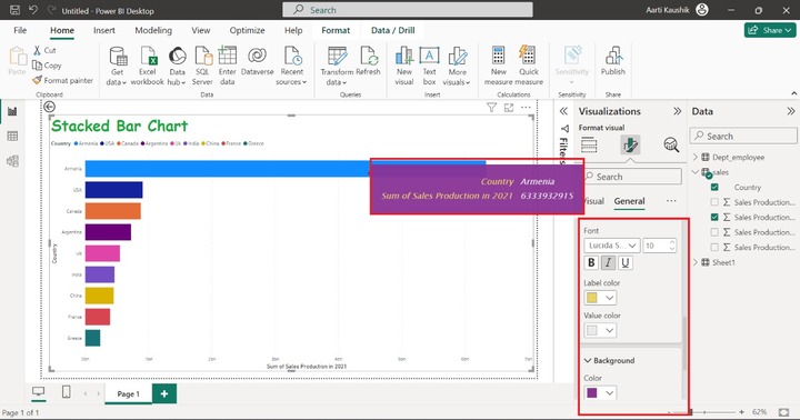
Step 5 − When he expands the Tooltips tile that comprises three sections "Options", "Text" and "Background".
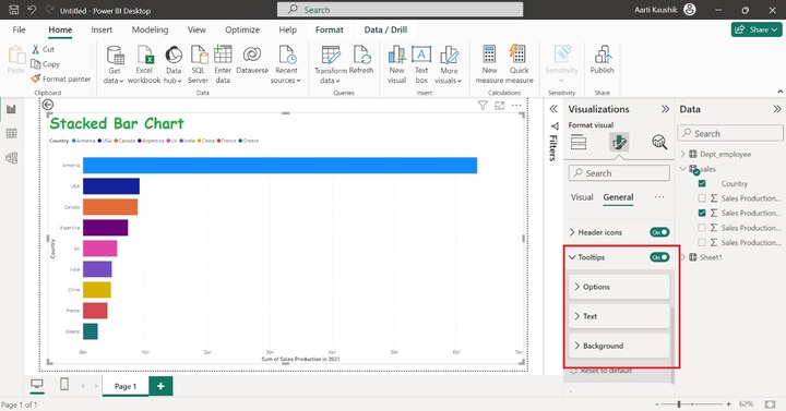
Lets change the font style to "Lucida Sans Unicode" and set the font size to 10, select Italic, modify the Label color, and choose the desired background color of the Tooltips.
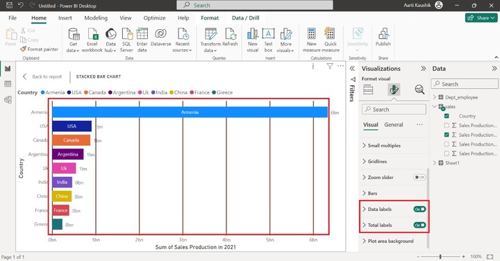
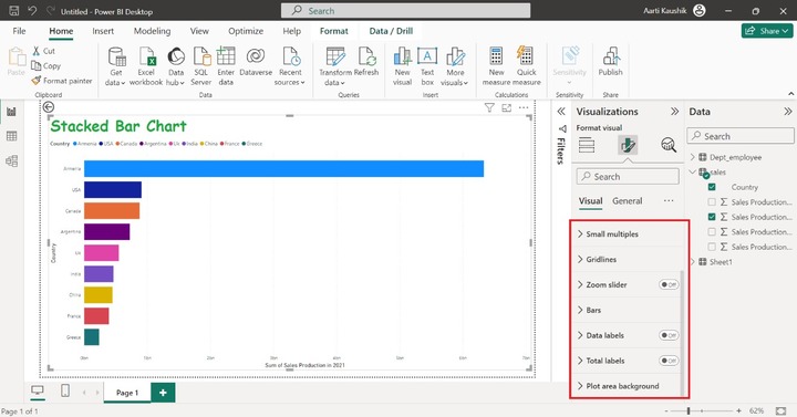
Step 7 − Now, Richard clicked on the "Visual" where multiple options like Small multiples, Gridlines, Zoom Slider, and so on are presented to enhance the visual appearance.
Step 8 − Richard can alter the styling of the Gridlines. To achieve this, he can expand the Gridlines, select the "Solid" and alter its color, and set its width to "2px".
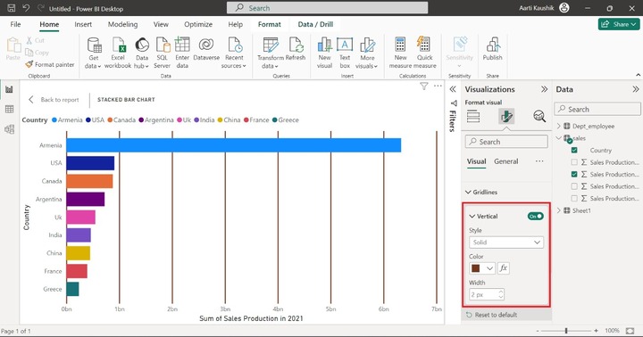
Step 9 − You may turn the Data labels and Total labels option to display them on the different bars.