- Power BI - Home
- Power BI - Introduction
- Power BI - Installation Steps
- Power BI - Architecture
- Power BI Desktop
- Power BI - Desktop
- Power BI - Desktop Window
- Power BI Service
- Power BI - Window Supported Browsers
- Power BI - Generating Reports
- Power BI Desktop Service
- Power BI - Desktop vs Service
- Power BI - Supported Data Sources
- Power BI - Comparison Tools
- Power Query Editor
- Power Query Editor - Introduction
- Power Query Editor - Data Discrepancy
- Power Query Editor - Merge Queries (Part 1)
- Power Query Editor - Merge Queries (Part 2)
- Power BI - Develop Star Schema
- Data Modeling Concepts
- Power BI - Data Modeling
- Power BI - Manage Relationships
- Power BI - Cardinality
- Power BI - Dashboard Options
- Power BI Report Visualizations
- Power BI - Visualization Options
- Power BI - Visualization Charts
- Power BI - Stacked Bar Chart
- Power BI - Stacked Column Chart
- Power BI - Clustered Chart
- Power BI - 100% Stacked Chart
- Power BI - Area Chart and Stacked Area Chart
- Power BI - Line and Stacked Column Chart
- Power BI - Line and Clustered Column Chart
- Power BI - Ribbon Chart
- Power BI - Table and Matrix Visuals
- Power BI Map Visualizations
- Power BI - Creating Map Visualizations
- Power BI - ArcGIS Map
- Power BI Miscellaneous
- Power BI - Waterfall Charts
- Funnel Charts and Radial Gauge Chart
- Power BI - Scatter Chart
- Power BI - Pie Chart and Donut Chart
- Power BI - Card and Slicer Visualization
- Power BI - KPI Visual
- Power BI - Smart Narrative Visual
- Power BI - Decomposition Tree
- Power BI - Paginated Report
- Power BI - Python Script & R Script
- Power BI - Multi-row Card
- Power BI - Power Apps & Power Automate
- Power BI - Excel Integration
- Power BI Dashboard
- Power BI - Sharing Dashboards
- Power BI Sales Production Dashboard
- Power BI - HR Analytics Dashboard
- Power BI - Customer Analytics Dashborad
- Power BI - DAX Basics
- Power BI - Administration Role
- Power BI - DAX Functions
- Power BI - DAX Text Functions
- Power BI - DAX Date Functions
- Power BI - DAX Logical Functions
- Power BI - DAX Counting Functions
- Power BI - Depreciation Functions
- Power BI - DAX Information Functions
Power BI - KPI Visual
KPI (Key Performance Indicator) is the best visual to determine the performance of the employees towards their defined target. It facilitates meaningful insights and permits companies to identify their strong and weak areas. Performance metrics must be defined and tracked through the KPI visual. For example, user reviews and customer feedback can be tracked, and crucial decisions are taken accordingly for further enhancements.
How to Develop KPI Visual in Power BI?
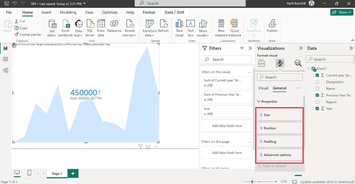
Step 1 − You can import the "D:\sales executive.xlsx" into the BI desktop and select the KPI visual from the "Visualizations". The default KPI visual is inserted into the Report canvas as it contains no fields. The three main sections of the KPI visual are "Value", "Trend Axis" and "Target".
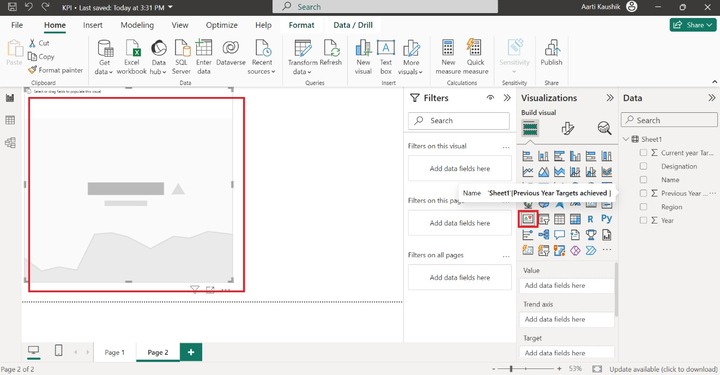
Step 2 − You can place the "Current year target achieved" field into the "Value" and add the "Year" field into the "Trend axis". After that, add the "Previous year target achieved" field into the "Target".
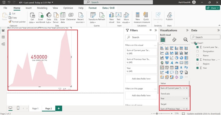
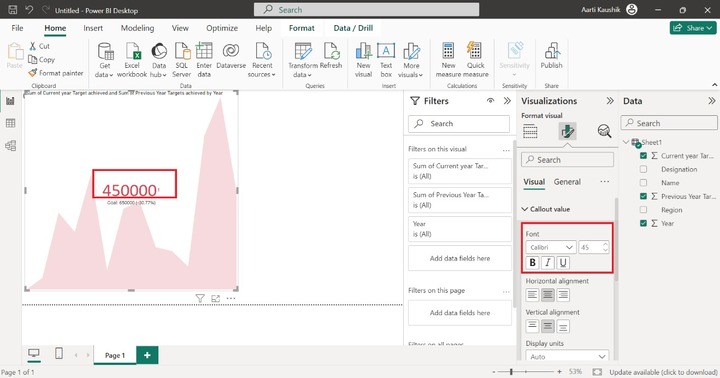
As you can notice in the screenshot, the center value "450000" is considered an indicator that represents the last field value of the "Current year Target achieved".
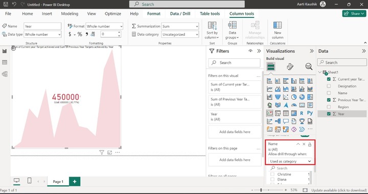
Step 3 − You can observe the individual goals of the specific name through the "Drill through" section. Also, place the "Name" into the "Drill through" and choose "Used as a category" under "Allow drill through when" where all employees' names are listed sequentially.
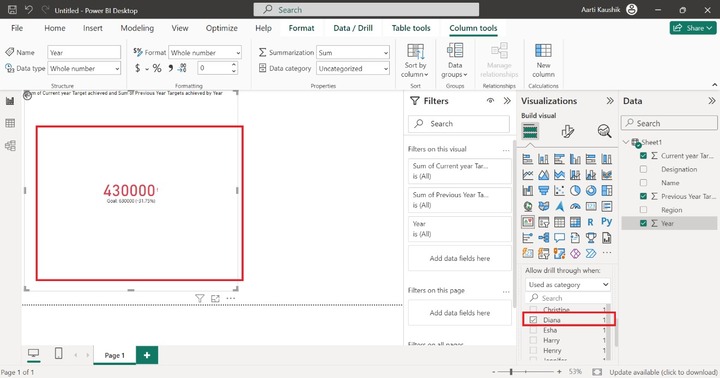
You may click on the "Diana" that populates the measure performance of her on the canvas.
How to Format a KPI Visual?
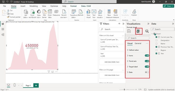
You can click on the "Format visual" to customize the KPI visual. Various options like "Callout Value", "Icons", "Trend axis", "Target label", and "Date" are presented inside the Visual.
You may expand the "Callout value" change the Font style to "Calibri" and increase the font size to 45. Here, you may notice in the screenshot, that the performance measure which is "450000" styling has been modified. You may also alter the Horizontal Alignment and Vertical alignment of it.
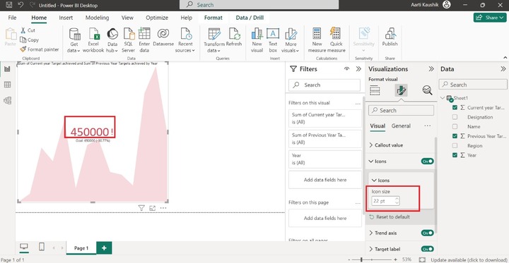
You can turn on the "Icon" button and expand the Icon title to increase set its size to 22 pt.
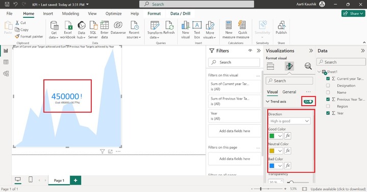
The trend axis is the period that you added to the dataset. You can click on the "Trend axis", turn on its toggle button and select "High is good" under the "Direction". You can apply conditional formatting for "Good color", "Neutral Color" and "Bad Color".
You can turn on the Target label button and modify its formatting. You may expand the Values tile, alter the font style to "Symbol", increase the font size to "20" and choose the desired color from the drop-down list. Enter the "Target" under "Label" subpart.
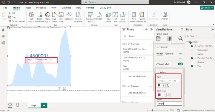
As you can notice in the screenshot, the Target label styling has been modified.
You may also turn on the "Distance to goal" button and select the "Value" from the given list under the "Style" section. Choose the "Segoe UI" and set its size to 20 and choose the desired color from the given list of theme colors.
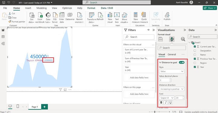
Therefore, the Distance to goal value is shown in numeric form instead of percentage and its default color is changed to the blue color.
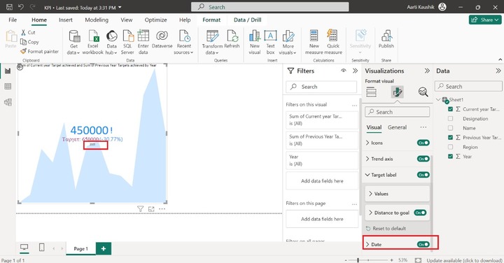
You can click on the "Date" tile to view the period on the visual.
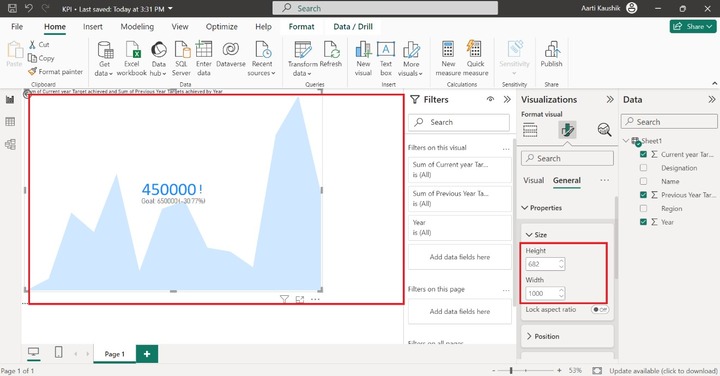
Now, you can click on the "General" tab for basic formatting of the KPI visual. Multiple options like Properties, Titles, Effects, Header icons, and Alt text are presented.
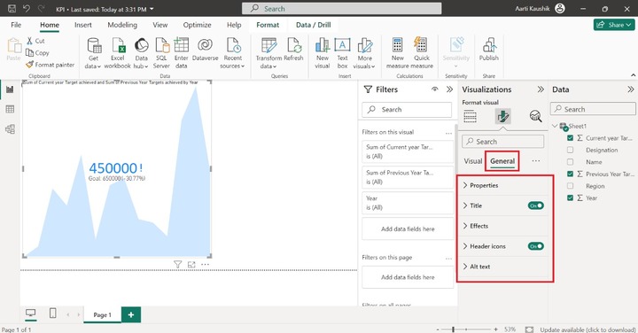
Properties
You can expand the "Properties" tile which consists of Size, Position, Padding, and Advanced options.
Moreover, you can click on "Size" where you can adjust the Height and Width of the report canvas. Here, you can set the height to 682 and the width to 1000.
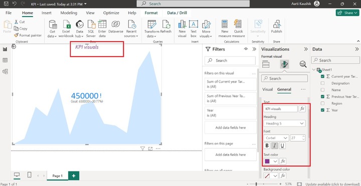
Title
The next section "Title" comprises of the "Title", "Subtitle", "Divider", and "Spacing" subparts.
You may expand the "Title" to alter its default title name. Enter the new title "KPI visuals" under the Text section and change the heading to Heading 5, alter the font style to Corbel, increase the font size to 27, alter the Text color to "#893395", and select the "Center" alignment.
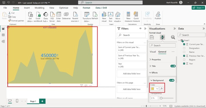
Lets change the background of the KPI visuals. You can expand the "Effects" and then click on the "Background" tile and then select the "#e8d166" color from the given list of the theme colors.
Similarly, you can also customize the subtitle and change its text styling and horizontal alignment after clicking on the Subtitle button.
Header Icons
You may alter the formatting of the Header icon which is at the bottom right side of the designated visual. Click on the "Header icon" toggle button and select the desired color for the "Background", "Border" and "Icon" subparts.
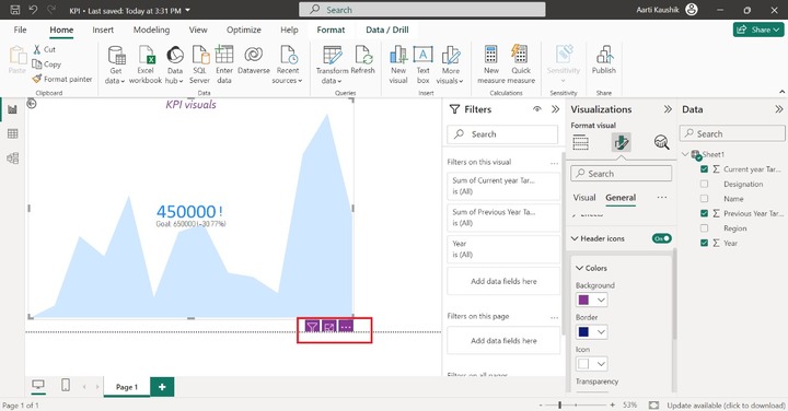
Therefore, the Header icon styling has been altered.