- Power BI - Home
- Power BI - Introduction
- Power BI - Installation Steps
- Power BI - Architecture
- Power BI Desktop
- Power BI - Desktop
- Power BI - Desktop Window
- Power BI Service
- Power BI - Window Supported Browsers
- Power BI - Generating Reports
- Power BI Desktop Service
- Power BI - Desktop vs Service
- Power BI - Supported Data Sources
- Power BI - Comparison Tools
- Power Query Editor
- Power Query Editor - Introduction
- Power Query Editor - Data Discrepancy
- Power Query Editor - Merge Queries (Part 1)
- Power Query Editor - Merge Queries (Part 2)
- Power BI - Develop Star Schema
- Data Modeling Concepts
- Power BI - Data Modeling
- Power BI - Manage Relationships
- Power BI - Cardinality
- Power BI - Dashboard Options
- Power BI Report Visualizations
- Power BI - Visualization Options
- Power BI - Visualization Charts
- Power BI - Stacked Bar Chart
- Power BI - Stacked Column Chart
- Power BI - Clustered Chart
- Power BI - 100% Stacked Chart
- Power BI - Area Chart and Stacked Area Chart
- Power BI - Line and Stacked Column Chart
- Power BI - Line and Clustered Column Chart
- Power BI - Ribbon Chart
- Power BI - Table and Matrix Visuals
- Power BI Map Visualizations
- Power BI - Creating Map Visualizations
- Power BI - ArcGIS Map
- Power BI Miscellaneous
- Power BI - Waterfall Charts
- Funnel Charts and Radial Gauge Chart
- Power BI - Scatter Chart
- Power BI - Pie Chart and Donut Chart
- Power BI - Card and Slicer Visualization
- Power BI - KPI Visual
- Power BI - Smart Narrative Visual
- Power BI - Decomposition Tree
- Power BI - Paginated Report
- Power BI - Python Script & R Script
- Power BI - Multi-row Card
- Power BI - Power Apps & Power Automate
- Power BI - Excel Integration
- Power BI Dashboard
- Power BI - Sharing Dashboards
- Power BI Sales Production Dashboard
- Power BI - HR Analytics Dashboard
- Power BI - Customer Analytics Dashborad
- Power BI - DAX Basics
- Power BI - Administration Role
- Power BI - DAX Functions
- Power BI - DAX Text Functions
- Power BI - DAX Date Functions
- Power BI - DAX Logical Functions
- Power BI - DAX Counting Functions
- Power BI - Depreciation Functions
- Power BI - DAX Information Functions
Power BI - Scatter Chart
What is a Scatter Chart?
The plotting of the different data points representing various groups over the X- and Y-axes is done using a scatter chart for the selected variables. Ten thousand data points can be rendered through this chart. Three main sections "Values", "X-axis" and "Y-axis" are available in this visual. In the Values section, a specific field can be added that draws data points for every data value and X-axis displays a numeric or categorical field and the Y-axis denotes only a numeric field value.
How to Generate the Scatter Chart?
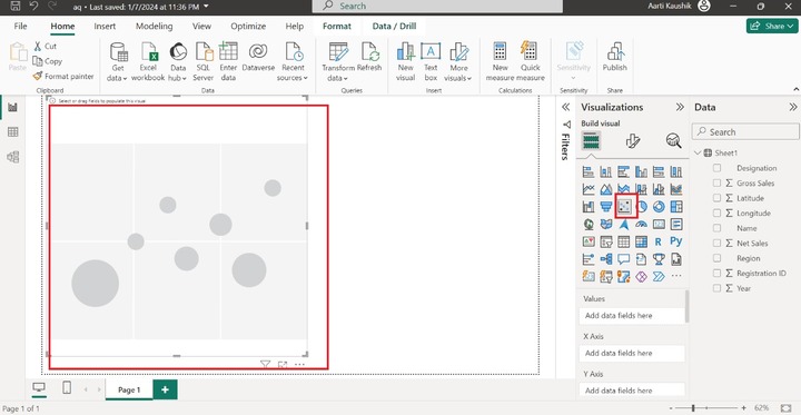
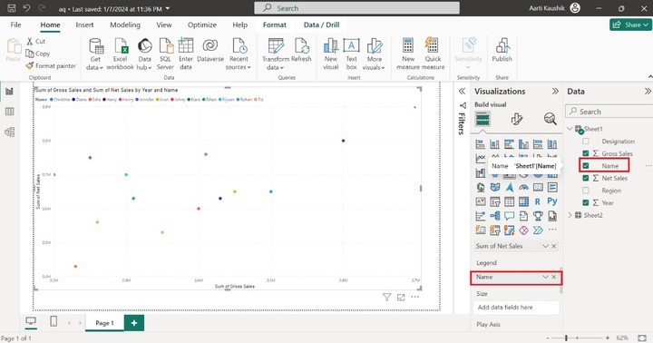
Step 1 − Once you import the dataset into the BI desktop, you can select the "Scatter Chart" visual from the "Visualizations".
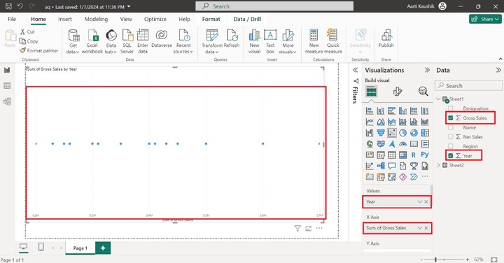
Step 2 − You can place the "Year" field into the "Values" and add the "Gross Sales" to the X-axis. However, you must add the field to the Y-axis to make it a complete chart.
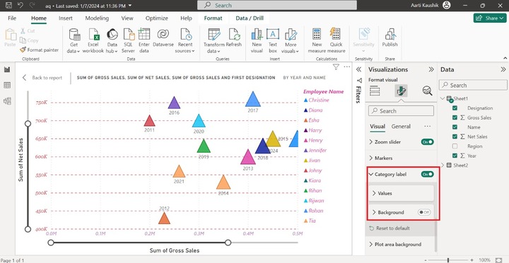
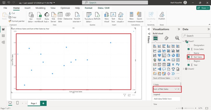
Step 3 − You may place the "Net Sales" into the Y-axis. The aggregate function of the X-axis and Y-axis would also be changed. As you can observe in the screenshot, the Scatter chart depicts the "Sum of Gross Sales and the Sum of Net Sales by Year".
Step 4 − You may add the "Name" section into "Legend" which populates the different colors for the selected field value and its respective data points.
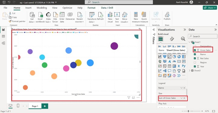
Step 5 − The size section is used to determine the relative bubbling size. You may add the "Sum of Gross Sales" to the "Size" section. Small colorful bubbles specify the small gross sales whereas large size data point shows larger gross sales.
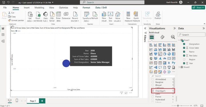
Step 6 − When you place the cursor on the "Rohan" sales, then you can observe that his designation and Region field information are not populated.
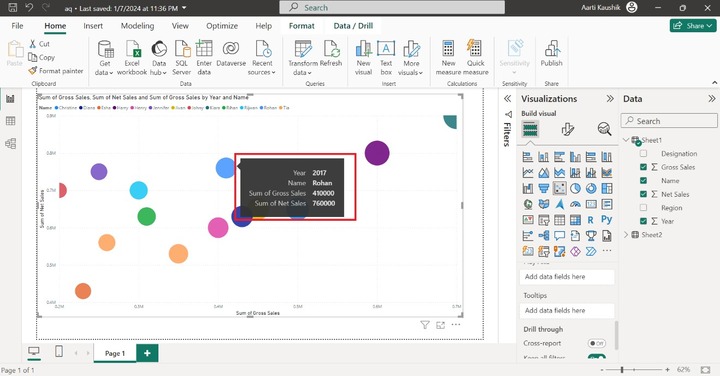
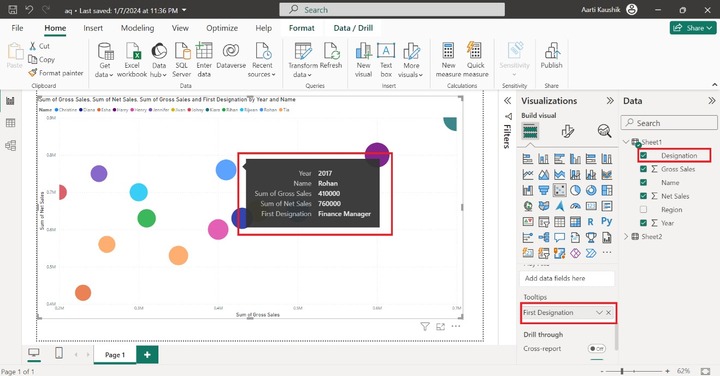
You can add a "Designation" field or any other field to the Toolstips section to get the relative information. As you can view in the screenshot, his designation "Finance Manager" is also populated along with other field information.
Step 7 − For example: you want to select only those Employees who belong to the Chandigarh region. With the aid of Drill through, you may filter the specific field that will get populated on the canvas. You can add the "Region" into the "Drill through" section, select the "Used as category" and click on the "Chandigarh" checkbox from the drop-down menu. Therefore, it is concluded through the screenshot, that "Diana" belongs to the region Chandigarh.
How to Format Scatter Chart?
Customizing a scatter chart is necessary to improve its appearance and visibility. You may use the "Format Visual" from "Visualizations" where numerous options are available to change the data labels, modify the X and Y axes style, Legend styling, and so on.
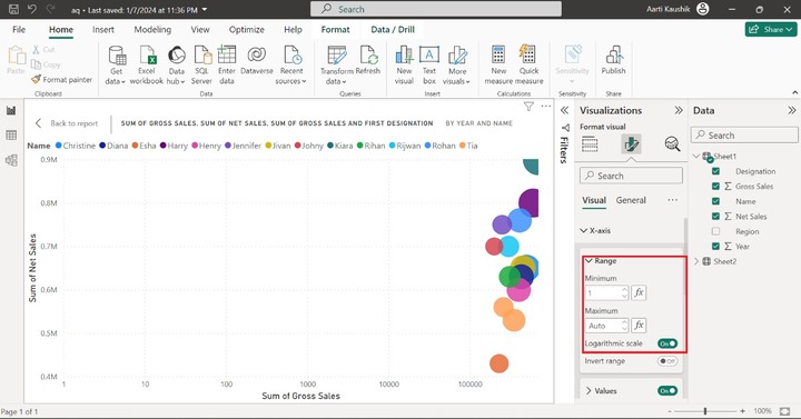
X-axis
It contains three sub-sections "Range", "Values", and "Title". Expand the X-axis tile and click on the "Range" where you can convert the X-axis into a "Logarithmic Scale" or the "Invert Range" by turning on its buttons. Smaller value and larger values can also be set in the Minimum and Maximum label under "Range".
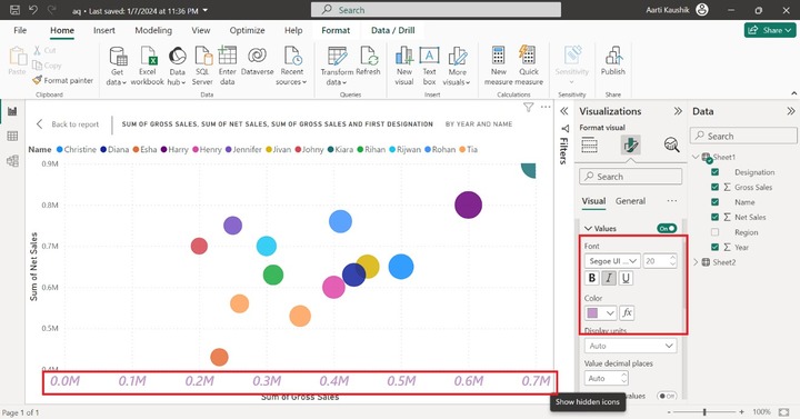
X-axis labels text style, size, and color can be modified by expanding the Values tile where you can set the desired style like "Segoe UI semibold", set the size to 20, and select the purple color from the drop-down list.
Similarly, you can either hide the "Sum of Gross Sales" title by turning off the title button or after turning on its button, you may change its font size, style, and color as you did in the Values section.
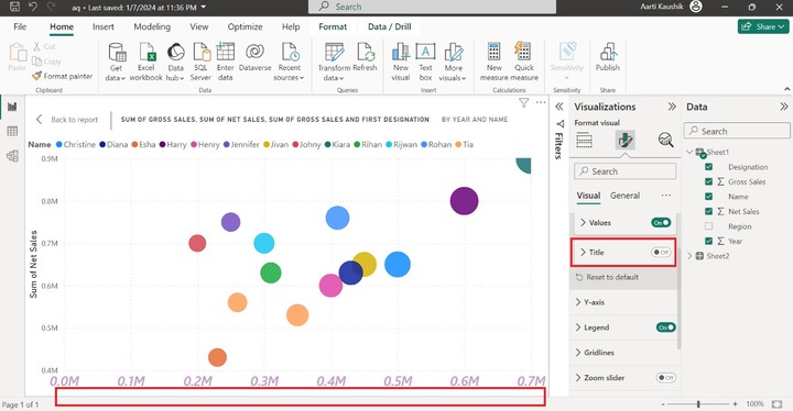
Here, you can notice in the screenshot, the x-axis title is not visible as you turn off the "Title" button.
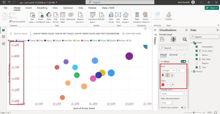
Y-axis
Like X-axis, a similar subsection that is "Range", "Values" and "Title" are presented inside it. You can click on the Y-axis tile and then select the "Values" tile and modify its Font style to "Georgia" and set size to 14, click on the "Italic", also select the specified color under "Color".
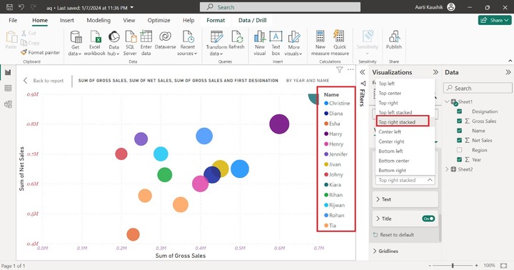
Legend
It comprises three sub-parts "Options", "Text", and "Title". You may expand the Legend tile and then further click on the "Options" to change its placement on the Visual. Select the "Top right stacked" under "Position".
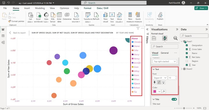
You may further click on "Text" where you can modify the text style, size, and font color. As you can notice in the screenshot the default color, and font style of the legend have been altered.
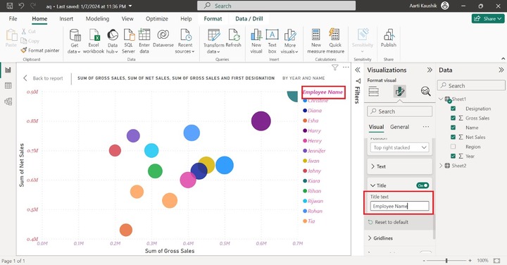
You can also change the legend title name or hide it by turning off the "Title" button. Expand the "Title" section and enter the "Employee name" in the textbox under "Title text".
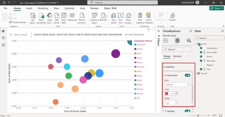
Gridlines
It contains two parts "Horizontal" and "Vertical". Click on the "Horizontal" and select the "Dashed" style and choose the "Red" color to transform its appearance into "Dashed" horizontal colorful gridlines. Similarly, you may modify the style of the Vertical gridlines.
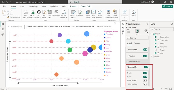
Zoom Slider
You may turn the "Zoom slider" button to add a slider on the visual that allows you to focus on the specific data points by stretching in or stretching out the Zoom slider for the visual.
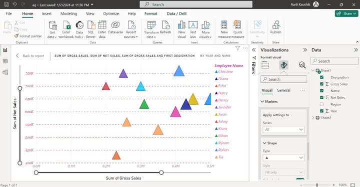
Markers
Click on the Markers where you may modify the default shape of the bubbles representing the distinct variables. Select the "Triangle" symbol from the given list under the "Shape" tile.
Category Labels
It consists of two subparts "Values" and "Background". If you wish to see the "Year" for every data point, then you can turn the Category label button.