- Power BI - Home
- Power BI - Introduction
- Power BI - Installation Steps
- Power BI - Architecture
- Power BI Desktop
- Power BI - Desktop
- Power BI - Desktop Window
- Power BI Service
- Power BI - Window Supported Browsers
- Power BI - Generating Reports
- Power BI Desktop Service
- Power BI - Desktop vs Service
- Power BI - Supported Data Sources
- Power BI - Comparison Tools
- Power Query Editor
- Power Query Editor - Introduction
- Power Query Editor - Data Discrepancy
- Power Query Editor - Merge Queries (Part 1)
- Power Query Editor - Merge Queries (Part 2)
- Power BI - Develop Star Schema
- Data Modeling Concepts
- Power BI - Data Modeling
- Power BI - Manage Relationships
- Power BI - Cardinality
- Power BI - Dashboard Options
- Power BI Report Visualizations
- Power BI - Visualization Options
- Power BI - Visualization Charts
- Power BI - Stacked Bar Chart
- Power BI - Stacked Column Chart
- Power BI - Clustered Chart
- Power BI - 100% Stacked Chart
- Power BI - Area Chart and Stacked Area Chart
- Power BI - Line and Stacked Column Chart
- Power BI - Line and Clustered Column Chart
- Power BI - Ribbon Chart
- Power BI - Table and Matrix Visuals
- Power BI Map Visualizations
- Power BI - Creating Map Visualizations
- Power BI - ArcGIS Map
- Power BI Miscellaneous
- Power BI - Waterfall Charts
- Funnel Charts and Radial Gauge Chart
- Power BI - Scatter Chart
- Power BI - Pie Chart and Donut Chart
- Power BI - Card and Slicer Visualization
- Power BI - KPI Visual
- Power BI - Smart Narrative Visual
- Power BI - Decomposition Tree
- Power BI - Paginated Report
- Power BI - Python Script & R Script
- Power BI - Multi-row Card
- Power BI - Power Apps & Power Automate
- Power BI - Excel Integration
- Power BI Dashboard
- Power BI - Sharing Dashboards
- Power BI Sales Production Dashboard
- Power BI - HR Analytics Dashboard
- Power BI - Customer Analytics Dashborad
- Power BI - DAX Basics
- Power BI - Administration Role
- Power BI - DAX Functions
- Power BI - DAX Text Functions
- Power BI - DAX Date Functions
- Power BI - DAX Logical Functions
- Power BI - DAX Counting Functions
- Power BI - Depreciation Functions
- Power BI - DAX Information Functions
Funnel Charts and Radial Gauge Chart
What is a Funnel Chart?
A funnel chart is used to show how data is gradually reduced as it moves from one phase to the next. The final stage represents the highest value whereas the primary stage denotes the smallest value. Each of these stages' data is shown as a different percentage of 100% (the total). Unlike cluster column charts, axes are not employed in the Funnel chart. For example, monthly sales production, identifying the employees salary range from maximum to minimum, and net revenue month-wise can be visualized through a Funnel chart.
How to Shortlist Employee Salaries Through a Funnel Chart?
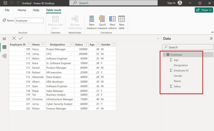
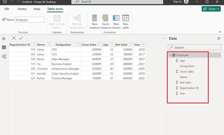
Step 1 − Open the Power BI desktop and consider the sample dataset "Employee" consisting of the six columns as highlighted below −
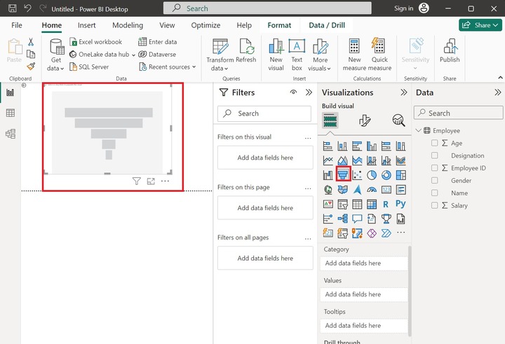
Step 2 − Move to the Report View and click on the Funnel chart. The default chart that contains no fields is shown on the canvas. Expand the size of the funnel chart for more visibility.
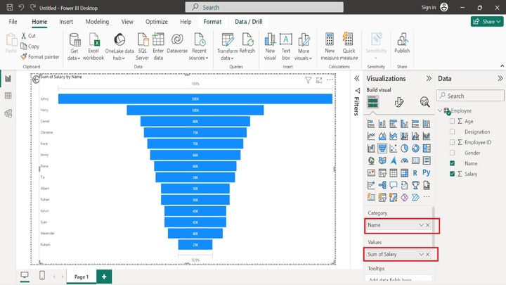
Step 3 − Select the Name column to the Category section, drag the "Salary" column, and drop it into the "Values" section like this. The final stage represents the highest salary of employee "Johny". Similarly, the initial stage denotes the lowest salary of the employee "Ruhani".
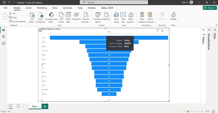
Step 4 − If you place the cursor on any of the workflows, the details of the employee like name, percentage, and salary are populated like this.
Calculating a Company's Annual Gross Sales
Step 1 − Assume the sample datasets comprises seven columns as shown below −
Step 2 − Switch to the Report View and select the "Funnel chart" in the "Visualizations" pane. The default funnel chart contains no data as shown below:

Step 3 − Now, you may add field value in the Funnel chart. Add the "Year" column to the Category, select the "Gross sales" column, and add it to the Values as highlighted below image. Each stage indicates the total percentage year-wise.
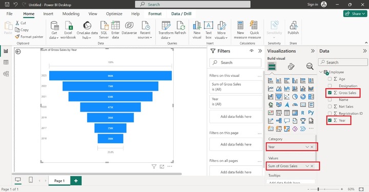
As you can observe in the above screenshot, the yearly gross sales are determined through the Funnel Chart. We can observe that the highest gross sale is in 2023 and the lowest gross sale is in 2018.
Sorting of the field value is swiftly done through the Funnel chart. Annual gross sales, exporting products to the clients, and percentage of imported items production are populated from this precious chart. The lowest stage represents the smallest value, the second lower stage depicts the second smallest value, and so on.
Radial Gauge Chart
Users can identify the critical areas of businesses after monitoring numerous KPIs and visualize them through radial gauge charts. It comprises of semi-circular arc representing a solitary value that slowly reaches a destination value. Users may set the smallest value, destination value, and largest value, add a specific field on the gauge chart, and develop a vibrant Gauge chart by employing conditional formatting. The present field value lies between the smallest and largest values on the Gauge chart.
Creating a Radial Gauge Chart in Power BI
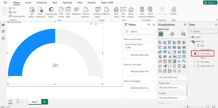
Step 1 − Consider the sample datasets named Sheet1(2) consisting of six columns that are Age, Designation, Gross Sales, Name, Net Sales, and Registration ID.
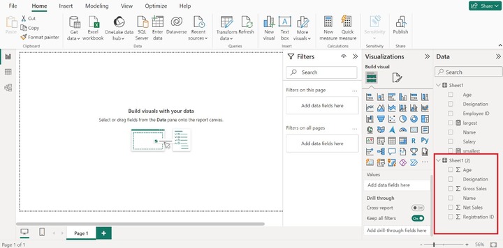
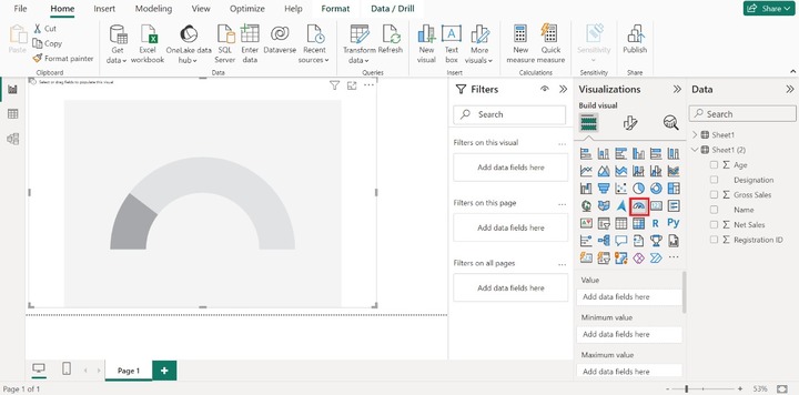
Step 2 − You may select the "Radial Gauge" chart from the "Visualization" pane. After that, a radial gauge chart would be generated that contains no data value.
Step 3 − You can insert the specific column by clicking on the Gross Sales column. The smallest value depicted on the lower left side of the chart is 0M(by default) and the largest value is 7M depicted on the lower right side of the chart. The blue part of the chart denotes the sum of the Gross Sales.
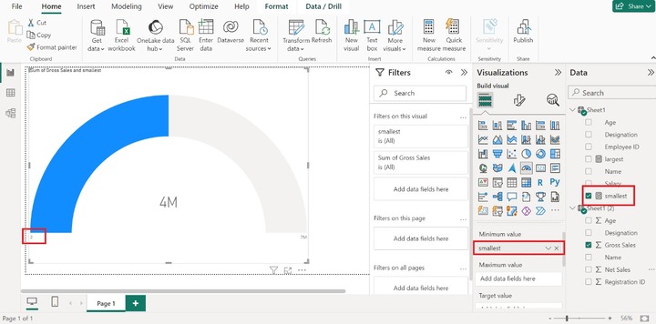
Step 4 − Suppose you want to customize the smallest value. To achieve this, click on the New measure tab and write the new measure that is "smallest =2". Now, drag the smallest measure and drop it into the "Minimum value" textbox as shown below:
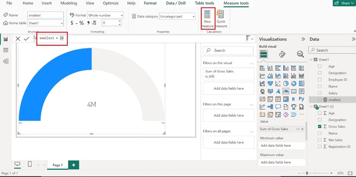
Therefore, the smallest value has been altered to 2.
Step 5 − Furthermore, you may drag the Net Sales column into the Target value textbox. The Sum of Net Sales is illustrated via line. Here, we can say that the current gross sales is 4M and the target is yet to be achieved which is 6M.
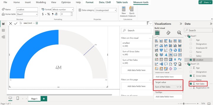
A gauge chart is an excellent way to identify the gaps between multiple dimensions in a company. Managers may also rapidly identify whether the gross sales have reached the target limit at certain intervals through this exclusive chart. If the sales targets are not achieved, then a few marketing strategies need to be changed by managers.
You can enhance the visibility and customize these charts by clicking on "Format Visual" and can modify the fill color, Gauge Axis, Background effects, Data label, etc.