- Power BI - Home
- Power BI - Introduction
- Power BI - Installation Steps
- Power BI - Architecture
- Power BI Desktop
- Power BI - Desktop
- Power BI - Desktop Window
- Power BI Service
- Power BI - Window Supported Browsers
- Power BI - Generating Reports
- Power BI Desktop Service
- Power BI - Desktop vs Service
- Power BI - Supported Data Sources
- Power BI - Comparison Tools
- Power Query Editor
- Power Query Editor - Introduction
- Power Query Editor - Data Discrepancy
- Power Query Editor - Merge Queries (Part 1)
- Power Query Editor - Merge Queries (Part 2)
- Power BI - Develop Star Schema
- Data Modeling Concepts
- Power BI - Data Modeling
- Power BI - Manage Relationships
- Power BI - Cardinality
- Power BI - Dashboard Options
- Power BI Report Visualizations
- Power BI - Visualization Options
- Power BI - Visualization Charts
- Power BI - Stacked Bar Chart
- Power BI - Stacked Column Chart
- Power BI - Clustered Chart
- Power BI - 100% Stacked Chart
- Power BI - Area Chart and Stacked Area Chart
- Power BI - Line and Stacked Column Chart
- Power BI - Line and Clustered Column Chart
- Power BI - Ribbon Chart
- Power BI - Table and Matrix Visuals
- Power BI Map Visualizations
- Power BI - Creating Map Visualizations
- Power BI - ArcGIS Map
- Power BI Miscellaneous
- Power BI - Waterfall Charts
- Funnel Charts and Radial Gauge Chart
- Power BI - Scatter Chart
- Power BI - Pie Chart and Donut Chart
- Power BI - Card and Slicer Visualization
- Power BI - KPI Visual
- Power BI - Smart Narrative Visual
- Power BI - Decomposition Tree
- Power BI - Paginated Report
- Power BI - Python Script & R Script
- Power BI - Multi-row Card
- Power BI - Power Apps & Power Automate
- Power BI - Excel Integration
- Power BI Dashboard
- Power BI - Sharing Dashboards
- Power BI Sales Production Dashboard
- Power BI - HR Analytics Dashboard
- Power BI - Customer Analytics Dashborad
- Power BI - DAX Basics
- Power BI - Administration Role
- Power BI - DAX Functions
- Power BI - DAX Text Functions
- Power BI - DAX Date Functions
- Power BI - DAX Logical Functions
- Power BI - DAX Counting Functions
- Power BI - Depreciation Functions
- Power BI - DAX Information Functions
Power BI - Stacked Column Chart
A Stacked Column chart that displays the data values in the vertically stacked rectangle without overlapping. It distinguishes a portion of the total between categories.
How to Generate a Stacked Column Chart?
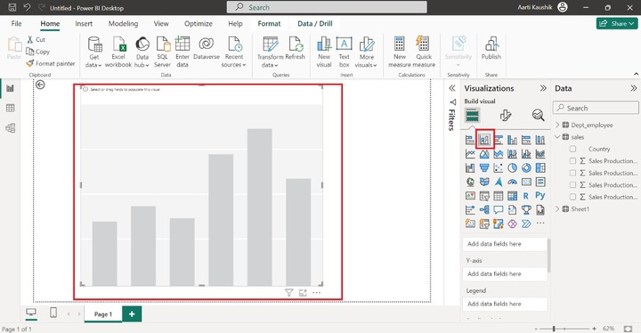
Step 1 − You can import the dataset "D:\Dataset_excel\sl.xlsx" in the BI desktop and select the "Stacked Column Chart" from the Visualizations.
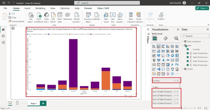
Step 2 − Now, place the "Country" into the X-axis and place the remaining fields into the Y-axis.
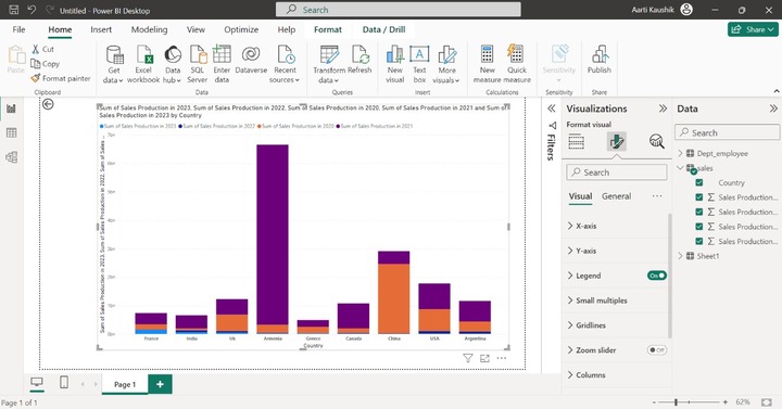
Step 3 − You can also subdivide the generated visual into multiple small charts with the help of the "Small multiples". You can add the "Country" into the "Small Multiples".
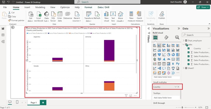
As you can observe in the screenshot, multiple small visuals have been generated that separate all countries' sales production.
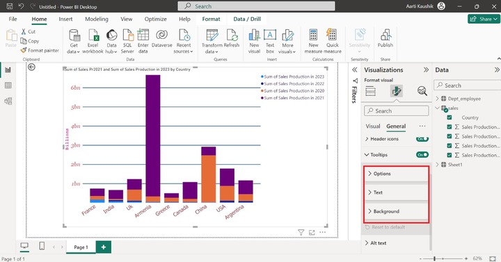
Step 4 − Suppose you want to see the information related to the "Sum of sales production in 2023" when hovering over the specific data bar. You may utilize the Toolstips section where you can add the field to get its details.
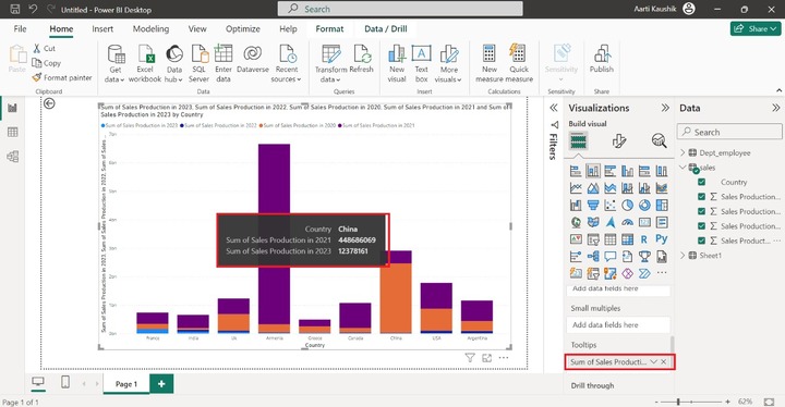
Here, you can notice in the screenshot, that the detail of "Sum of Sales Production in 2023" is also displayed while placing a cursor over the specific bar.
How to Format a Stacked Column Chart?
You can format the designated Stacked Column chart to enhance its appearance and make it more vibrant. You need to click on the "Format Visual" where multiple options are presented.
Step 1 − X-axis contains three further sub-sections "Values, "Title", and "Layout". Click on the X-axis tile and then expand the "Values". You can alter the Font style to "Tahoma", set the font size to 16, select "Italic" and choose the specified color from the list.

Here, you can observe in the screenshot, the X-axis data styling has been modified.
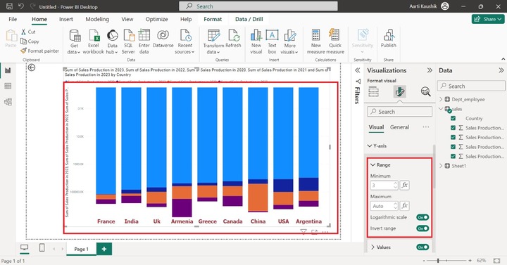
Step 2 − You can expand the Y-axis and click on the "Range" where the starting and ending values can be set in the "Minimum" and "Maximum" sections. Turn on the "Logarithmic scale" and "Invert range".
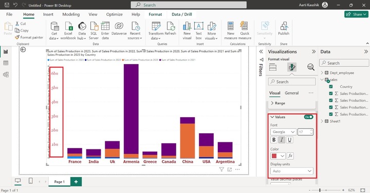
Now you can expand the "Values" tile and set the Font style to "Georgia", increase the font size to 17, choose "Italic" and choose the specified color from the given color list.
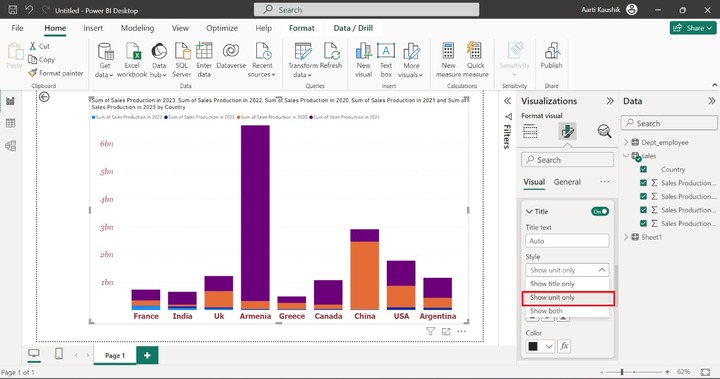
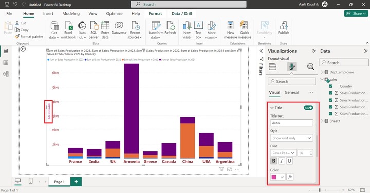
Step 3 − Similarly, you can modify the title of the Y axis by expanding the "Title" subsection. For example, click on the "Show unit only" under the Style section.
You can also alter the Font style to "Courier New" and the set the font size to 14 and change the pink color.
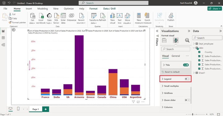
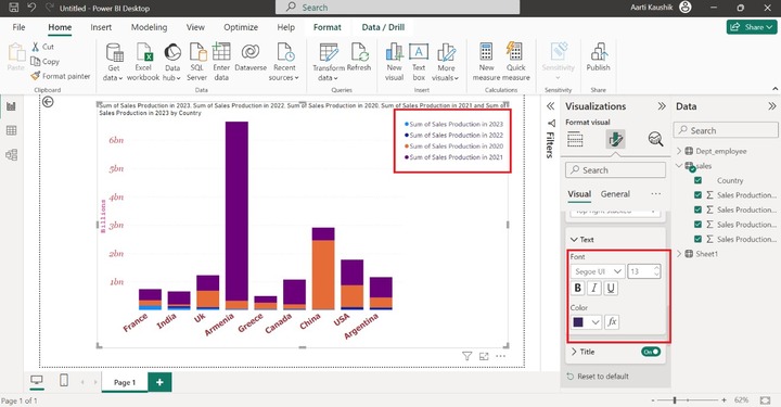
Step 4 − If you dont wish to see the Legend on the chart then you can turn off the "Legend" button.
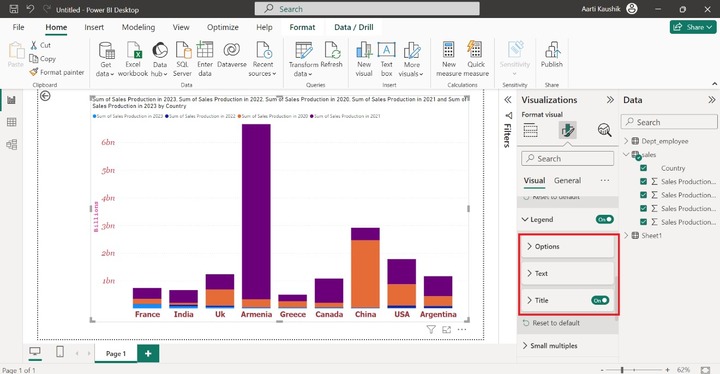
Legends comprise three options "Options", "Text" and "Title".
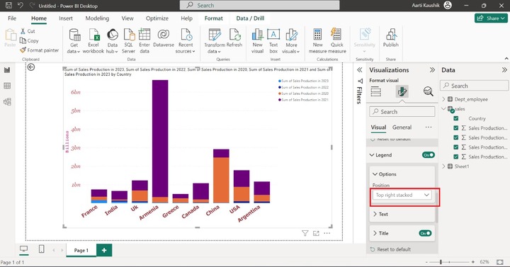
You may expand the "Options" tile and select the "Top right Stacked" under Position to alter its placement.
You can also modify the text styling, size, and color of the legends as you did in the previous step.
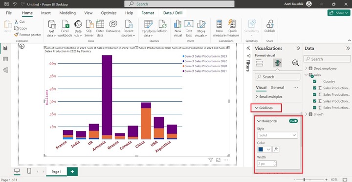
Step 5 − You can alter the Gridlines style. Click on the Gridlines, select "Solid" under "Horizontal" and then modify its color, and set its width to "2px".
Step 6 − The selected field color can be modified once you expand the "Column" tile, choose the "Sum of sales production in 2021" from the drop-down list, and select the desired color.
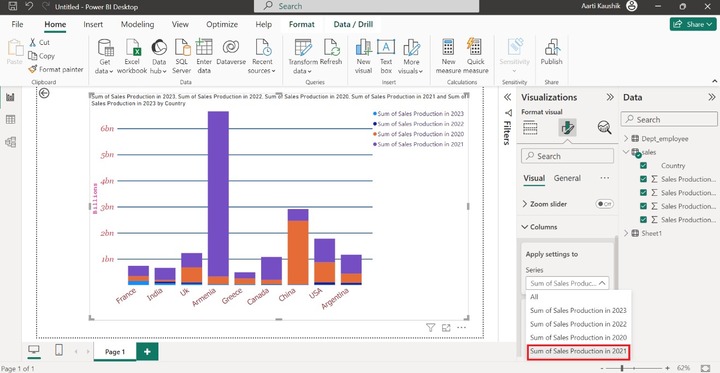
As you can notice in the screenshot, the color of the "Sum of sales production in 2021" field has been altered.
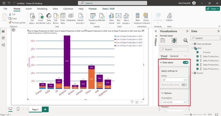
Step 7 − Turn on the "Data labels" button and select "All" under the "Series" section and by default, orientation is Horizontal. You can modify the Orientation to "Vertical" under the Options tile. Note that overlap text is not displayed on the series.
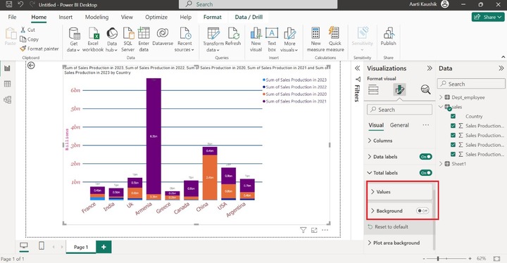
Step 8 − If you wish to see the total value of the series, then you may turn on the "Total labels" button which consists of two sections "Values" and "Background". You may change the font style and its color under the Values option.
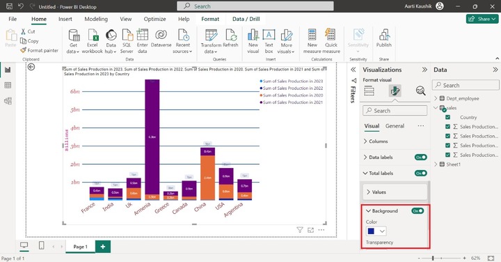
You can Turn on the "Background" button and alter its color.
Step 9 − You may navigate to the "General" tab where you can increase or decrease the height and width of the page.

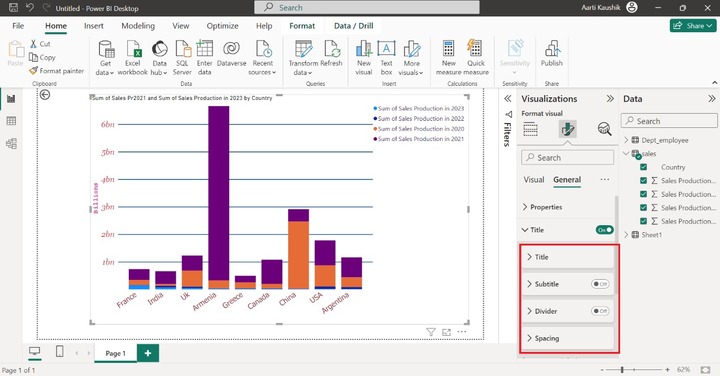
Step 10 − You may turn off the title button to hide the title from the visual.

Expand the title tile that consists of various sub-sections like "Title", "Subtitle", "Divider", and "Spacing".
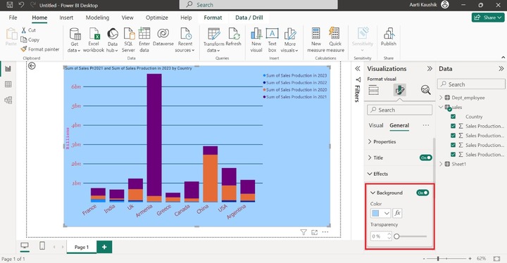
Step 11 − If you wish to change the background of the canvas, then expand the "Effects" tile and choose the desired color under the "Background" section.
Step 12 − Tooltips comprise three sections "Options", "Text" and "Background". You can customize the tooltips through these options.
Lets change the background of the Tooltips. You can expand the Background tile and select the respective color under "Color" as shown below −
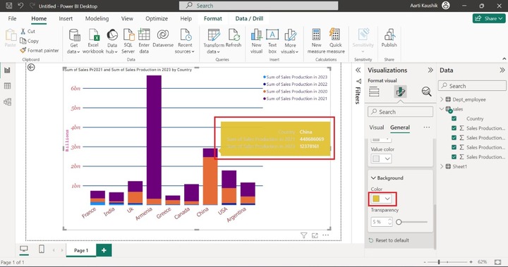
As you can notice in the screenshot, the background color of the Tooltips has been changed.