- Power BI - Home
- Power BI - Introduction
- Power BI - Installation Steps
- Power BI - Architecture
- Power BI Desktop
- Power BI - Desktop
- Power BI - Desktop Window
- Power BI Service
- Power BI - Window Supported Browsers
- Power BI - Generating Reports
- Power BI Desktop Service
- Power BI - Desktop vs Service
- Power BI - Supported Data Sources
- Power BI - Comparison Tools
- Power Query Editor
- Power Query Editor - Introduction
- Power Query Editor - Data Discrepancy
- Power Query Editor - Merge Queries (Part 1)
- Power Query Editor - Merge Queries (Part 2)
- Power BI - Develop Star Schema
- Data Modeling Concepts
- Power BI - Data Modeling
- Power BI - Manage Relationships
- Power BI - Cardinality
- Power BI - Dashboard Options
- Power BI Report Visualizations
- Power BI - Visualization Options
- Power BI - Visualization Charts
- Power BI - Stacked Bar Chart
- Power BI - Stacked Column Chart
- Power BI - Clustered Chart
- Power BI - 100% Stacked Chart
- Power BI - Area Chart and Stacked Area Chart
- Power BI - Line and Stacked Column Chart
- Power BI - Line and Clustered Column Chart
- Power BI - Ribbon Chart
- Power BI - Table and Matrix Visuals
- Power BI Map Visualizations
- Power BI - Creating Map Visualizations
- Power BI - ArcGIS Map
- Power BI Miscellaneous
- Power BI - Waterfall Charts
- Funnel Charts and Radial Gauge Chart
- Power BI - Scatter Chart
- Power BI - Pie Chart and Donut Chart
- Power BI - Card and Slicer Visualization
- Power BI - KPI Visual
- Power BI - Smart Narrative Visual
- Power BI - Decomposition Tree
- Power BI - Paginated Report
- Power BI - Python Script & R Script
- Power BI - Multi-row Card
- Power BI - Power Apps & Power Automate
- Power BI - Excel Integration
- Power BI Dashboard
- Power BI - Sharing Dashboards
- Power BI Sales Production Dashboard
- Power BI - HR Analytics Dashboard
- Power BI - Customer Analytics Dashborad
- Power BI - DAX Basics
- Power BI - Administration Role
- Power BI - DAX Functions
- Power BI - DAX Text Functions
- Power BI - DAX Date Functions
- Power BI - DAX Logical Functions
- Power BI - DAX Counting Functions
- Power BI - Depreciation Functions
- Power BI - DAX Information Functions
Power BI - Table and Matrix Visuals
Developing a table in a BI desktop is one of the easiest ways, you may either create a table manually and then manually do the entries or utilize the Table/Matrix visual where data is being displayed in the table. When you create a new measure then its expression is evaluated, and its result can be visualized through Table/Matrix visual.
How to Create a Table in Power BI?
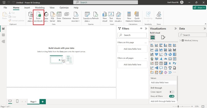
Step 1 − Open the BI desktop and select the "Excel workbook" to import the dataset "D:\emi.xlsx".
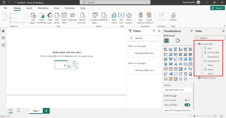
Step 2 − You can see the field names of the "Current_EMI" table in the Data pane.
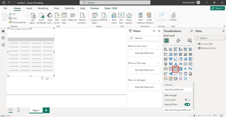
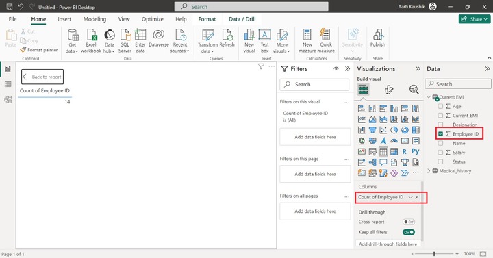
Step 3 − Now, you can select the "Table" visual. The default visual would be displayed and better to expand its size.
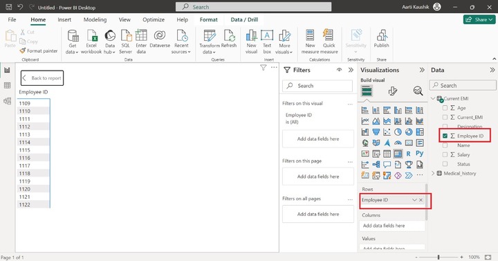
Step 4 − Place the "Employee ID" into the "Columns" section. As you can observe in the screenshot, "Count of Employee ID" is populated on the canvas despite of the individual Employee IDs.
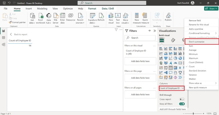
Step 5 − You may click on the "Count of Employee ID" and select the "Dont summarize" option.
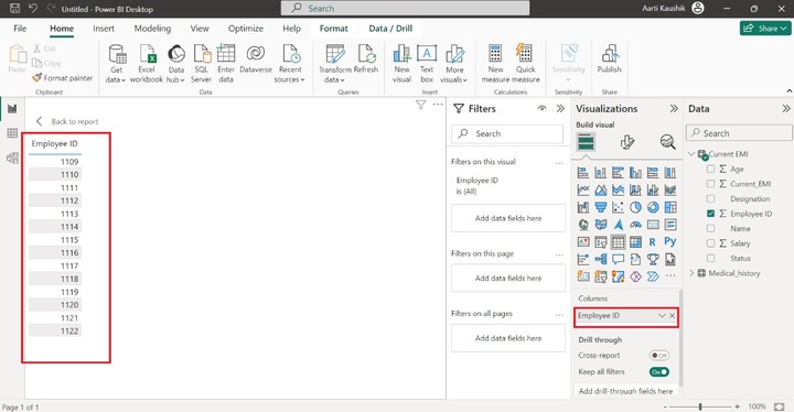
As you can notice in the screenshot, the Employee ID field along with values are displayed.
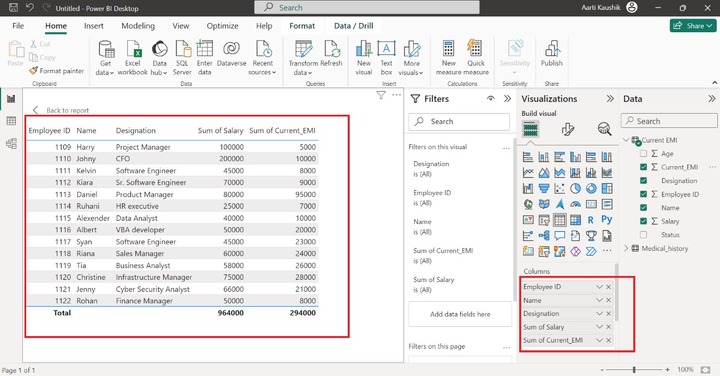
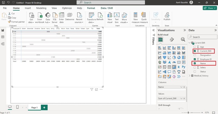
Similarly, add "Name", "Designation", "Salary", "Current_EMI" fields into the Columns section. You may select the "Dont summarize" option for "Salary" and "Current_EMI" fields.
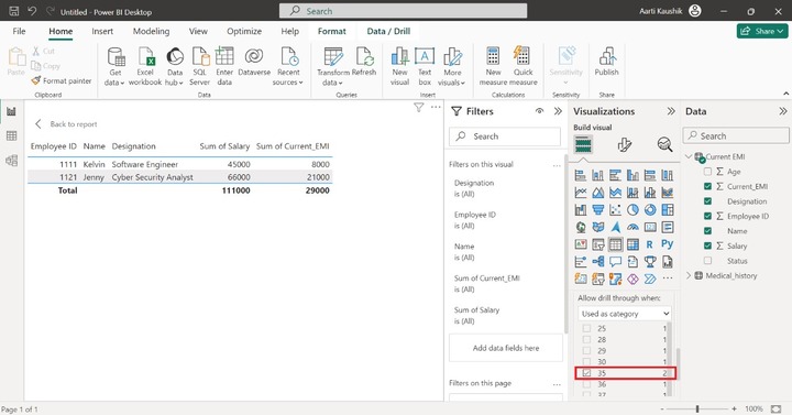
Is there a possibility to filter employee table based on their Age field?
Yes, With the aid of Drill Through, you may place the "Age" field into it. And select the "Used as category" where you can choose the specific age of the employee and view their details.
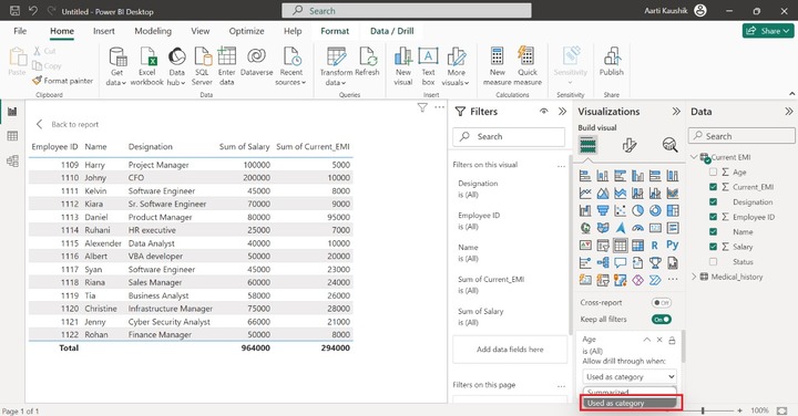
For example: You can click on the 35 checkbox, only two employees details whose age is 35 are displayed on the canvas.
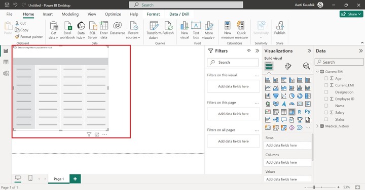
How to Create a Matrix in BI Desktop?
Matrix visuals contains three main section Rows, Columns and Values. You may add the desired fields into them.
Step 1 − You can select the "Matrix" visual just adjacent to the Table visual.
Step 2 − The default Matrix with no values has been inserted on the Report Canvas.
Step 3 − Drag and drop the "Employee ID" field into the "Rows" where Employee ID field become a column heading and all its field values becomes rows.
Step 4 − You may place the "Name" field into Columns section and place the "Current_EMI" field into Values. Therefore, the matrix has been generated which is slightly different from the Table visual.
Step 5 − Could you answer the following questions?
- How many employees whose designation is Software Engineer?
- What is the age of Harry?
Yes, with the help of the Drill through the section, you can filter the generated Matrix.
Let's add the "Designation" field into the "Drill through" and then select the "Used as category" under the "Allow drill through when:" part.
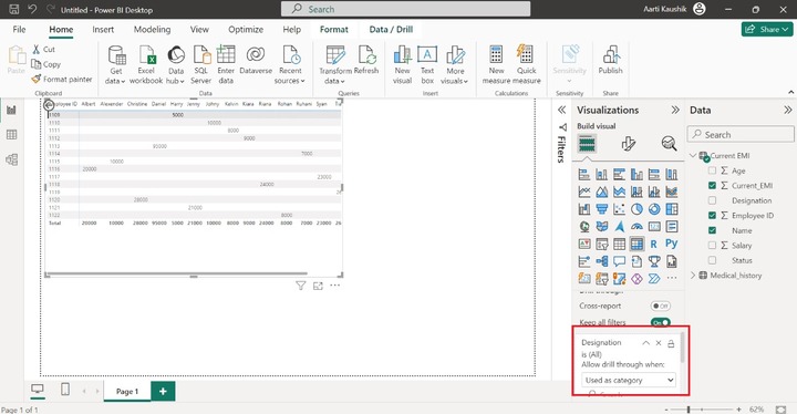
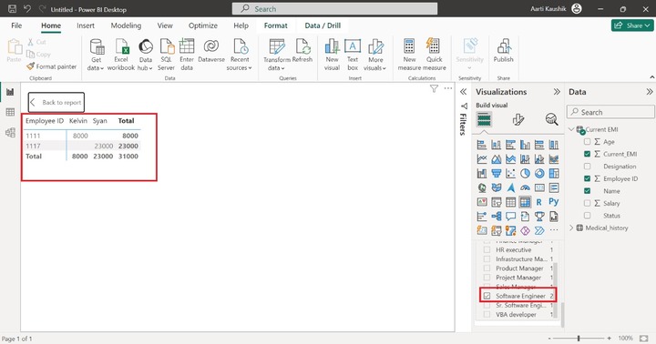
You may choose the "Software Engineer" from the listed category. Once you have selected the filtered designation, the list of employees whose designation is a Software Engineer will be populated on the canvas.
How to Format a Matrix?
You may select the "Format your visual" where you can customize the designated Matrix.
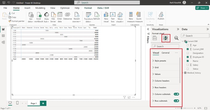
Lets elaborate each section sequentially.
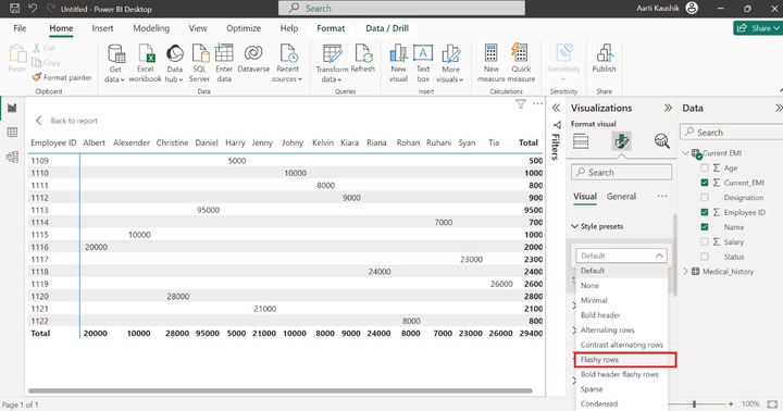
Style Presets
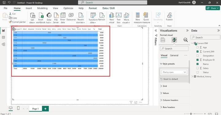
You can change the style of Matrix, just expand the "Style presets" tile and select the "Flashy rows" to make rows more colorful.
As you can notice in the screenshot, the attractive rows have been displayed.
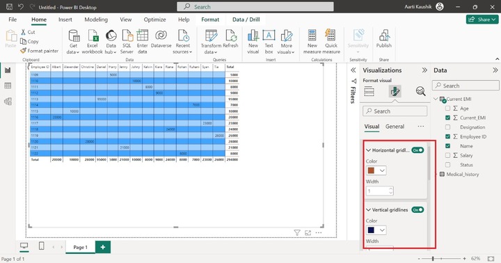
Grid
You may turn on the horizontal and vertical gridlines and alter their color by expanding the tiles and selecting the desired color.
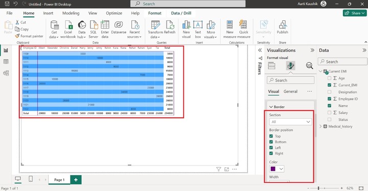
Borders
You can expand the "Border" tile and select any of the available options like "All", "Column header" etc.
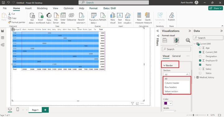
Lets select "All" and tick all the border positions Top, Bottom, Left, and Right to set border lines for the Matrix and you can also modify the default color of the border lines.
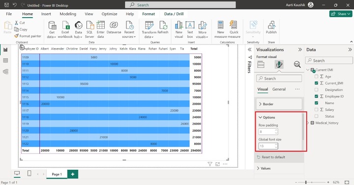
Options
In the designated matrix, Row padding can be altered through the Row padding option and increase change the global font size so that you can see the data values with more clarity.
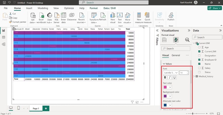
Values
You can change the Font style, Font size, Font color, Text color, Background color, and Alternate text color to make the Matrix more colorful.
Column Headers
Similarly, you can modify the field style and its size and change the default text color and its background color.
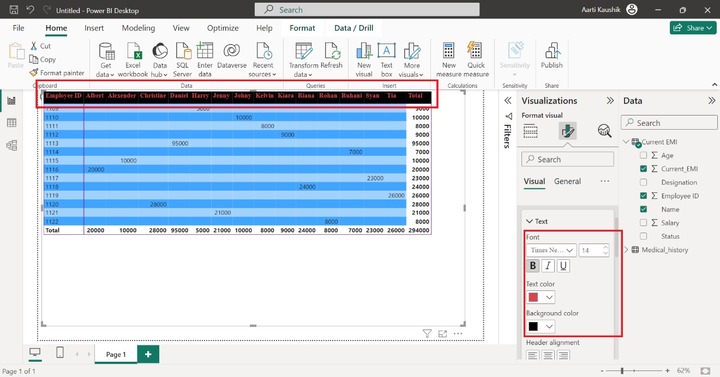
As you can observe in the screenshot, the column header text and background styling has been changed.
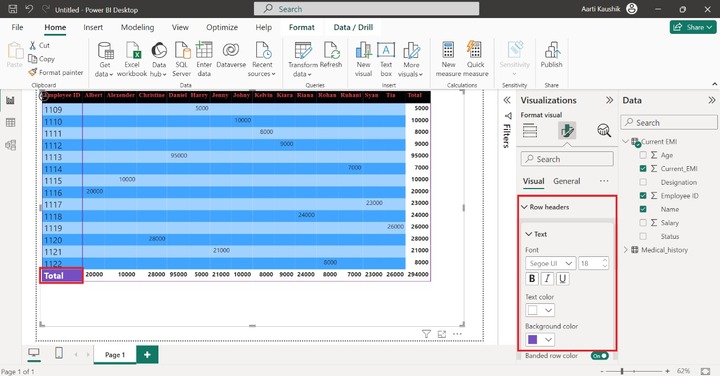
Row Headers
You can click on the "Row headers" and expand the "Text" tile to alter the styling of row headers.
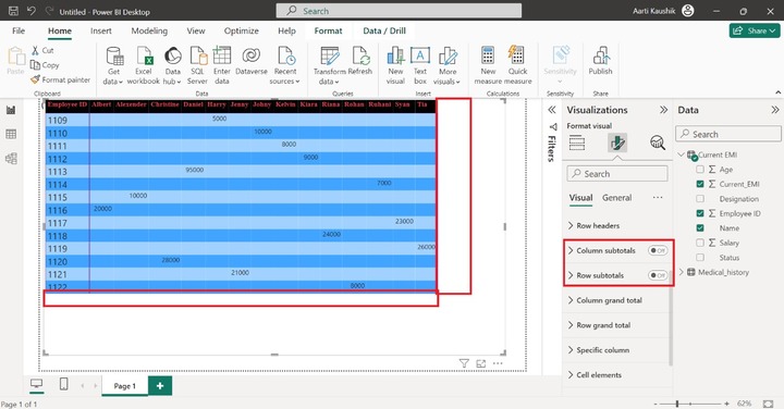
Column Subtotals and Row Subtotals
You may turn off the column and row subtotals through these options. As you can observe in the screenshot, column subtotals and row subtotals are hidden in the visual.
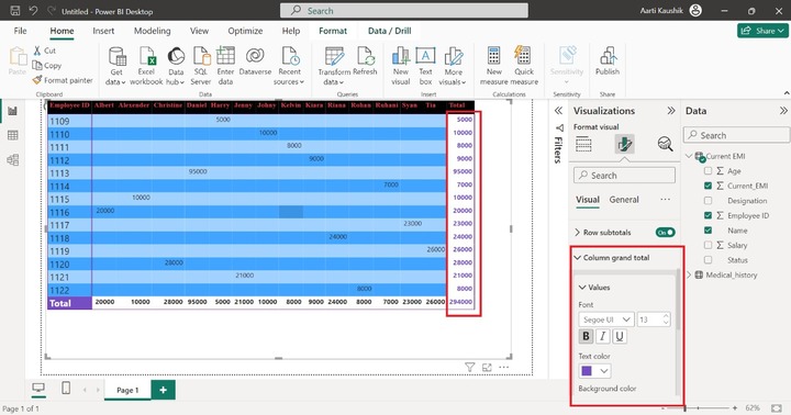
Column Grand Total
You may modify the font style, modify its default size, and change the color of the column total. As you can notice in the screenshot, the styling of the Column total has been altered.
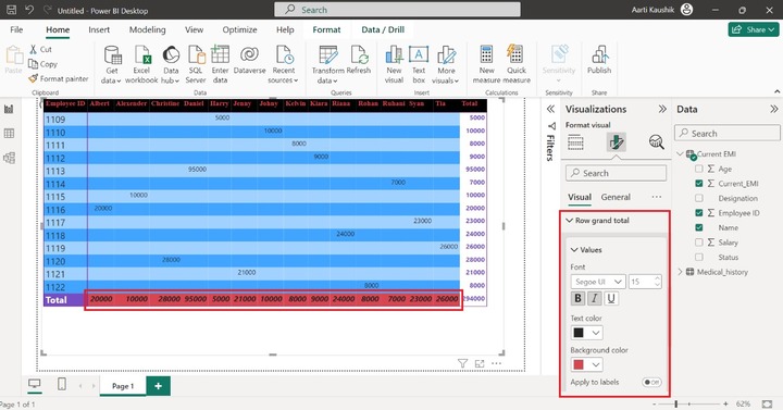
Row Grand Total
Click on the Row grand total section, expand the Values tile, set the Font size to 15, and alter the Background color.
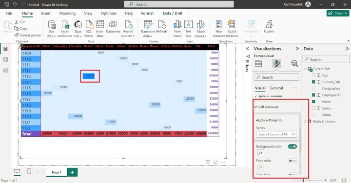
Cell Elements
You may specify distinct formatting under various constraints to cell elements. You may set the conditional formatting by clicking on fx. Turn on the "Background color". After that, the highest data value background color will be changed to blue color.