- Power BI - Home
- Power BI - Introduction
- Power BI - Installation Steps
- Power BI - Architecture
- Power BI Desktop
- Power BI - Desktop
- Power BI - Desktop Window
- Power BI Service
- Power BI - Window Supported Browsers
- Power BI - Generating Reports
- Power BI Desktop Service
- Power BI - Desktop vs Service
- Power BI - Supported Data Sources
- Power BI - Comparison Tools
- Power Query Editor
- Power Query Editor - Introduction
- Power Query Editor - Data Discrepancy
- Power Query Editor - Merge Queries (Part 1)
- Power Query Editor - Merge Queries (Part 2)
- Power BI - Develop Star Schema
- Data Modeling Concepts
- Power BI - Data Modeling
- Power BI - Manage Relationships
- Power BI - Cardinality
- Power BI - Dashboard Options
- Power BI Report Visualizations
- Power BI - Visualization Options
- Power BI - Visualization Charts
- Power BI - Stacked Bar Chart
- Power BI - Stacked Column Chart
- Power BI - Clustered Chart
- Power BI - 100% Stacked Chart
- Power BI - Area Chart and Stacked Area Chart
- Power BI - Line and Stacked Column Chart
- Power BI - Line and Clustered Column Chart
- Power BI - Ribbon Chart
- Power BI - Table and Matrix Visuals
- Power BI Map Visualizations
- Power BI - Creating Map Visualizations
- Power BI - ArcGIS Map
- Power BI Miscellaneous
- Power BI - Waterfall Charts
- Funnel Charts and Radial Gauge Chart
- Power BI - Scatter Chart
- Power BI - Pie Chart and Donut Chart
- Power BI - Card and Slicer Visualization
- Power BI - KPI Visual
- Power BI - Smart Narrative Visual
- Power BI - Decomposition Tree
- Power BI - Paginated Report
- Power BI - Python Script & R Script
- Power BI - Multi-row Card
- Power BI - Power Apps & Power Automate
- Power BI - Excel Integration
- Power BI Dashboard
- Power BI - Sharing Dashboards
- Power BI Sales Production Dashboard
- Power BI - HR Analytics Dashboard
- Power BI - Customer Analytics Dashborad
- Power BI - DAX Basics
- Power BI - Administration Role
- Power BI - DAX Functions
- Power BI - DAX Text Functions
- Power BI - DAX Date Functions
- Power BI - DAX Logical Functions
- Power BI - DAX Counting Functions
- Power BI - Depreciation Functions
- Power BI - DAX Information Functions
Power BI - Ribbon Chart
What is a Ribbon Chart?
It is used to provide the relationship between the categorical field and the numeric field. The vibrant ribbons are used to depict the distinct categories/multiple selected fields that are stacked over each other. The category that contains a larger sales value has a larger ribbon width over the specific X-axis value.
How to Generate the Ribbon Chart?
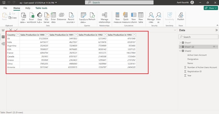
Step 1 − The structure of the loaded Excel workbook is shown in the screenshot.
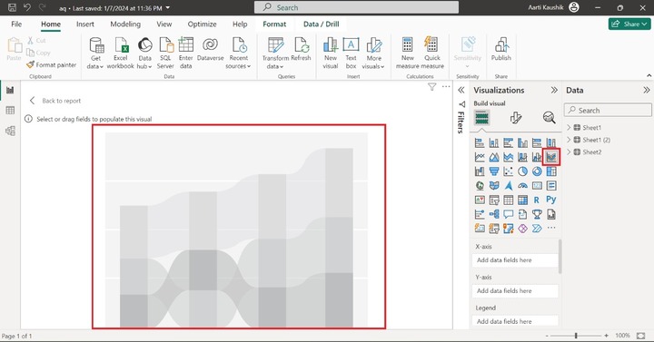
Step 2 − You can navigate to the "Report View" and click on the "Ribbon chart" to build it on the Report. The empty ribbon chart has been displayed on the canvas.
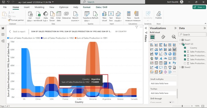
Step 3 − You can add the "Country" field to the "X-axis" and add the "Sales Production in 1990", "Sales Production in 1992", and "Sales Production in 1991" to the "Y-axis".
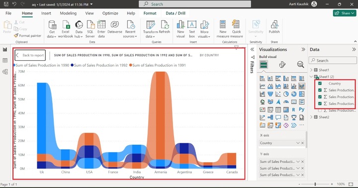
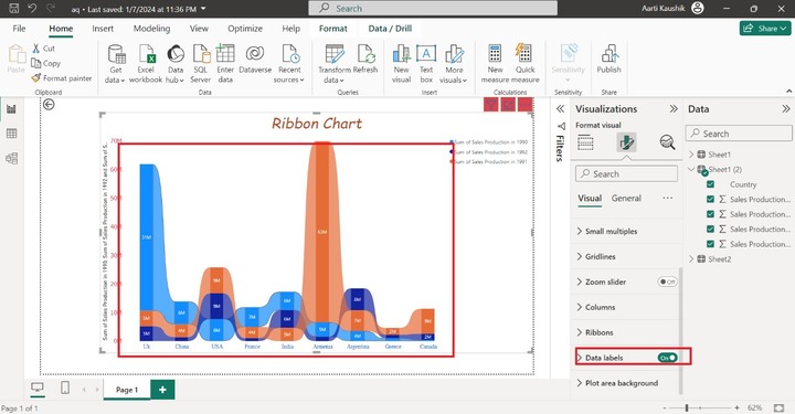
In the screenshot, the colorful ribbon chart has been displayed representing the sum of "Sales Production in 1990", "Sales Production in 1992", and "Sales Production in 1991" by country.
Step 4 − You can utilize the "Small multiples" to see the aggregate production of the individual country separately. Add the "Country" to the "Small multiples". As you may observe in the screenshot, different charts have been generated that show the Sales production in different years of countries. For example, the total sales production of Armenia country is more than the total sales production of Argentina country.
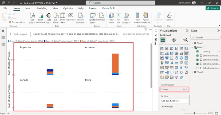
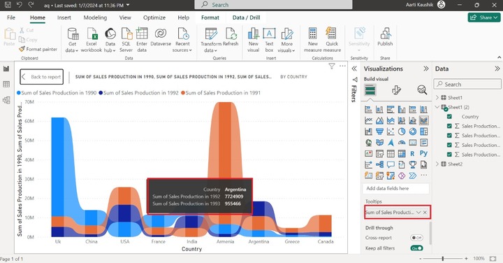
Step 5 − Once you hover over the "Argentina" country, only "Country Name" and "Sum of sales production in1992" relative information is displayed. You can add more detailed information about other fields by adding a specific field to the "Tooltips" section.
For instance, you may add "Sales production in 1993" to the "Tooltips" section to see the Sales production for the 1993 year.
How to Format a Ribbon Chart?
Formatting the Ribbon chart becomes a necessity for business analysts to customize it according to their client requirement. You can switch to the "General" tab where multiple options are available.
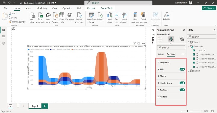
You can expand the "Properties" tile and increase/decrease the "Height" and "Width" of the report page under "Size".
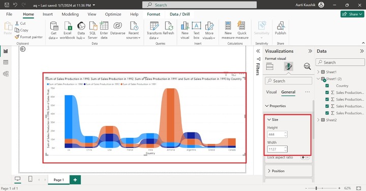
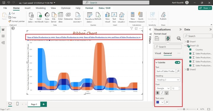
You can click on the "Title" and enter the desired text "Ribbon Chart", alter the font style to "Comic Sans MS" and set the font size to "29" and choose the specific text color under the "Text color" section to change the titles default name and style.

You can turn on the "Subtitle" button and select "Heading 2" from the list under "Heading", select "Italic" and choose the blue color from the drop-down list to change the text color.
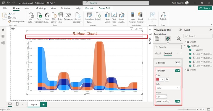
Once you turn the "Divider" button which inserts the delimiter between the Title "Ribbon Chart" and the remaining portion of the Visual. You can click on the "Divider" tile to change the color from the drop-down menu and choose "Solid" from the list under Style.
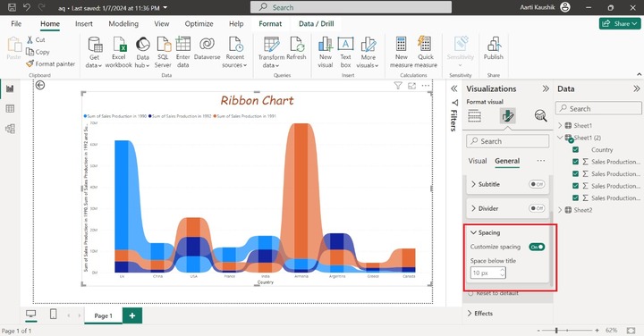
You can increase the Space just below the title. Expand the "Spacing" tile and set 10 px under "Space below the title" section.
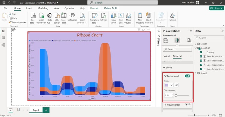
The next option "Effects" comprise three options "Background", "Visual border" and "Shadow".
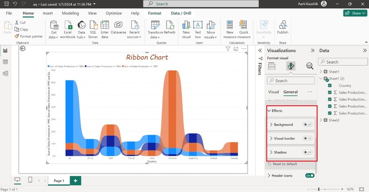
You can expand the "Background" and select the desired color from the drop-down list.
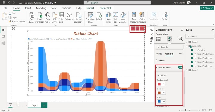
Turn on the "Header icons" button and change the "Background", "Border" and "Icon" colors to improve its appearance.
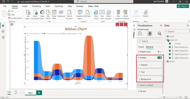
The "Tooltips" consist of three sections "Options", "Text", and "Background".
You can click on the "Text" where you can chanhe the font style to "Georgia" and set size to 9. Select the "#a8337d" color under the "Label color" section and choose the "#D9B300" color from the "Value color" section.
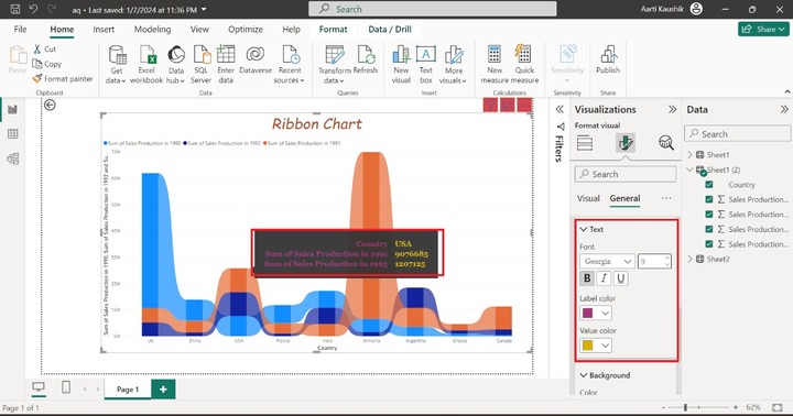
As you can observe in the screenshot, the tooltip font style and color have been changed.
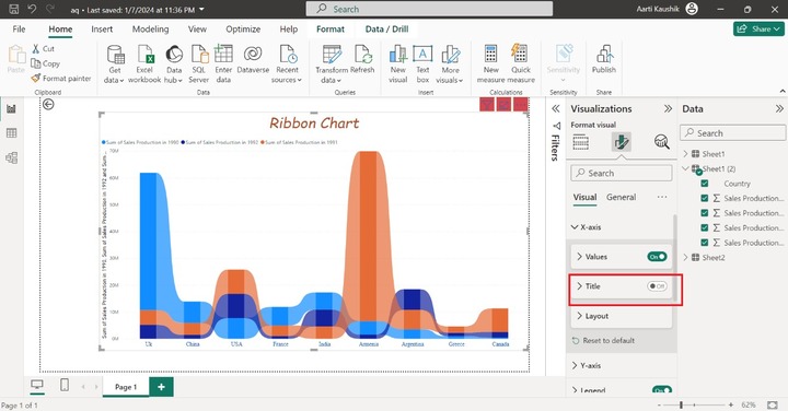
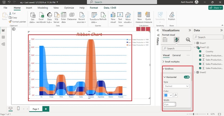
Now you can navigate to the Visual tab where so many options are available like X-axis, Y-axis, Legends, Small Multiples, Gridlines, and so on.
You may click on the X-axis, expand the "Values" tile, set the "Font" style to "Times New Roman" and set the size to 11. Select the blue color from the drop-down menu under the "Color" section.

A title that is "Country" of the X axis can be hidden by turning off the "Title" button.
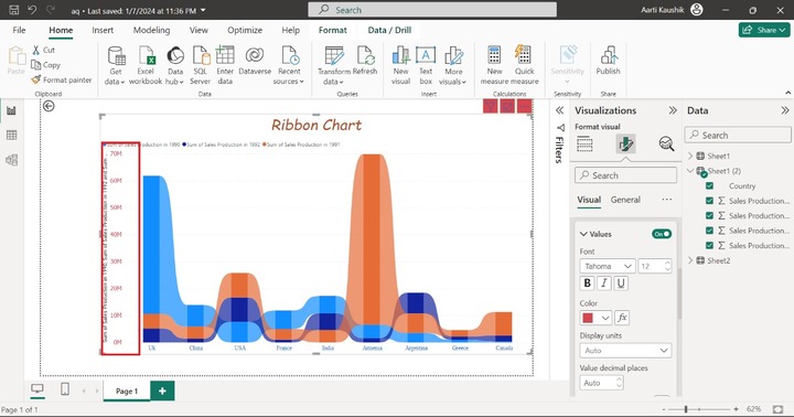
Similarly, click on the Y-axis, expand the "Values" tile, modify the "Font" style to "Tahoma" and change the default size to 12. Choose the desired color under the "Color" section.
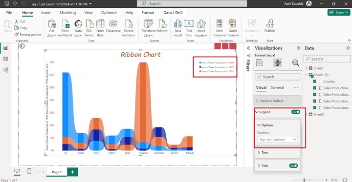
You may click on the "Legend" and select the "Top right stacked" under Options to change the legends position on the visuals.
Gridlines comprise a "Horizontal" option. Turn on the "Horizontal" button and expand it, click on the "Dashed" style, choose the "blue" color under the "Color" label, and set the 4 px to Width.
You can select the Ribbon section to change its color, transparency, or its boundary.
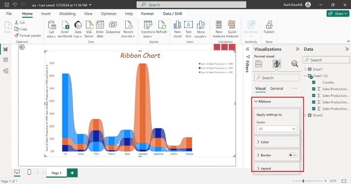
You can turn on the "Data labels" button to view them on every segment of the Ribbon chart.