- Power BI - Home
- Power BI - Introduction
- Power BI - Installation Steps
- Power BI - Architecture
- Power BI Desktop
- Power BI - Desktop
- Power BI - Desktop Window
- Power BI Service
- Power BI - Window Supported Browsers
- Power BI - Generating Reports
- Power BI Desktop Service
- Power BI - Desktop vs Service
- Power BI - Supported Data Sources
- Power BI - Comparison Tools
- Power Query Editor
- Power Query Editor - Introduction
- Power Query Editor - Data Discrepancy
- Power Query Editor - Merge Queries (Part 1)
- Power Query Editor - Merge Queries (Part 2)
- Power BI - Develop Star Schema
- Data Modeling Concepts
- Power BI - Data Modeling
- Power BI - Manage Relationships
- Power BI - Cardinality
- Power BI - Dashboard Options
- Power BI Report Visualizations
- Power BI - Visualization Options
- Power BI - Visualization Charts
- Power BI - Stacked Bar Chart
- Power BI - Stacked Column Chart
- Power BI - Clustered Chart
- Power BI - 100% Stacked Chart
- Power BI - Area Chart and Stacked Area Chart
- Power BI - Line and Stacked Column Chart
- Power BI - Line and Clustered Column Chart
- Power BI - Ribbon Chart
- Power BI - Table and Matrix Visuals
- Power BI Map Visualizations
- Power BI - Creating Map Visualizations
- Power BI - ArcGIS Map
- Power BI Miscellaneous
- Power BI - Waterfall Charts
- Funnel Charts and Radial Gauge Chart
- Power BI - Scatter Chart
- Power BI - Pie Chart and Donut Chart
- Power BI - Card and Slicer Visualization
- Power BI - KPI Visual
- Power BI - Smart Narrative Visual
- Power BI - Decomposition Tree
- Power BI - Paginated Report
- Power BI - Python Script & R Script
- Power BI - Multi-row Card
- Power BI - Power Apps & Power Automate
- Power BI - Excel Integration
- Power BI Dashboard
- Power BI - Sharing Dashboards
- Power BI Sales Production Dashboard
- Power BI - HR Analytics Dashboard
- Power BI - Customer Analytics Dashborad
- Power BI - DAX Basics
- Power BI - Administration Role
- Power BI - DAX Functions
- Power BI - DAX Text Functions
- Power BI - DAX Date Functions
- Power BI - DAX Logical Functions
- Power BI - DAX Counting Functions
- Power BI - Depreciation Functions
- Power BI - DAX Information Functions
Power BI - Multi-row Card
The single-row card visual is slightly different from the multi-row card. Single-row card visual is employed to display only a single computed value. Multi-row card consists of multiple rows where details of selected field values are showcased in a single card. Field values associated data is grouped.
How to Generate a Multi-row Card Visualization?
Step 1 − You may choose the sample dataset and select the multi-row card visual from the Visualizations. The default multi-row card is embedded in the report that contains no field values.
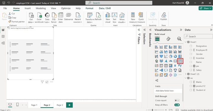
Step 2 − You may place the "Name", "Designation", "Salary" and "Incentive" into the "Fields" section.
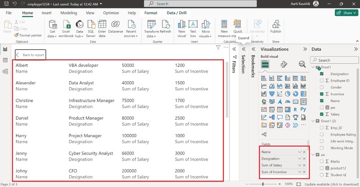
As you can notice in the screenshot, the list of various names and their designation, salary, and incentives are listed on the multi-row card.
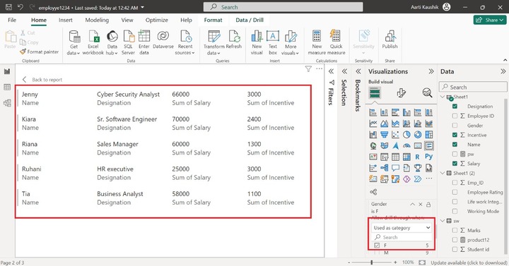
Step 3 − You can also filter the data through the Drill through section. Let's place the "Gender" field into "Drill through" and select the "Used as category". You may tick on the "F(Female)" checkbox that populates female employees on the canvas.
How to Customize Multi-row Card?
To make the multi-row card more interactive and stunning, you may change the default formatting of the multi-row card.
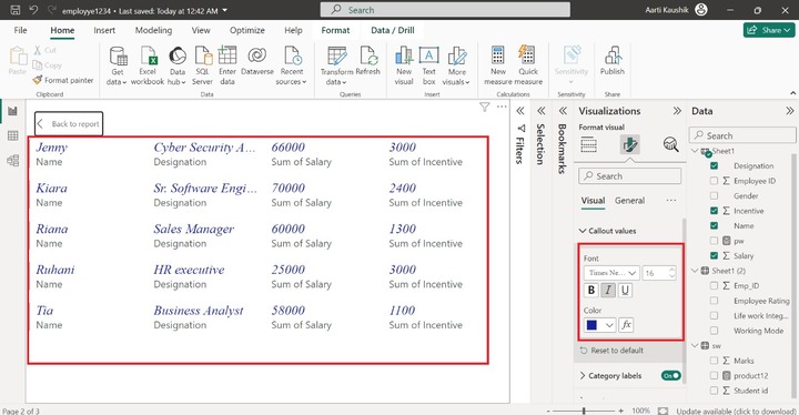
Step 1 − You may click on the "Format Visual" that comprises two tabs named "Visual" and "General". The "Visual" comprises three options "Callout values", "Category labels" and "Cards". Callout values indicate the field values. You may select the "Times New Roman" font style, set the font size to 16, select the "Italics" and choose the desired font color from the drop-down list under "Color".
Step 2 − You may expand the "Category labels" and alter the font style to "Georgia" and choose the font size to 10. You can also select the "Italic" and desired font color from the drop-down list under "Color".
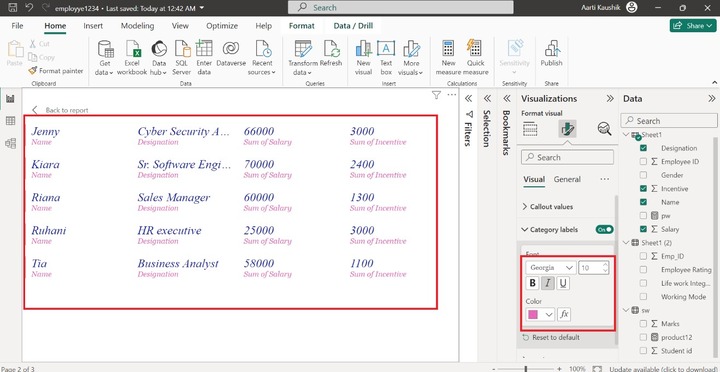
As you can notice in the screenshot, the styling of the category labels means field name styling has been modified.
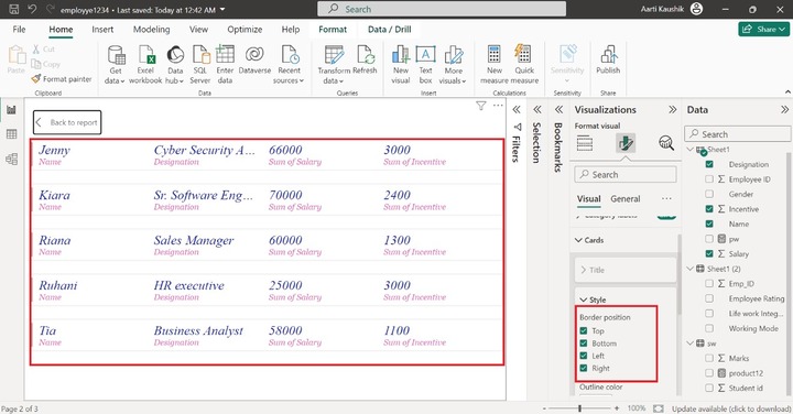
Step 3 − Cards consist of three sub-section named "Title", "Style" and "Accent bar". You may expand the "Style" tile and select the "Top", "Bottom", "Left" and "Right" checkboxes to develop the boundary among all the rows.
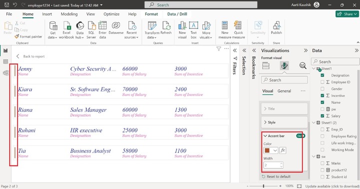
Step 4 − You can also change the color and Width of the Accent Bar. Select the "#ad5129" color from the drop-down menu and increase the width to the 2. Therefore, the color of the Accent bar has been changed.
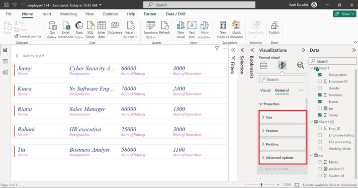
Step 5 − The General tab comprises the various options "Properties", "Title", "Effects", "Header" Icons, "Alt text".
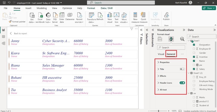
Step 6 − You can expand the "Properties" tile that consists of the "Size", "Position", "Padding" and "Advanced options".
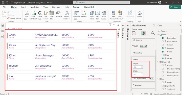
Step 7 − You may expand the "Size" tile and increase the Height to "681" and Width to "935" of the canvas.
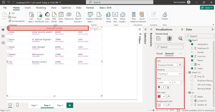
Step 8 − You may turn on the "Title" option, expand this tile, and write the "Employee Details" in the textbox. Select "Heading 5" for the given list under "Heading". You may select "Calibri" from the drop-down list under "Font" and set the font size to 17. Click on the "Italics" style. You can choose the "#d64550" color under the "Text" and select the "f5c4af" color from the given theme colors under the "Background color". Then you may click on the "Center" horizontal alignment.
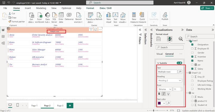
Step 9 − You can turn on the "Subtitle" button and write the "Multiple rows" in the textbox. Select the "Heading 2" under "Heading". You may alter the font style to "Tahoma" under "Font" and increase the font size to 11. You can select the "Italics" style and choose the desired color under the "Text color". You may select the "Center" horizontal alignment.
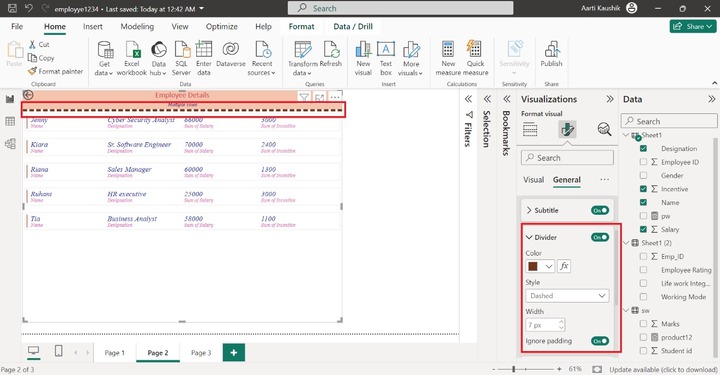
Step 10 − You may turn the "Divider" button that inserts the delimiter between the header part and the first row. Select the "#73361c" color to alter the divider color, select the "Dashed" under "Style" and increase the Width to "7 px".
Step 11 − You can click on "Effects" and turn on the "Background" button, select the light pink color from the given list.
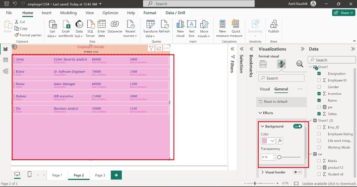
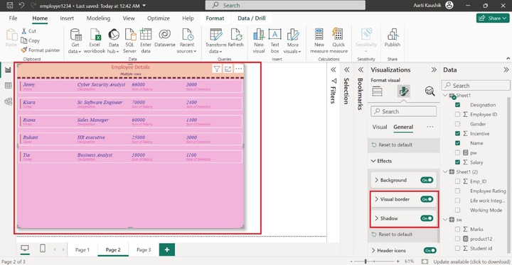
As you can notice in the screenshot, the background of the multi-row card visual has been changed. Similarly, you may turn on the "Visual border" and "Shadow" buttons to enable these features on the visual.
Step 12 − You can expand the "Header icons" and click on the "Color" tile to alter the desired background color, Border color, and Icon color from their respective drop-down list.
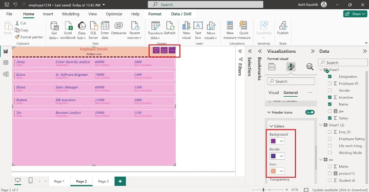
As you can observe in the screenshot, the styling of the header icons has been changed.
The alt text section can be chosen by the users where they can write a brief introduction related to the generated visual so that the reader can see the Alt text only after installing the narrator in the local system. Once it is activated, only the local system dictates the Alt text.