- Power BI - Home
- Power BI - Introduction
- Power BI - Installation Steps
- Power BI - Architecture
- Power BI Desktop
- Power BI - Desktop
- Power BI - Desktop Window
- Power BI Service
- Power BI - Window Supported Browsers
- Power BI - Generating Reports
- Power BI Desktop Service
- Power BI - Desktop vs Service
- Power BI - Supported Data Sources
- Power BI - Comparison Tools
- Power Query Editor
- Power Query Editor - Introduction
- Power Query Editor - Data Discrepancy
- Power Query Editor - Merge Queries (Part 1)
- Power Query Editor - Merge Queries (Part 2)
- Power BI - Develop Star Schema
- Data Modeling Concepts
- Power BI - Data Modeling
- Power BI - Manage Relationships
- Power BI - Cardinality
- Power BI - Dashboard Options
- Power BI Report Visualizations
- Power BI - Visualization Options
- Power BI - Visualization Charts
- Power BI - Stacked Bar Chart
- Power BI - Stacked Column Chart
- Power BI - Clustered Chart
- Power BI - 100% Stacked Chart
- Power BI - Area Chart and Stacked Area Chart
- Power BI - Line and Stacked Column Chart
- Power BI - Line and Clustered Column Chart
- Power BI - Ribbon Chart
- Power BI - Table and Matrix Visuals
- Power BI Map Visualizations
- Power BI - Creating Map Visualizations
- Power BI - ArcGIS Map
- Power BI Miscellaneous
- Power BI - Waterfall Charts
- Funnel Charts and Radial Gauge Chart
- Power BI - Scatter Chart
- Power BI - Pie Chart and Donut Chart
- Power BI - Card and Slicer Visualization
- Power BI - KPI Visual
- Power BI - Smart Narrative Visual
- Power BI - Decomposition Tree
- Power BI - Paginated Report
- Power BI - Python Script & R Script
- Power BI - Multi-row Card
- Power BI - Power Apps & Power Automate
- Power BI - Excel Integration
- Power BI Dashboard
- Power BI - Sharing Dashboards
- Power BI Sales Production Dashboard
- Power BI - HR Analytics Dashboard
- Power BI - Customer Analytics Dashborad
- Power BI - DAX Basics
- Power BI - Administration Role
- Power BI - DAX Functions
- Power BI - DAX Text Functions
- Power BI - DAX Date Functions
- Power BI - DAX Logical Functions
- Power BI - DAX Counting Functions
- Power BI - Depreciation Functions
- Power BI - DAX Information Functions
Power BI - Clustered Chart
Visualization is an effective technique where the users can showcase their data in the presentation form. Numerous built-in visuals are available in Power BI tools like Simple clustered charts, Line charts, Heat maps, Funnels, Gauge charts, Pie charts, and so on. Through these visuals, the segregation of data based on accuracy enables quicker identification of useful information while eliminating time-consuming manual corrections.
Clustered Bar Chart
This chart comprises a collection of the horizontal bar, with the Y axis representing category variables and the X axis representing summarised values. A cluster bar chart is a successful approach to visualizing massive data with extended labels.
Steps to Create a Clustered Bar Chart for Gender Distribution
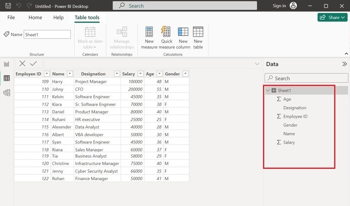
Step 1 − Open the Power BI desktop and load the dataset "D:\Employee.xlsx" consisting of the six columns named Age, Designation, Employee ID, Gender, Name, and Salary. The complete structure and entries of the Sheet1 table are shown below −
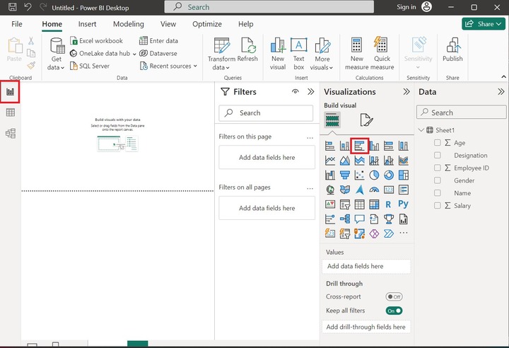
Step 2 − Navigate to the Report Editor, and click on the Clustered bar chart as depicted below −
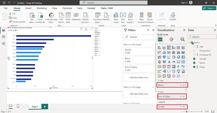
Step 3 − You may select the Name column to the Y axis, drag the Salary column, drop it to the X axis, and add the Gender column to the Legend section as shown in the below image. The gender distribution is done by their salary. Therefore, the female employees are populated in the light blue color, and Male employees are showcased in dark blue color.
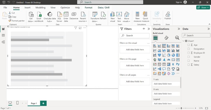
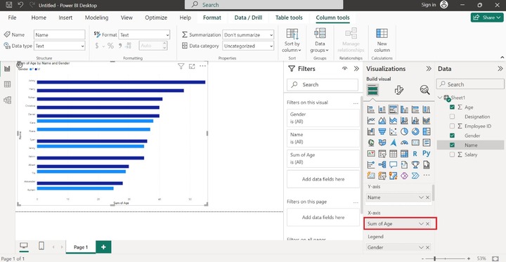
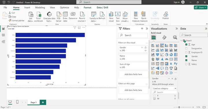
Step 4 − Let's change the X-axis column. Drag the Age column and drop it into the X-axis section. The clustered bar chart depicts the sum of age by name and gender as shown below −
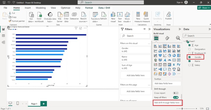
Step 5 − You can also count the number of Female and Male employees by drill-down option. Drag the Gender column and drop into the "Drill through" section as highlighted below image −
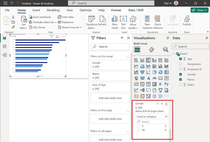
As you can notice in the screenshot, we may easily count the number of female employees which is 5 and the number of male employees is equal to 9.
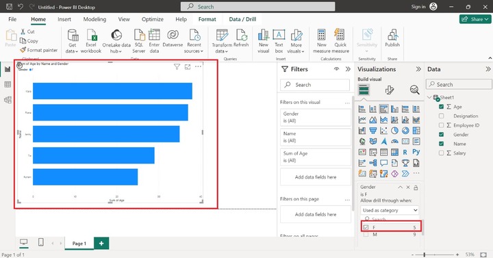
Step 6 − You can click on the F checkbox to populate only Female employees −
Step 7 − Similarly, you may click on the "M" checkbox to count the number of Male employees through this visual.
Clustered Column Chart
The multiple data points are represented by different vertical bars based on the selection of the fields. The categorical data are shown on the horizontal (X) axis and aggregate values (Like Sum and count) are shown on the Y axis.
Determining Company Sales Profit Using a Clustered Column Chart
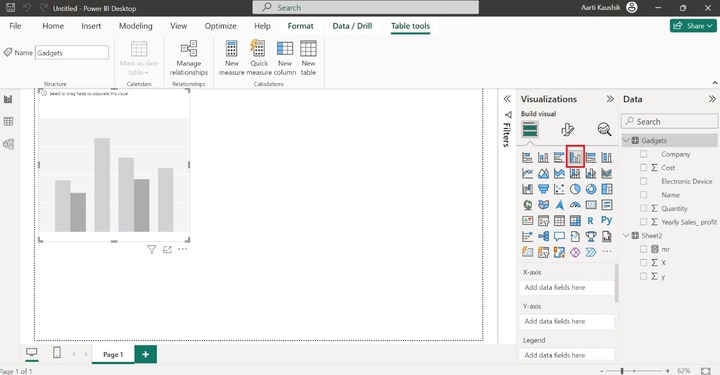
Step 1 − You may select the Clustered Column chart icon and the default chart is automatically displayed on the canvas.
Step 2 −Place the Company and Yearly Sales_profit columns into the X-axis and Y-axis as highlighted in the screenshot. Finally, a company field's data values are categorized through their yearly sales profit.
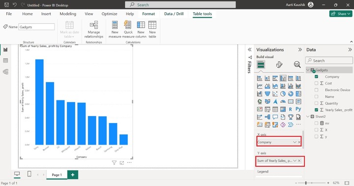
As you can see in the screenshot, all the vertical data bars are of the same color blue.
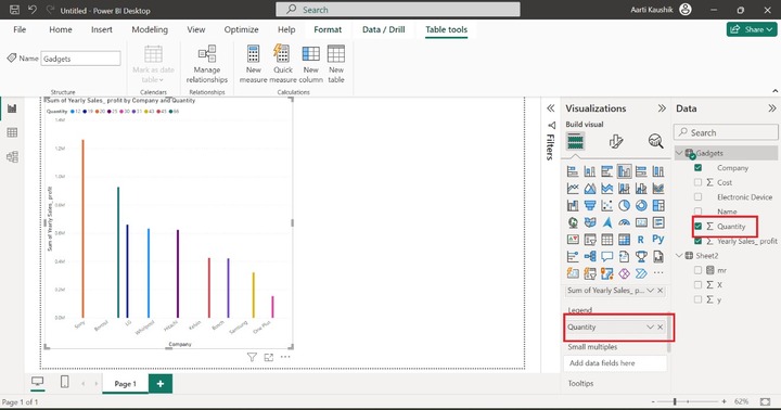
Step 3 − With the help of a legend, you can show the data bar in the different colors that make the cluster column chart more beautiful. Place the Quantity into the Legend.
Step 4 − You may also partition the clustered column chart into various small visuals that show a single data bar separately. Place the Cost column into the "Small multiples".
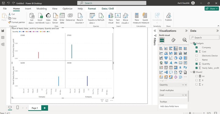
As you can observe in the screenshot, the multiple vertical bars are generated based on the cost field.
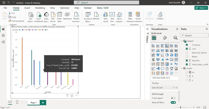
Step 5 − More data fields can be added to the Tooltips to get related information while placing the cursor over the data point. You may place the "Cost" into the Tooltips section.
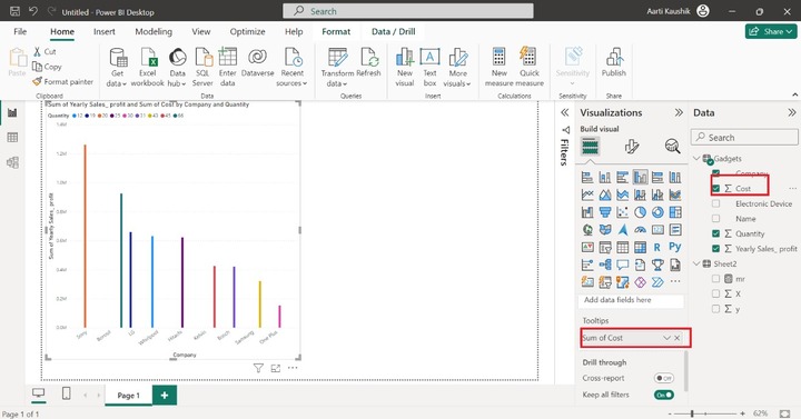
As you can see on the screenshot, once you place the cursor on any of the data points, the "sum of cost information is also appended in the dialog box.
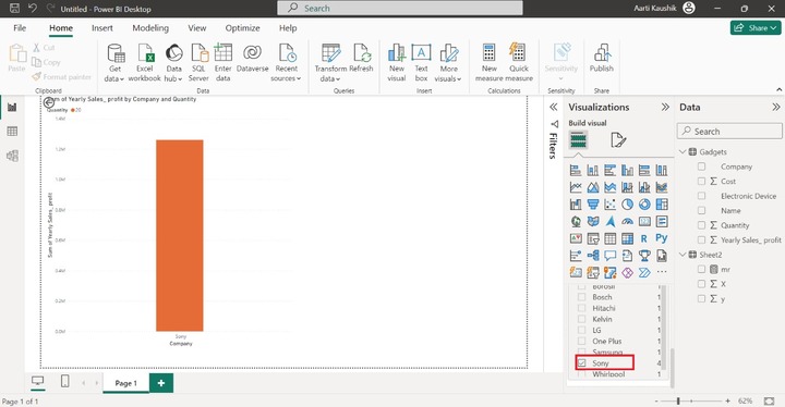
Step 6 − The drill-through option permits users to filter field values and you can select the categorical data value that will be populated on the visual.
For example − You can place the "Company" field into the "Drill through" option and expand the filter card. Furthermore, you may select the "Sony" company and only this data bar will be showcased on the canvas
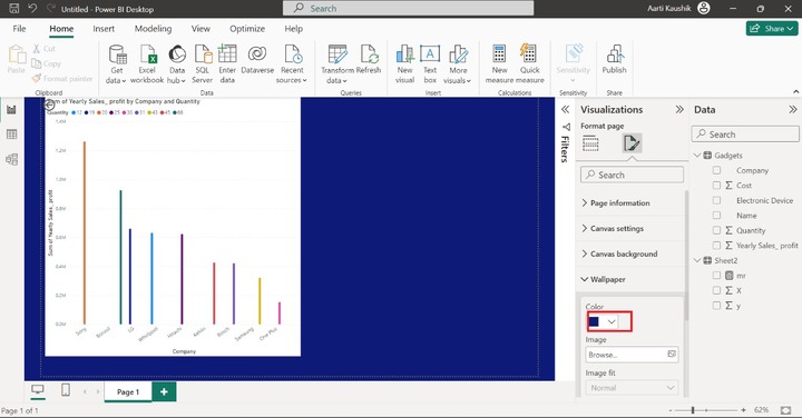
Step 7 − You may customize your generated report. By default, the Report wallpaper is white. Let's change its color to make the report more attractive. You may select the Format your report page and then expand the "Color" section.
The user must follow the above instructions to generate the simple clustered charts. It is an effective yet simple and precious technique; beginners may take advantage of this technique. Make sure that the employee table comprises the Gender, Name, and Salary columns. Other columns in the employee table are optional.